Optimizing the User Journey to Maximize Online Fundraising: Médecins Sans Frontières Canada Case Study
|
|
|
- Blaise Goodwin
- 5 years ago
- Views:
Transcription
1 Optimizing the User Journey to Maximize Online Fundraising: Médecins Sans Frontières Canada Case Study Elise Ledsinger Director, Online Fundraising Strategy Grassriots
2 PASSIONATE, POWERFUL, PROGRESSIVE Grassriots Inc. is a digital agency based out of Toronto, Canada. We serve clients from around the globe including Canada and the United States, with our cousins in the United Kingdom and Ireland, and on the other side of the planet in India and Australia. Our team of dedicated designers, developers, technologists, fundraisers and campaigners have spent most of their careers supporting organizations and causes that capture our passion and imagination. Our mission is to help people and organizations focused on positive social change access the power of the grassroots online and through the social web. We have extensive experience in advocacy, fundraising, and online organizing and support our clients with innovative solutions that engage their supporters and win campaigns.


3 Ryan Baillargeon Jeremy Oudit Paul Bonsell Elise Ledsinger CEO & Founder Director, Digital Strategy Creative Director Director, Online Fundraising Meghan Liu Senning Luk Jeremy Hatter Justin Girard Project Manager Lead Developer Developer Developer
4
5 MÉDECINS SANS FRONTIÈRES CANADA YEAR END CAMPAIGN OUTLINE


6 Médecins Sans Frontières Canada asked Grassriots to develop a creative strategy and an online fundraising landing page to acquire new donors, reengage lapsed donors, and to increase their online fundraising for their Year End campaign. Their fundraising template was outdated and wasn t mobileresponsive, and it did a poor job of conveying the urgency of why donations were needed for their emergency fund campaign. MSF also wanted a fresh, strategic approach for their acquisition efforts.
7 optimize user experience variable content and creative increase mobile users fresh approach new content boost fundraising Goals acquire new onetime donors improve user journey encourage form completion reduce form fields reduce barriers for giving
8 CAMPAIGN TIMELINE


9 CREATIVE APPROACH USER JOURNEY FIXED FORM & FIELDS MOBILE RESPONSIVE GAMIFIED TECHNIQUE RESULTS
10 DEMO
11 CREATIVE APPROACH
12 Our process began with setting business objectives and determining the target audience.


13 From there, we developed the creative concept.

14 We developed a variety of assets that were launched across various online acquisition and advertising platforms to acquire new donors.
15 USER JOURNEY

16 Particular attention was paid to the user s journey to ensure a consistent entry and end point, from acquisition to donation conversion.

17

18

19

20 We tested out several variants of creative, from ads to split tests, to see which variation performed the best.
21 FIXED FORM AND FIELDS

22 The more form fields you have, the lower your conversion rates will be. # Fields 3 Fields 3-5 Fields 6+Fields Avg. Conversion Rate (Lead Gen.) 25% 20% 15% Analysis of over 40,000 landing pages on the hubspot network HUBSPOT
23 The form: pre-redesign This form has too many visible form fields, and an intimidating design that may turn away potential donors. The donate button is hardly visible and not distinctive enough on the page.

24 FIXED FORM Fixing the form above the fold keeps the action at the forefront of the content - allowing for longer, more descriptive campaigns where scrolling should not interfere with conversion. If the user requires more information before they donate, they are free to scroll while keeping the ask in context. 52% TOOK ACTION WITHOUT SCROLLING 48% TOOK ACTION AFTER SCROLLING

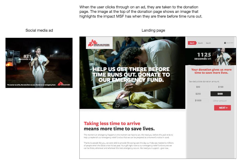
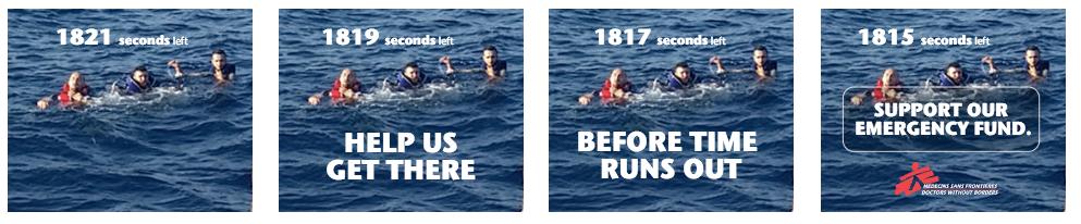
25 Our data shows that a large percentage of users do not scroll through content. If the conversion is not visible above the fold, they are less likely to search for it. With a fixed form, the needs of both audiences are met. For those looking to donate immediately - the page loads and the conversion is clearly visible. For those needed more information before they give, they can scroll down and still maintain visual with the form.
26 MOBILE RESPONSIVE

27 Before the form was redesigned, the journey was not mobile optimized.


28 Simplifying the process for mobile can help overcome some of the limitations inherent to the device, specifically around screen realestate. Our aim was to build a form that has a fixed donate button, and then a multi-step process that makes donating easy.


29

30
31 GAMIFIED TECHNIQUE
32 We wanted to stress a sense of urgency throughout this campaign: since it was during year end, there was a set timeframe to appeal, and because we were raising funds for the emergency fund. Stressing that every second counts during an emergency was paramount to this campaign. We wanted to show how a gift helped buy more time, since it would allow for MSF to be more prepared. This technique also led to a higher average gift.


33 We implemented a live counter, which increased once you landed on the donation page, and jumped up when you increased your gift amount.


34
35 RESULTS

36

37

38

39
40 THE END. THANK YOU!
41 Contact me! strategy creative technology fundraising campaigns social media analytics acquisition seo training wordpress media ads engaging networks campaigns optimization Centre for Social Innovation 215 Spadina Ave. Suite 466 Toronto, ON M5T 2C7 t grassriots w grassriots m info@grassriots.com