Creating Logos. What is a LOGO????
|
|
|
- Cori Bradford
- 5 years ago
- Views:
Transcription
1 Creating Logos What is a LOGO????

2 What is a logo?
3 What makes a good logo? Iconic logos are: 1. Describable 2. Memorable 3. Effective without colour 4. Scalable (work when just an inch in size) 5. Relevant to the industry in question
4 What makes a good logo? A good logo is distinctive, appropriate, practical, graphic, simple in form and conveys an intended message. There are five principles that you should follow to ensure that this is so An effective logo is (in no particular order): Simple Memorable Timeless Versatile Appropriate

5 What makes a good logo?

6 Simple A simple logo design allows for easy recognition and allows the logo to be versatile & memorable. Good logos feature something unique without being overdrawn. K.I.S.S. Principle of design; which translates to: Keep It Simple, Stupid. It does convey a very important design consideration. Simple logos are often easily recognized, incredibly memorable and the most effective in conveying the requirements of the client. A refined and distilled identity will also catch the attention of a viewer zipping by signage at 70 miles per hour, on packaging on the crowded shelves of a store, or in any other vehicle used for advertising, marketing and promotion. Remember, the basis of the hugely effective international branding for the world s largest shoe manufacturer is a very simple graphic swoosh.

7 Memorable Following closely behind the principle of simplicity, is that of memorability. An effective logo design should be memorable and this is achieved by having a simple, yet, appropriate logo. You want your logo to be distinctive, memorable and clear.
8 Timeless An effective logo should be timeless that is, it will endure the ages. Will the logo still be effective in 10, 20, 50 years? Leave trends to the fashion industry Trends come and go, and when you re talking about changing a pair of jeans, or buying a new dress, that s fine, but where your brand identity is concerned, longevity is key. Don t follow the pack. Stand out. Probably the best example of a timeless logo is the Coca-Cola logo if you compare it to the Pepsi logo below, you can see just how effective creating a timeless logo can be. Notice how the Coca Cola logo has barely changed since 1885? That is timeless design.
9 Timeline Pepsi vs Coke Timeless
10 Versatile An effective logo should be able to work across a variety of mediums and applications. The logo should be functional. For this reason a logo should be designed in vector format, to ensure that it can be scaled to any size. The logo should be able to work both in horizontal and vertical formats. Ask yourself; is a logo still effective if: Printed in one colour? Printed on the something the size of a postage stamp? Printed on something as large as a billboard? Printed in reverse (i.e. light logo on dark background) One way around creating a versatile logo is to begin designing in black and white only. This allows one to focus on the concept and shape, rather than the subjective nature of colour. One must also remember printing costs the more colours used, the more expensive it will be for the business over the long term.
11 Appropriate How you position the logo should be appropriate for its intended purpose. For example, if you are designing a logo for children s toys store, it would be appropriate to use a childish font & colour scheme. This would not be so appropriate for a law firm. It is also important to state that that a logo doesn t need to show what a business sells or offers as a service. ie. Car logos don t need to show cars, computer logos don t need to show computers. The Harley Davidson logo isn t a motorcycle, nor is the Nokia logo a mobile phone. A logo is purely for identification. For further evidence of this, take the top 50 brands of the world 94% of the logos do not describe what the company does.
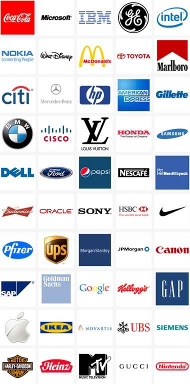
12 Top Logos According to the Top 100 Global Brands Scoreboard the top 50 brands & logo designs in the world are, in ranking order: Coca-Cola, Microsoft, IBM, GE, Intel, Nokia, Walt Disney, McDonald s, Toyota, Marlboro, Mercedes-Benz, Citi, Hewlett- Packard, American Express, Gillette, BMW, Cisco, Louis Vuitton, Honda, Samsung, Dell, Ford, Pepsi, Nescafé, Merrill Lynch, Budweiser, Oracle, Sony, HSBC, Nike, Pfizer, UPS, Morgan Stanley, JPMorgan, Canon, SAP, Goldman Sachs, Google, Kellogg s, Gap, Apple, Ikea, Novartis, UBS, Siemens, Harley- Davidson, Heinz, MTV, Gucci and Nintendo.
13
14 Top Logos The % below identifies the percentage of these 50 brands that hold to this view: The name does not describe the product sold (94%) (i.e. in most cases a logo is used to identify a company, not describe what it does.) The by-line tag is not included in the logo (90%) The font style is clean and clear (84%) The logo design uses one colour only (74%) (white & black not counted as a colour) The logo design uses letters only without the symbol (74%) The logo design is a made-up name or ACRONYM (72%) The logo design is rectangular in shape (66%) The logo design is one word only (62%) The logo design includes the trademark symbol (54%) and is placed in the top right (48%) The name is 6 letters or less (52%) The name uses upper & lower case (44%) (excluding ACRONYMS) The background is filled and solid. (52%) The pronunciation includes three sounds/syllables (44%) The predominant colour base is blue (40%)
15

16
17
18
19 Check out these websites for more ideas
20