Attribution of Haze. What Are the Pieces and How Do They Fit? s e. a e
|
|
|
- Aubrie Mills
- 5 years ago
- Views:
Transcription
1 Attribution of Haze What Are the Pieces and How Do They Fit? a n o R s a e E l b Pr r g o s s e
2 One Possible Recipe Describe the area Identify glidepath Break down problem by pollutant Where is the pollutant coming from? In space source regions In time historical trends Relate these to emissions Characterize natural component
3 One Possible Recipe Where is the pollutant going? Future emission trends Future (modeled) concentration changes at Class I areas in 2018 Analyze 2018 emissions and TSSA results Conduct what if scenarios and narrow down strategies Use model predictions plus all of the above to demonstrate strategies will likely result in reasonable progress


4 Case Studies Mt. Rainier, WA Sulfate Carbon Carlsbad and Salt Creek, NM Sulfate Dust Nitrate

5 Mount Rainier Baseline ( ) = 19 dv Actual photos available at IMPROVE website ( Some photos can be obtained and made hazier with WinHaze software.
")
6 Mount Rainier Presumptive Goal (2018) = 16.5 dv
7 Mount Rainier Natural Conditions (2064) = 8 dv
8 Mount Rainier Uniform Rate of Progress 20% Worst Visibility Days (Deciviews) Baseline 1st Planning Period (2.6 dv) Natural Conditions Year 2064
9 Mount Rainier Aerosol Composition on 20% Worst Days ( ) Available at IMPROVE website (
10 Visibility Improvement Needed by 2018 to Meet Uniform ROP Goal at Mount Rainier Compared to the Aerosol Components ( ) Aerosol Light Extinction (Mm-1) Improvement Needed dv 0 NO3 SO4 EC OC SOIL
11 Mount Rainier SO4

12 Mount Rainier Back Trajectory Difference Plot For 20% Worst Sulfate Days ( ) On high SO4 days, air comes disproportionately from the west and northwest relative to all days. TSSA and TRA results show no contribution from OR, but sharp gradient near Portland could cause some uncertainty in this finding. Available at Causes of Haze website (


13 2002 Preliminary SO2 Emissions Available at WRAP Attribution of Haze website (
14 Mount Rainier SO4 Trend on 20% Worst Visibility Day ( ) Centralia SO2 cut by 72% Additional permanent reductions occurred at Centralia in Further reductions will result from Tier 4 nonroad rule by Approximate natural conditions Note: Because Centralia reductions occur in the baseline period and not the planning period, they would not count towards the reasonable progress demonstration. They do reduce the baseline, slope, and improvement needed in 2018, but the extent depends on whether controls are implemented at beginning or end of baseline period. Available at IMPROVE website (
15 Mount Rainier Carbon Changing gears
16 Mount Rainier Back Trajectory Difference Plot For 20% Worst Elemental Carbon Days ( )

17 Mount Rainier Back Trajectory Difference Plot For 20% Worst Organic Carbon Days ( ) Sources of OC appear less confined than EC, consistent with fact that EC is relatively more anthropogenic/urban.
18 Oregon Wildfire Acerage and OC Extinction at Mount Rainier 30 OR Acres* OC Oregon Acerage Burned 1,000, , , , , * * Preliminary Interannual variability of OC not as great as fire variability. Other, more constant sources of OC probably modulating the signal. Light Extinction from OC on Worst Visibility Days (Mm-1) 1,200,000
19 Carbon has a significant presence in all samples and seasons.
20 Fraction of Carbon that Is Modern or Fossil Biogenic 0.40 Fossil Vermont Brig Great Smoky Mt Rainier Puget Sound
21 Mount Rainier National Park 4.00 Contemporary loading -3 µg m ) Contemporary or fossil Carbon loading ( Fossil loading y = 0.788x Linear (Contemporary loading) Linear (Fossil loading) y = 0.212x (Aersol Loadingµg m ) Fossil and contemporary carbon concentrations correlate. Common factors may include stagnation / accumulation of both types of emissions and/or conversion of gaseous fossil and contemporary carbon to aerosols by oxidants.
22 Mount Rainier and Puget Sound OC Concentrations (Jul, Aug, and Sep of ) 12 Mount Rainier OC (ug/m3) Seattle OC (ug/m3) This correlation implies a common regional source (e.g., smoke) and/or transport from the Seattle area. 12
23 Increasing OC Trend Decreasing OC Trend
24 Mount Rainier Organic Carbon and Tacoma Ozone Extinction from OC (Mm-1) 20 Ozone OC th Percentile 8-hr Ozone Concentration (ppm) Approximate natural conditions Year Looks like controls for ozone are also reducing OC, and/or that there s less ozone oxidizing VOCs.
25 Five years of aerosol data show that most of the 20% worst extinction days occurred during summer months, dominated by sulfates and OMC (Organic Mass by Carbon). Site observers, familiar with conditions at the site, report that this has not been associated with wildland fires over that time. Summertime maxima likely result from greater summertime photochemical secondary aerosol production, as well as longer upwind transport distances that occur during the summertime. [Causes of Haze website.]
26 Canyonlands Ozone and OC Concentrations SUM06 Ozone OC on Worst Days and seem like high smoke years. So is ozone affecting OC, or is fire affecting ozone and OC, or both? SUM06 Ozone Concentrations (ppm-hr) OC Extinction On 20% Worst Visibility Days (Mm-1) 45

27 Mount Rainier Fine Soil Quick note


28 Mount Rainier Back Trajectory Difference Plot For 20% Worst Fine Soil Days ( )
29 Implications for Mount Rainier Based on a baseline, a 50% reduction in SO4 would be sufficient to meet the presumptive goal Sources of SO4 seem limitted to western WA, British Columbia, and their coastal areas Recent reductions at Centralia will reduce WA SO2 emissions by almost half Another 10-15% reduction should result from nonroad fuel regulations effective by 2010 Harbor emissions from vessels fueled outside the U.S. are being addressed
30 Implications for Mount Rainier Treatment of Centralia reductions in baseline and/or reasonable progress demonstration should be addressed. Recommendations for further SO4 analysis TSSA and TRA-based contributions from the Portland, OR area should be carefully evaluated given the steep gradient in that area Emissions from British Columbia are potential contributors. TRA predicts a 20% contribution. TSSA predicts no contribution. Representativeness
31 Implications for Mount Rainier Carbon is 2nd largest contributor to haze Major source areas appear to be western WA, central OR, and British Columbia Correlations with Seattle OC imply transport and/or common regional sources (e.g., smoke) At least 20% of carbon appears to be fossil Additional carbon aerosols may be formed by anthropogenic oxidation of biogenic VOCs
32 Implications for MORA Carbon has been decreasing. Coincidental decrease in ozone implies a possible link to anthropogenic emission reductions, which are expected to continue. Portland carbon data should be folded in. The source regions and trends of SO4 and carbon, and their apparent response to ongoing anthropogenic emission reductions provide a weight of evidence that presumptive goals for 2018 will be met
33 Carlsbad Monitor located at Guadalupe Mtns in Texas SO4 NO3 Dust
34 Carlsbad Uniform Rate of Progress 20% Worst Visibility Days (Deciviews) Baseline 1st Planning Period (2.5 dv) Natural Conditions Year 2064

35 Carlsbad Aerosol Composition on 20% Worst Days ( )
36 Visibility Improvement Needed by 2018 to Meet Uniform ROP Goal at Carlsbad Caverns Compared to the Aerosol Components ( ) Aerosol Light Extinction (Mm-1) 25 Improvement Needed dv 5 0 NO3 SO4 EC OC SOIL
 San Pedro Source")

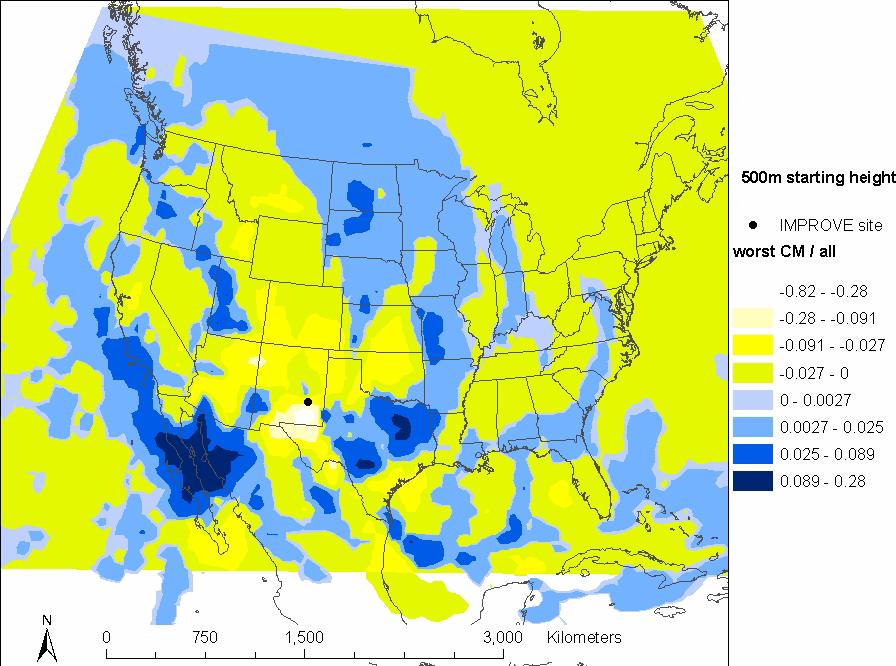
37 Back Trajectory Difference Plots For 20% Worst Sulfate Days ( ) San Pedro Source regions for SO4 shift from west to east for sites in the Southeas part of the WRAP region. Carlsbad
38 Preliminary PreliminarySO4 SO4Simulation Simulation
39 13,000, ,000, East U.S. SO2 Emission (tons) 12 11,000, ,000, Annual Average Carlsbad SO4 Extinction (Mm-1) 9,000, ,000, ,000, ,000, Carlsbad SO4 Extinction (Mm-1) East U.S. SO2 Emissions (tons) Carlsbad SO4 and East U.S. SO2 Emissions
40 Carlsbad Nitrate Changing gears

41 Salt Creek Had the 3rd Highest NO3 Concentration In the WRAP Region, Outside CA

42 Salt Creek Back Trajectory Difference Plot For 20% Worst Nitrate Days ( )
 Data from multiple sites may be useful to triangulate source")
43 Carlsbad Back Trajectory Difference Plot For 20% Worst Nitrate Days ( ) Data from multiple sites may be useful to triangulate source regions.
44 Salt Creek NO3 vs Carlsbad NO3 (April February 2004) 9 8 Salt Creek NO3 (ug/m3) Carlsbad NO3 (ug/m3) Although Salt Creek and Carlsbad share a common source region and are located relatively close to one another, Salt Creek NO3 is much higher and the correlation is not good. Thus, the source region does not affect both simultaneously (i.e., alignment with wind direction), and/or Carlsbad is further downwind.


45 2002 Preliminary NOx Emissions Oil & Natural Gas Production
46

47
48 Trends in Annual Average NO3 Extinction
49 Nitrate Trends in Precipitation

50


51 Carlsbad Dust Changing gears
 May be negative due to high")
52 Carlsbad Back Trajectory Difference Plot For 20% Worst Coarse Mass Days ( ) May be negative due to high winds

53 Carlsbad Back Trajectory Difference Plot For 20% Worst Fine Soil Days ( ) Could be unpaved road dust from gas fields, but VIEWS trajectories give conflicting results
54 Fine Soil (ug/m3) th percentile coarse mass Carlsbad Fine Soil vs Coarse Mass ( ) Di ffe re n ts ou rc es? th percentile fine soil Coarse Mass (ug/m3) 1. Regional windblown or local mechanically-suspended dust. 2. Locally windblown dust
55 Preliminary 2002 Windblown PM10 Dust Emissions PM10 (tons/yr) > 5,000 4,000-5,000 3,500-4,000 3,000-3,500 2,500-3,000 2,000-2,500 1,750-2,000 1,500-1,750 1,250-1,500 1,000-1, ,

56 Preliminary 2002 Windblown PMcoarse Dust Emissions

57 2003 Ambient Annual PMcoarse Concentrations

58
59 Carlsbad Visibility and Dust Trends On the 20% Worst Days 20% cleanest days holding ground
60 Implications for Carlsbad Future eastern U.S. reductions may hold substantial benefit for Carlsbad and southeast portion of WRAP region, but unless the dust issue is addressed, the glidepath may not be met and and reasonable progress will be difficult to demonstrate Understanding sources (especially dust) outside the WRAP region is critical
61 Implications for Carlsbad NO3 is a looming issue Dust and NO3 also need to be considered in terms of 20% cleanest days
62 2002 Representation of Baseline


63
64 High fire activity in 2002 affects the seasonal distribution of the 20% worst days and diminishes the apparent role of NO3 and benefit of NOx control strategies.
65 Concluding Remarks Find a recipe for synthesizing data that works for you and your stakeholders Use a variety of data types to strengthen confidence and build a case Phase II should include more data types and enable better integration among them Emission, air quality, and deposition trends Air quality trends adjusted for meteorology Receptor modeling (e.g., CMB and PMF)
66 Concluding Remarks Trajectories for 2003 and 2004 Include data from othe sites as necessary (urban, tribal, CENRAP, Canada/Mexico) Develop bounds on the anthropogenic and natural contributions of fire and dust Characterize strengths/advantages and uncertainties/limitations of each data type Representativeness of 2002
67 END
68 Mount Rainier Trends in Light Extinction by Major Species on 20% Worst Day ( ) Centralia SO2 cut by 72%
69 SO4 Coarse Mass
70

71