Our objectives today will be to review Outcomes Report layout and how to use the metrics to gauge how your site is doing in relation to all of the
|
|
|
- Edward Stone
- 5 years ago
- Views:
Transcription
1 Our objectives today will be to review Outcomes Report layout and how to use the metrics to gauge how your site is doing in relation to all of the other IMPACT participants. We will discuss how to determine what goes into the numerator and denominator both in the Executive Summary and in the detail lines within each procedure. Finally we will get into how to use the data for process and quality improvement purposes.

2 Before we get into the Outcomes Reports, I wanted to discuss the steps leading up to the Outcomes Reports for our newer participants to help close the loop and paint a full picture. You have your data entry in the tool, whether you use the ACC online tool or a vendor tool. Quality check is the next phase of the process. Please note you can do quality checks as often as you would like (after each patient is entered is ideal to work out any logical errors that are picked up). Remember that ERRORS within quality check must be corrected before submitting to DQR, whereas WARNINGS are more red flags asking you to double check your entry for that element. Once quality checks are complete, click on Submit to DQR tab under NCDR Maintenance. Upon submitting data, usually within a few minutes, you will be able to view the DQR. The DQR gives you either a red, yellow or green status. The only status that will compare your data to the national data is in a green status. A green status means you have satisfied the requirements for the completeness assessment and data assessment for that given quarter. With a yellow status, only your own hospital data will appear on the report. With a red status, not even your own data will appear on the report, since there is too much missing. Also, since our reports cover four quarters, if you have gone back and changed data in previous quarters, it is best to run quality checks on those and submit to DQR to be sure you are getting the green status on those as well. Even if you are using a third party vendor tool to enter your data, it all still must be submitted to our DQR within the IMPACT Registry. The quality check process is done through the vendor tool. If you are getting ready to submit your data for the first time and would like assistance, you can always reach NCDR support to aid you in the process.

3 You have submitted data and are now ready to view the DQR. This can be done by going to the Reports tab, followed by clicking on DQR. After you submit your data, the DQR will show a record of all of your submissions and the status at which they are at. You always want to look at the most recent submission for that given quarter (this is marked by the green arrow on this slide). If you had a green status previously for a given quarter and new data was added, now giving you a yellow status, that will need to be corrected in order for your data to be included with the national data so you want to make ensure your final submission before the data deadline is green. The benchmark inclusion status is marked by the red arrow on the slide. Whenever you see FAIL in the completeness assessment (marked in purple), you can click on the FAIL hyperlink and it will take you to the level where you can see where the specific errors are. Once those errors are completed, you must resubmit your data and view your DQR again. Repeat this process until a green status is achieved for each quarter you wish to submit.


4 In order to receive notification that your Outcomes Report is ready to view, go to the ADMINISTRATION Tab within the Registry and select Individual Profile. Once in the Individual Profile, scroll down to the Preferences section and make sure the last check box is checked for Outcomes Reports. After the call for data deadline each quarter, it takes a few weeks to get your Outcomes Report. Under the administration tab, click individual profile, make sure to have the notification clicked so that you will get an when the Outcomes Report is released. From the Reports tab, click on Outcomes Report and you will get the screen below. From there, you may select either the pdf format or excel format to view your data. For this presentation, we will mainly focus on the pdf version.


5 For the Outcome Report Companion Guide, Go to Resources tab, select Documents. From the list of documents, select Download Outcomes Report Companion Guide.

6 The Outcomes Report varies in size depending on the registry. For IMPACT, the sections include the benchmark inclusion summary with release notes, if applicable. We will go into more detail for each of these. Then there is the Executive Summary. This is where you will find all of the metrics laid out in several formats. There is the benchmark comparison and something called box and whisker plots. Then there are graphic representations followed by a detail line section for the executive summary. The final section is the detail line submission summary. This section is the Benchmark inclusion summary of your report. It lets you know the timeframes that are included in the report, what status you are at for each (red/yellow/green) and if your data is included in the executive summary. Each Outcomes Report is in the rolling 4 quarters format. This means that each report will have the current quarter, plus three quarters back. Each new report drops the oldest quarter and adds the next one.
 in RED and also followed by a description of the change, which is underlined in this example.")
7 This slide shows a snapshot of the release notes from our most recent Outcomes Report. If there are any release notes for a given report, they will be found under the Benchmark Inclusion Summary. It will outline changes to the report noting the detail line(s) in RED and also followed by a description of the change, which is underlined in this example. Within the executive summary, there are 12 quality metrics. For each Outcomes Report, we encourage the team to review the results. These are meant to support self assessment and quality improvement of patient care. These metrics or other new ones could, at some point, become performance measures with National Quality Forum Endorsement that may lead to public reporting of data. The NQF is a non profit organization whose mission is to improve healthcare in America. Our Science team applies for NQF endorsement and if endorsement is attained, it can enhance the value and meaning of such reporting measures by the hospital.

8 This is a snapshot from the Outcomes Report Companion Guide for Metric 9 which looks at the proportion of patients that have a post procedure coarctation peak systolic gradient of <10mmHg. The snapshot goes on to describe the population that makes up the numerator and denominator as well as the inclusion/exclusion criteria for this particular metric. So what can you do with this information? The next slide we will talk about applying this information to the Outcomes Report.

9 This snapshot is from the Outcomes Report for Metric 9. A few important details to note. This metric is looking at ISOLATED coarctation procedures. If the coarctation was in combination with other procedures, it is not considered isolated, so those cases would be excluded from the metric. The report also includes the detail line from which this information was pulled for this display. We will discuss this further in just a bit. The chart on the left side of the screen shows how your hospital performed in this metric. Next to that it shows the median At the 50 th percentile how hospitals performed and then next to that the 90 th percentile. This hospital performed at 70%, which falls between the 50 th and 90 th percentile. The display on the right is the box and whisker plot. The green arrow will always indicate where your hospital falls in the metric. The numbers below the green arrow represent the distribution of numbers from all of the other sites within the registry that got a green status (usually displaying the 10 th, 25 th, 50 th, 75 th and 90 th Percentile). You want your results to be on the right side, as close to the 90 th percentile as possible, even trying to be to the right of it. If this hospital performed near the 90 th percentile, it would mean that only 10% of the hospital scored higher. Being that they are close to the 75 th percentile, the way to interpret this is to say that 25% of the hospital scored higher than they did.
10 This slide drives the point home of the box and whisker plots. As indicated on this, the word better with the arrow toward the right indicates which direction you want your hospital to score in. It will always be to the right that will mean the better result. Now this scale shows the numbers ascending from 45.8 (10 th percentile) by the blue arrow up to 86.5 (90 th percentile) by the red arrow. There may also be instances where the numbers go in the descending direction, like the next slide. This example from the same Outcomes Report shows 0% as the better result, meaning this site had no deaths of patients 1 month to less than one year of age. 0% is the 90 th percentile (red) in this case and the scale drops from 16.4% (10 th percentile) to 0% (90 th percentile) from hi to low vs the other scale was lo to high. The point I want to make with this is that depending on the metric, the 90 th percentile may be 100 or 0. What is important is that you are on the right side of the box and whisker plot.
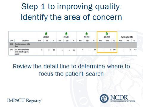
11 A few slides ago, I mentioned the detail line referenced in the Executive Summary. This information shows which detail line to reference for that specific piece of data. You can see it summed up the numerators and denominators from the 4 quarters and when you calculate out the percent by taking the numerator and dividing it by the denominator and multiplying by 100, its 70%, which is what is was on the box and whisker plot. From here, if we had a dashboard, you could drill down to the patient level to see which patients are falling into this metric. The dashboard is coming in the future for IMPACT, but for now, we have the data extract that will allow you to figure out which patients are falling into this metric.

12 The top snapshot is from the Outcomes Report Companion Guide. It shows the parameters for the numerator and denominator with regards to the age groups captured in the IMPACT Registry. Those same parameters appear in the snapshot from the Outcomes Report below which shows the 4 quarters and the total for MY HOSPITAL. This one is a fairly simple example, but it will show you how to use the Outcomes Report Companion guide along with your report to help interpret your data. Let s say your physicians and administrators wanted a breakdown of these age groups across these four quarters. You know the denominator includes all patients in the IMPACT Registry and the numerator varies depending on the age group being looked at. Each quarter lists the denominator representing the total patients submitted that quarter. The sum of the numerators from the <1mo age group totaled up across four quarters equals the numerator in the MY HOSPITAL column. The same goes for the denominator. You can then report out the exact number of patients and the percentage of patients in each age group as well.

13


14
15
16