Logo Design Tips for WordPress and Beyond!
|
|
|
- Bathsheba Gilmore
- 5 years ago
- Views:
Transcription
1 Logo Design Tips for WordPress and Beyond! What makes a logo effective on the web and in print? WORDCAMP ASHEVILLE AUGUST 19, 2018


2 Hi I m Su Schaer I m the owner of Nimble Design Team, a graphic design and WordPress website business located in Atlanta, GA. I love creating WordPress websites for clients. I m very grateful for the Atlanta WordPress
3 Why have a logo? What is a logo, anyway? Logo vs. Branding vs. Brand Identity
4 Logo: a graphic symbol that represents the essence of a person, company or organization. A logo is symbolic artwork A crisp, clear and professional logo on your website conveys credibility and authority Establishes your business or organization as a high-quality, trustworthy entity and offers reassurance that visiting your site will be worthwhile
5 Brand identity: a combination of how you define and promote yourself, and how others see you. Your logo is one (very important) element, of your organization's brand identity Everything you do to build awareness and reputation around your company and its product or services creates branding Brand identity is the collection of your business assets, including the logo, which helps to create your brand image


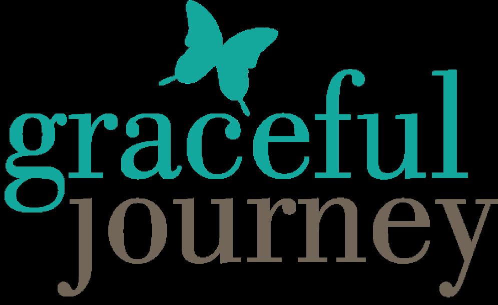
6 Example of consistent use of a well-designed logo
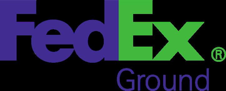
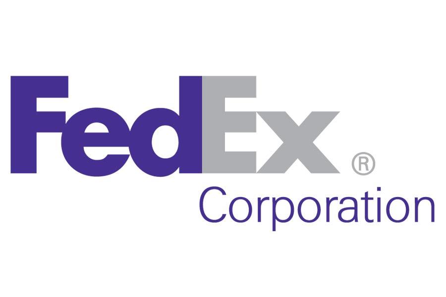
7 Be consistent. When building brand recognition, you will confuse your audience if you use different logo versions. Consistent colors, typefaces and shapes help your potential clients to remember your business, and forges a connection. People are more likely to choose brands that are familiar, because they seem established, and therefore trustworthy.
8 A strong logo should do the following: 1. Embody your brand 2. Be instantly recognizable 3. Be versatile 4. Be timeless

9
10 What are the key elements of an effective logo? Typography Color Imagery
11 What are the key elements of an effective logo? Typography Color Imagery
12 A logo can be purely typographic, or include a visual element. A logotype or wordmark is where only the letters of the name make up to the logo (no additional symbols). The lettering itself becomes the visual.


13 ..
14 A logomark combines a visual element along with the business name.


15 ..
16 How about not having any typography at all?


17 Some logos need no words...
18 A logo can tell a story. NBC (originally known as the Peacock Network) used an illustration of a stylized peacock in its 1956 logo. The peacock became a marketing tool that was used in the hope NBC viewers would purchase color TV sets. Over the years, the peacock evolved into a new shape.


19 Brought to you in living color..

20 What are the key elements of an effective logo? Typography Color Imagery
21 Create a consistent color palette. Consistent use of your logo colors should be part of your overall branding strategy, across all media. Does the client have existing corporate colors, or a branding guide that you need to follow?
22 Example. of a simple logo branding guidelines sheet
23 Color trends vary. Certain color schemes look dated today but were hip & trendy once. Colors can really age a logo.

24 Dated Timeless..
25 Color is powerful. Color is subjective. Colors that might work well in North America can have a radically different meaning in other cultures. Even in a global economy, color associations can vary.


26 Red implies passion, energy, and danger; it can also convey warmth and heat...


27 Green implies fresh, ethical, growth. Popular with financial products, too...


28 Blue implies professionalism, trust, integrity, sincerity and calm, and is one of the most widely used colors in corporate logos...
29 Single color or two-color palettes are best but not always * *There are some very successful multi-colored logos.


")
30 These companies offer a diverse selection of products and services. The multi-color scheme used for the Olympic rings suggests diversity and inclusivity. Learn how to do things that aren t in your normal toolkit, such as: CSS editing (to customize theme) Migrating websites Creating backups Formatting basic SEO
31 What are the key elements of an effective logo? Typography Color Imagery
32 On selecting imagery Go for non-generic, memorable elements that communicate your business personality Readability is key - for instant recognition and clarity Icon style images are useful for social media
33 Current trends in logo design Unusual typefaces Geometric shapes Social-media ready Bright, flat colors Gradient color and overlays
34 Logos that have been redesigned to look better on social media Before versions..


35 Logos that have been redesigned to look better on social media..
36 Don t do this! Poor quality, overused clip art Poor quality or illegible typefaces Free art (always check on copyright limitations) Generic canned logos can look cheap, unprofessional

37 Clip art that your client found for free in Microsoft Word does not qualify as a logo.
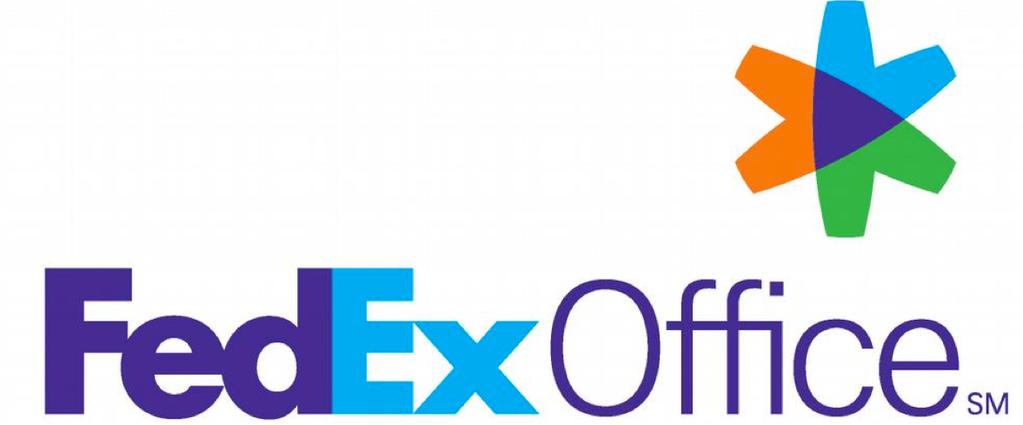
38 Help your logo work well on the web: Echo colors, typeface on site; option to use logo typeface with accent headlines, etc. Connect visually and use same logo colors on your social media and print materials as well. Consistency!
39 Where should the logo appear on your website? The header of any website (where visitors will likely first see your logo) is a strategically important piece of real estate and interaction. Users are 89% more likely to remember logos shown in the traditional, top-left position over logos placed on the right.


40
41 Centered logos and mobile devices Centered logos appear more often on websites, likely because of responsive and mobile-first designs. Mobile designs often use the top-left corner to display a menu icon, and then shift the logo towards the center of the screen.

42

43
44 The dreaded request: Can We Make the Logo Bigger? Bigger is definitely not better.
45
46 Logo shape options: be flexible and create different versions Many companies use a single letter or graphic element from their logo for social media purposes. An uncomplicated logo with just a few colors will stand out better online. Logos need to adapt to various formats and usages.


47

48

49

50 The small but mighty favicon!
51 Best practices for logo file creation: Create logo file as vector art (.ai file) in Adobe Illustrator, so it can be sized as large as you like and not lose resolution When you create your logo in Adobe Illustrator you can set up colors for the various file formats and usages you ll need

52 Logo colors may vary, depending on file format
53 Thank You!
54 Please see me for a quickie logo review, at the Happiness Bar and grab my handy Branding Audit Checklist handout! < Please sign up for my newsletter >


55 Su Schaer