Brand Guidelines. March 2015
|
|
|
- Julian Greene
- 5 years ago
- Views:
Transcription


1 Brand Guidelines March 2015
2 WHO WE ARE Word of Life Brand Guidelines 2


3 is a multi-disciplinary non-profi t organization that has a goal to present a cohesive, and effective visual brand to its audience.
4 Word of Life Logo - Who We Are BRAND PROMISE Word of Life s purpose can be summarized in its brand promise statement: Experience Your Faith The Brand Promise can be used in corporate, internal and promotional communication and should weave throughout the brand experience. Word of Life Brand Guidelines 4
5 Word of Life Logo - Who We Are BRAND ESSENCE A Word of Life brand experience should be curated around the following goals: Experience: Word of Life creates experiences that bring faith to life and teach spiritual principles in new and exciting ways. Outreach: Word of Life ministries create opportunities to share the message of salvation with those who have never heard. Life-Change: Word of Life gives people the chance to encounter God, then walks with them through their spiritual journeys, resulting in long-lasting, heart-level life change. Eternal Impact: Word of Life desires to see every man, woman and child experience a relationship with Jesus, and our core purpose is to make an eternal impact on everyone s lives we touch. The Brand Essence is NOT language to be used, but rather ideas to guide the creation of language. Word of Life Brand Guidelines 5
6 Word of Life Logo - Who We Are POSITIONING STATEMENT The Word of Life positioning statement is THE summary statement for the End User : Word of Life creates faith-defining experiences that give students and families the opportunity to encounter God and grow in their spiritual walks. Through camps, the Bible Institute, Local Church Ministries and International Ministries, Word of Life is a catalyst for lasting life-change and eternal impact. Word of Life Brand Guidelines 6
7 Word of Life Logo - Who We Are OVERVIEW STATEMENT The Word of Life overview statement summarizes the scope of the Word of Life impact: Word of Life is a nondenominational Christian organization creating faith-defining experiences that give students and families the chance to encounter God and grow in their spiritual walks. Through high-energy camping ministries, in-depth biblical training, local church ministries, and international missions, Word of Life shares the message of salvation with those who have never heard and helps believers grow in their faith. We are made up of four ministries: Youth and Family Camps: high-energy Christian camping experiences for youth and families Bible Institute: collegiate-level biblical study programs Local Church Ministries: curriculum, training and resources to equip local churches in their children s and youth ministries International Ministries: short- and long-term missions trips to share the Gospel around the world Through each of these ministries, we create loving environments and engaging experiences where life-change happens. To learn more, visit Word of Life Brand Guidelines 7
8 LOGO Word of Life Brand Guidelines 8
9 The Word of Life Logo This is the original and preferred logo for all applications. In order to maintain consistency and professionalism in the way we use our logo, a few simple guidelines should always be followed. Several versions of our logo exist for use in different situations and with different printing requirements. The preferred version of our logo is 4-color. (c: 73 m: 0 y: 0 k: 73 and c: 48 m: 0 y: 0 k: 0 and c: 0 m: 0 y: 0 k: 90 and c: 0 m: 0 y: 0 k: 50) Logo typefaces: Helvetica Bold and Helvetica Light Word of Life Brand Guidelines 9
10 The Word of Life Logo - Approved Orientations Horizontal version Mark alone Vertical version Alternate Vertical - for use in narrow layouts where it seems appropriate Word of Life Brand Guidelines 10
11 The Word of Life Logo - Color Formats STANDARD REVERSED This is the original and preferred logo for all applications. This is the reversed logo shown White on Black. This is the greyscale version. This is the reversed logo shown in less than 4 colors. This is the one color version shown in Black. These color setups can be used with any of the Approved Orientations. The logo can appear on color, illustration, or photographic backgrounds, as long as the legibility and integrity of the logo are not diminished. The full-color version should always appear on a white, light color or neutral background. Make sure there is enough contrast so that the logo is easily readable. Word of Life Brand Guidelines 11
12 The Word of Life Logo - Clear Space The minimum amount of clearspace is equivelent to the height and width of the logomark on every side of the logo. This amount changes depending on which Approved Orientation of the logo is used. To ensure the legibility of the logo, it must be surrounded with a minimum amount of clearspace. This isolates the logo from competing elements such as photography, text or background patterns that may detract attention and lessen the overall impact. Using the logo in a consistent manner across all applications helps both to establish and reinforce immediate recognition of the Word of Life brand. Word of Life Brand Guidelines 12
13 The Word of Life Logo - Off Limits Adding drop shadows on the logo Adding strokes around the logo Beveling the logo Stretching the logo Changing the font of the logo Rearranging the elements of the logo Word of Life Brand Guidelines 13
14 The Word of Life Logo - Minimum Size 1 inch wide 1/4 inch wide PRINT 1/8 inch tall PRINT 1/4 inch tall 100 pixels wide 25 pixels wide DIGITAL 15 pixels tall DIGITAL 25 pixels tall When you consider how small the complete logo can be exhibited, please let the words Word of Life guide this result. The words Word of Life should never be reproduced smaller than 1 wide and 1/8 tall. When you consider how small the logo mark can be exhibited alone, please let the W guide this result. The W should never be reproduced smaller than 1/4 wide and 1/4 tall. The Word of Life logo retains its visual strength in a wide range of sizes. However, when the logo is reproduced too small in print and digital mediums, it is no longer legible and its impact is diminished. The minimum size of the logo for print/digital mediums should follow these guidelines: the smallest version of the complete logo should never exhibit the words Word of Life smaller than 1 wide and 1/8 tall typography the smallest version of the mark alone should never exhibit the circular mark smaller than 1/4 wide and 1/4 tall logos shown above are approximate sizes, NOT exact Word of Life Brand Guidelines 14
15 The Word of Life Logo - Sub-Brand Logos Word of Life Brand Guidelines 15
16 The Word of Life Logo - Sub-Brand Minimum Sizes 1 inch wide 1 inch wide 1 inch wide 1 inch wide Minimum size in regards to the sub-brand logos is observed to protect the legibility of the sub-brand names. When the logo is reproduced too small in print and digital mediums, it is no longer legible and its impact is diminished. The minimum size of the sub-brand logos for print/digital mediums should follow these guidelines: No distortions/changes to the proportions of the sub-brand name in relationship to the words Word of Life and the W mark The smallest version of a sub-brand logo should never exhibit the words Word of Life smaller than 1 wide typography logos shown above are approximate sizes, NOT exact Word of Life Brand Guidelines 16
17 The Word of Life Logo - Branded Category Tags Word of Life is made up of many parts. Its sub-brands (Youth and Family Camps, International Ministries, Bible Institute and Local Church Ministries) enable many products, events, missions and programs. These entities require identities of their own while staying related to Word of Life. for this reason, there are a few methods that should be used to create a consistency among them. logos shown above are approximate sizes, NOT exact Word of Life Brand Guidelines 17
18 TYPOGRAPHY Word of Life Brand Guidelines 18
19 The Word of Life Typography - Introduction Typography and its consistent use is a fundamental way to create an effective brand experience for Word of Life. The Word of Life brand and its sub-brands use the same typefaces for core purposes. If you are required to use these typefaces on behalf of Word of Life you can acquire licensed versions by contacting the Word of Life Communications Department. PRIMARY The Helvetica Family of Typefaces SECONDARY The Merriweather Family of Typefaces Typography and typeface options are specific to the sub-brands that they will be applied. Word of Life Brand Guidelines 19
20 Helvetica HELVETICA BLACK ABCDEFGHIJKLM NOPQRSTUVWXYZ abcdefghijklmnop qrstuvwxyz Helvetica is a broad type family that allows for great flexibility. Helvetica is our core font and can be used for most purposes: headlines, introductory copy, body copy, call-outs, as well as captions. Oblique or Italic versions of these weights are approved for use. DO NOT USE of Helvetica Rounded or any of its correlated typefaces. WEB FONT OPTIONS Helvetica is available as a desktop and web font at GENERIC DEFAULT FONT When Helvetica is not available, use Nimbus Sans instead. HELVETICA LIGHT ABCDEFGHIJKLM NOPQRSTUVWXYZ abcdefghijklmnop qrstuvwxyz HELVETICA REGULAR ABCDEFGHIJKLM NOPQRSTUVWXYZ abcdefghijklmnop qrstuvwxyz HELVETICA BOLD ABCDEFGHIJKLM NOPQRSTUVWXYZ abcdefghijklmnop qrstuvwxyz HELVETICA CONDENSED LIGHT ABCDEFGHIJKLM NOPQRSTUVWXYZ abcdefghijklmnop qrstuvwxyz HELVETICA CONDENSED ABCDEFGHIJKLM NOPQRSTUVWXYZ abcdefghijklmnop qrstuvwxyz HELVETICA CONDENSED BOLD ABCDEFGHIJKLM NOPQRSTUVWXYZ abcdefghijklmnop qrstuvwxyz Word of Life Brand Guidelines 20
21 Merriweather Merriweather is used for sections of extended body copy to promote ease of reading. And, it can also be used to inject variety into text heavy layouts as well as drawing attention to supplemental information. MERRIWEATHER LIGHT ABCDEFGHIJKLM NOPQRSTUVWXYZ abcdefghijklmnop qrstuvwxyz MERRIWEATHER BOLD ABCDEFGHIJKLM NOPQRSTUVWXYZ abcdefghijklmnop qrstuvwxyz WEB FONT OPTIONS Merriweather is available as a desktop and web font at or with Adobe Typekit as part of Adobe Creative Cloud. GENERIC DEFAULT FONT When Merriweather is not available, use Georgia instead. MERRIWEATHER REGULAR ABCDEFGHIJKLM NOPQRSTUVWXYZ abcdefghijklmnop qrstuvwxyz MERRIWEATHER ULTRA BOLD ABCDEFGHIJKLM NOPQRSTUVWXYZ abcdefghijklmnop qrstuvwxyz Word of Life Brand Guidelines 21
22 COLOR Word of Life Brand Guidelines 22
23 Word of Life - Primary Brand Colors PRIMARY BRAND COLORS Word of Life has 5 brand colors that can be used in a variety of ways. There are many other colors found across the brand that are detailed later throughout corporate, sub-brand and internal communications sections. PMS 548C CMYK = 73 / 0 / 0 / 73 RGB = 0 / 79 / 104 PMS 2915 CMYK = 48 / 0 / 0 / 0 RGB = 115 / 209 / 245 PMS 142 CMYK = 0 / 18 / 100 / 0 RGB = 255 / 207 / 1 BLACK 90% CMYK = 0 / 0 / 0 / 90 RGB = 65 / 64 / 66 BLACK 50% CMYK = 0 / 0 / 0 / 50 RGB = 147 / 149 / 152 COLOR HEIRARCHY Word of Life Brand Guidelines 23
24 CORPORATE BRAND VISUALS Word of Life Brand Guidelines 24


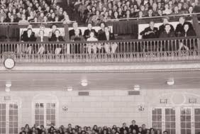
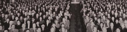
25 has an incredibly fl exible visual environment that has been created to maximize the impact of its current story while simultaneously acknowledging its rich past.

26 The Word of Life - Corporate Brand CORPORATE VISUAL CONCEPT Characteristics of the Corporate Visual Brand are as follows: A combination of irregularly sized rectangular cells contain combinations of textures, full color photos, text applied over solid color and headline applied over texture. Additionally, a vignette is applied to the whole composition. The logo should also be displayed over the solid color area where the body copy is displayed. Textures and photography can swap out with other textures and photography as it relates to the message of the promotion/communication. As a general rule: Photos that, in a dominant fashion, throw off the overall feel of the approved brand color palette (neutrals, blues and yellows) should be colorized using one of the approved colors. Certainly, with the Corporate Brand Visuals, the colorized photos would use the approved Primary Brand Colors. Word of Life Brand Guidelines 26


27 The Word of Life - Corporate Brand OVERALL VISUAL CONCEPT VARIATION It is best practice to design the compositions in a way that utilizes the standard cell size for at least 50% of the visual space. Standard cell The sizes and placement of cells can change: The visual intent is that the cells can change size and position for visual emphasis and adapt to support a variety of content volume. Word of Life Brand Guidelines 27
28 SUB-BRAND VISUALS Word of Life Brand Guidelines 28
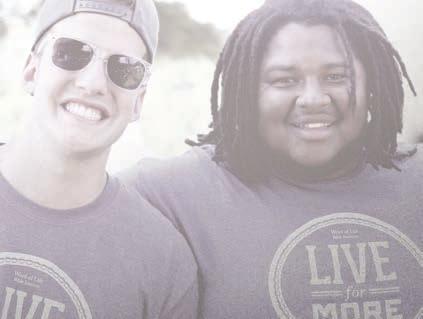
29 The Word of Life - Youth and Family Camps Visuals YOUTH AND FAMILY CAMPS SPECIFIC VISUAL ASSETS Logo: Typography: In addition to approved brand typography, Youth and Family Camps adds: Sub-Brand Promise: Launch Your Faith PHALANX ABCDEFGHIJKLM NOPQRSTUVWXYZ abcdefghijklmnopqrstuvwxyz Color: Youth and Family Camps promotion should use the approved Primary Brand Color palette unless the composition is tied to a specific camp brand (example: Snow Camp) that has its own color palette. In which case, that color palette should be used. If the composition is tied to a specific camp brand (example: Snow Camp) that has its own approved typefaces, they should be respected and used. Word of Life Brand Guidelines 29

30 The Word of Life - Youth and Family Camps Visuals YOUTH AND FAMILY CAMPS VISUAL CONCEPT Characteristics of the Youth and Family Camps Visual Brand are as follows: A combination of irregularly sized rectangular cells contain combinations of textures, full color camps-specific photos, text applied over solid color and headline applied over texture. Additionally, a vignette is applied to the whole composition. The logo should also be displayed over the solid color area where the body copy is displayed. Textures and photography can swap out with other textures and photography as it relates to the message of the promotion/communication. As a general rule: Photos that, in a dominant fashion, throw off the overall feel of the approved brand color palette (neutrals, blues and yellows) should be colorized using one of the approved colors. Certainly, with the Corporate Brand Visuals (or promoting Youth and Family Camps as a whole), the colorized photos would use the approved Primary Brand Colors. Word of Life Brand Guidelines 30
31 The Word of Life - Bible Institute Visuals BIBLE INSTITUTE SPECIFIC VISUAL ASSETS Logo: Typography: In addition to approved brand typography, Bible Institute uses as its primary typeface: Sub-Brand Promise: Deepen Your Faith Color: Bible Institute promotion should use the approved Primary Brand Color palette unless the composition is tied to a specific Bible Institute brand (example: Department of Music) that has its own color palette. In which case, that color palette should be used. HELVETICA CONDENSED MEDIUM ABCDEFGHIJKLM NOPQRSTUVWXYZ abcdefghijklmnopqrstuvwxyz HELVETICA THIN ABCDEFGHIJKLM NOPQRSTUVWXYZ abcdefghijklmnopqrstuvwxyz If the composition is tied to a specific Bible Institute brand (example: Department of Music) that has its own approved typefaces, they should be respected and used. Word of Life Brand Guidelines 31

32 The Word of Life - Bible Institute Visuals BIBLE INSTITUTE VISUAL CONCEPT Characteristics of the Bible Institute Visual Brand are as follows: A combination of irregularly sized rectangular cells contain combinations of textures, full color Bible institute-specific photos, text applied over solid color and headline applied over texture. Additionally, a vignette is applied to the whole composition. The logo should also be displayed over the solid color area where the body copy is displayed. Textures and photography can swap out with other textures and photography as it relates to the message of the promotion/communication. As a general rule: Photos that, in a dominant fashion, throw off the overall feel of the approved brand color palette (neutrals, blues and yellows) should be colorized using one of the approved colors. Certainly, with the Corporate Brand Visuals, (or promoting Bible Institute as a whole) the colorized photos would use the approved Primary Brand Colors. Word of Life Brand Guidelines 32
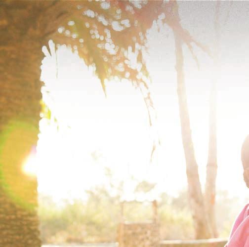
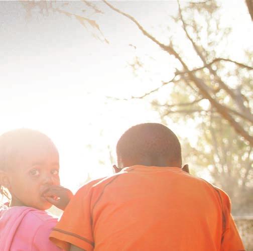
33 The Word of Life - International Ministries Visuals INTERNATIONAL MINISTRIES SPECIFIC VISUAL ASSETS Logo: Typography: In addition to approved brand typography, International Ministries adds: Sub-Brand Promise: Share Your Faith Color: International Ministries promotion should use the approved Primary Brand Color palette unless the composition is tied to a specific Ministry s brand (example: Haiti Mission Trip) that has its own color palette. In which case, that color palette should be used. HELVETICA THIN ABCDEFGHIJKLM NOPQRSTUVWXYZ abcdefghijklmnopqrstuvwxyz HELVETICA HEAVY ABCDEFGHIJKLM NOPQRSTUVWXYZ abcdefghijklmnopqrstuvwxyz If the composition is tied to a specific Ministry s brand (example: Haiti Mission Trip) that has its own approved typefaces, they should be respected and used. Word of Life Brand Guidelines 33
34 The Word of Life - International Ministries Visuals INTERNATIONAL MINISTRIES VISUAL CONCEPT Characteristics of the International Ministries Visual Brand are as follows: A combination of irregularly sized rectangular cells contain combinations of textures, full color International Ministries-specific photos, text applied over solid color and headline applied over texture. The logo should also be displayed over the solid color area where the body copy is displayed. Textures and photography can swap out with other textures and photography as it relates to the message of the promotion/communication. As a general rule: Photos that, in a dominant fashion, throw off the overall feel of the approved brand color palette (neutrals, blues and yellows) should be colorized using one of the approved colors. Certainly, with the Corporate Brand Visuals, (or promoting International Ministries as a whole) the colorized photos would use the approved Primary Brand Colors. Word of Life Brand Guidelines 34
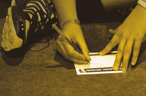
35 The Word of Life - Local Church Ministries Visuals LOCAL CHURCH MINISTRIES SPECIFIC VISUAL ASSETS Logo: Typography: In addition to approved brand typography, Local Church Ministries adds: Sub-Brand Promise: Grow Your Faith Color: Local Church Ministries promotion should use the approved Primary Brand Color palette unless the composition is tied to a specific Local Church Ministries brand (example: Super Bowl Event) that has its own color palette. In which case, that color palette should be used. HELVETICA BOLD ABCDEFGHIJKLM NOPQRSTUVWXYZ abcdefghijklmnopqrstuvwxyz HELVETICA CONDENSED LIGHT ABCDEFGHIJKLM NOPQRSTUVWXYZ abcdefghijklmnopqrstuvwxyz If the composition is tied to a specific Local Church Ministries brand (example: Super Bowl Event) that has its own approved typefaces, they should be respected and used. Word of Life Brand Guidelines 35

36 The Word of Life - Local Church Ministries Visuals LOCAL CHURCH MINISTRIES VISUAL CONCEPT Characteristics of the Local Church Ministries Visual Brand are as follows: A combination of irregularly sized rectangular cells contain combinations of textures, full color Local Church Ministries-specific photos, text applied over solid color and headline applied over texture. The logo should also be displayed over the solid color area where the body copy is displayed. Textures and photography can swap out with other textures and photography as it relates to the message of the promotion/communication. As a general rule: Photos that, in a dominant fashion, throw off the overall feel of the approved brand color palette (neutrals, blues and yellows) should be colorized using one of the approved colors. Certainly, with the Corporate Brand Visuals, (or promoting International Missions as a whole) the colorized photos would use the approved Primary Brand Colors. Word of Life Brand Guidelines 36


37 The Word of Life - Sub-Brands OVERALL VISUAL CONCEPT VARIATION It is best practice to design the compositions in a way that utilizes the standard cell size for at least 50% of the visual space. Standard cell The sizes and placement of cells can change: The visual intent is that the cells can change size and position for visual emphasis and adapt to support a variety of content volume. Word of Life Brand Guidelines 37
38 INTERNAL BRAND VISUALS Word of Life Brand Guidelines 38
. Layouts capitalize on tasteful use of negative space.")
39 The Word of Life - Internal Brand Visuals A very simple visual approach has been created to promote quick recognition of communication that is intended to be for internal audiences. Characteristics of the Internal Visual Brand are as follows: Large feilds of solid brand colors with simple text (Helvetica as primary typeface). Layouts capitalize on tasteful use of negative space. If available, Plans and Reports prepared, for Word of Life, by The A Group can be referrenced as a foundation for internal communication layout and design Word of Life Brand Guidelines 39


40 The Word of Life - Internal Brand Visuals 4/23/15 Currently, an exception to the overall internal brand visual consistency, would be Power Point templates. As these can be used for external purposes as well. Word of Life Brand Guidelines 40
41 GRAPHIC ELEMENTS AND PHOTOGRAPHY Word of Life Brand Guidelines 41
42 The Word of Life - Graphic Elements A number of graphic elements are used in concert with Word of Life photography to create the overall look for the brand. These currently include: The Word of Life accent Ribbon The Vignette The Digital Noise Color Gels The Textures We will explain these graphic elements in detail over the following pages. Word of Life Brand Guidelines 42
43 The Word of Life - Graphic Elements - Accent Ribbon The accent ribbon is a graphic element that can be used to call attention to a piece of text or another visual focal point. It also can be used to create a visual break between compact thoughts/sections/chapters. It is usually used on a very clean layout, and RARELY combined with the visual brand s photo collages. You can use any of the brand colors with the Accent Ribbon. If the Accent Ribbon is used at a size that is too small for text to be applied onto it, it should be used as a visual break device. Word of Life Brand Guidelines 43


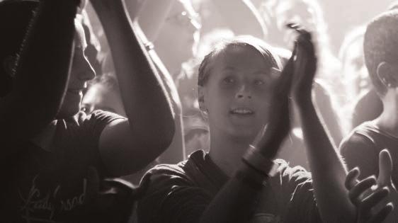
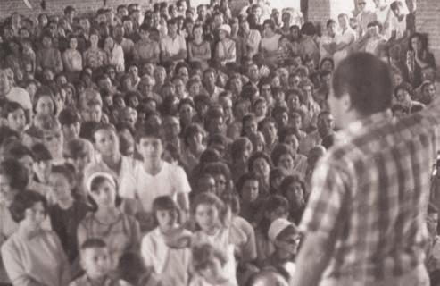
44 The Word of Life - Graphic Elements - Vignette Almost all Word of Life branded visual compositions will contain The Vignette. The Vignette brings a visual tone of richness, and contributes to the marriage of a complex visual palette. With the vignette Without the vignette Word of Life Brand Guidelines 44


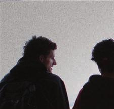
45 The Word of Life - Graphic Elements - Digital Noise When a number of photographs are used in a branded layout for Word of Life, a variety of Graphic Elements are used to create the rich complex visual combinations that have been presented before in these guidelines. The Digital Noise graphic element is used as a simple way to create variety among multiple full color images. It is typical for The Digital Noise Graphic Element to be applied over a full-color image using the Adobe Photoshop layer-style vivid light at an opacity of 24%. Digital Noise Without Digital Noise With Digital Noise Word of Life Brand Guidelines 45

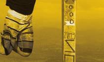
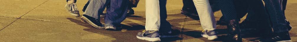
46 The Word of Life - Graphic Elements - Color Gels Some photography for Word of Life uses Color Gel overlays. More often than not these gels will be applied to photography using the Adobe Photoshop layer style Color with an opacity of 100%. Examples of the Color Gel s effect on photography are below, and then identified on a sample layout. Notice the Color Gels in use Word of Life Brand Guidelines 46


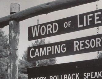
47 The Word of Life - Graphic Elements - Textures Textures are used in the Word of Life visual brand to separate sub-brand visuals from one another. Typically, they have a warm or cool neutral Color Gel applied to them. The textures are intended to relate, in some fashion, to the sub-brand. For example: Word of Life Youth and Family Camps = wood slats Word of Life International Ministries = thatched roof Word of Life Bible Institute = leather Word of Life Local Church Ministries = stone and grout Textures can be added for other parts of the brand, but should always be relative to their application in these previously exhibited ways. Typically, Textures will have a brand statement, or sub-brand statement applied over them to increase the functionality of the space. See these examples: Word of Life Brand Guidelines 47
48 The Word of Life - Photography Photography plays a central role in Word of Life s visual brand. The rich library of photography that Word of Life has preserved through the years is one of it s most powerful testaments to the dynamic experiences and deep legacy that the organization needs to portray. There are some common ways that we exhibit the great photography of Word of Life. These common practices include: Full Color applications Using Color Gels We will explain these photo applications in detail over the following pages. Word of Life Brand Guidelines 48


49 The Word of Life - Photography - Full color Photos Full color photos can be adjusted in a variety of ways. We want Word of Life s photography to stylisticly adapt to treatments and trends that are relevant over time. Here are a variety of ways that Word of Life currently adjusts their photos to creat a visually rich tone: Word of Life Brand Guidelines 49


50 The Word of Life - Photography - Color Gels Some photography for Word of Life uses Color Gel overlays. More often than not these gels will be applied to photography using the Adobe Photoshop layer style Color with an opacity of 100%. Examples of the Color Gel s effect on photography are below, and then identified on a sample layout. This info is the same as pg. 46 Notice the Color Gels in use Word of Life Brand Guidelines 50
51 THE WoL BRAND APPLIED Word of Life Brand Guidelines 51


52 The Word of Life - What the Brand looks like in Action The following is a gallery of successful applications of the Word of Life Visual Brand. Stationary Core Brand Promotional Collateral Word of Life Brand Guidelines 52
 Social Media")

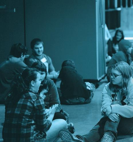
53 The Word of Life - What the Brand looks like in Action (continued) Social Media and Mobile Environmental Design and Trade Setup Word of Life Brand Guidelines 53
")

54 The Word of Life - What the Brand looks like in Action (continued) Callout Banners Branded Wearables Word of Life Brand Guidelines 54
")

55 The Word of Life - What the Brand looks like in Action (continued) Campus Branding Camps Sub-Branding Word of Life Brand Guidelines 55