Describe the impact that small numbers may have on data
|
|
|
- Marcus Shelton
- 5 years ago
- Views:
Transcription


1 1 Describe the impact that small numbers may have on data analysis and successfully identify small numbers in a data set Discuss the appropriate use of control charts, comparison charts, scatter plots and other graphics in the analysis of performance data Describe a rational process of data analysis for performance data 2 1
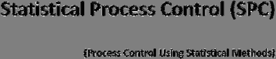
2 Background and theory Process control using statistical ttiti methods Graphing approaches Run charts Control charts Comparison charts Scatter plots, histograms, box plots Small numbers, outliers and power Practical considerations for proportion measures 3 Process capability Estimating upper and lower process capability limits it for continuous data Estimating the effect of common cause variation on continuous data A rational approach to data analysis Two Practical Exercises Control charts Small numbers, outlier identification and process capability 4 2
3 5 Major Premise: A duck is a bird that has webbed feet, a spoon shaped p bill and that quacks. Minor Premise: There is a bird that has webbed feet, a spoon shaped bill and it quacks. Conclusion: The bird I see is a duck. 6 3


4 Major Premise: The rate for measure A reflects the process that produced the data used to calculate the measure s rate. Minor Premise: Our hospital is dissatisfied with our rate for Measure A. Conclusion: Our hospital should be dissatisfied with the process for Measure A


5 9 Major Premise: Appropriate analysis must be used to evaluate performance effectively. Minor Premise: There is a chance that my hospital may not use appropriate analysis. Conclusion: There is a chance that my hospital might not evaluate performance effectively. 10 5


6
7 Based on concepts developed in the 1930s by Walter Shewhart at Western Electric (Bell Laboratories) Refined by W. Edwards Deming and Joseph Juran. Used extensively in industry and some areas within healthcare Clinical laboratory, radiology, nuclear medicine 13 Variation can be charted and control limits established Processes within control llimits it are under control and can be allowed to continue Processes outside control limits are out of statistical control and require adjustment Variation takes two forms Common cause variation Special cause variation 14 7
8 Eliminating special cause variation Eliminated by thoseoperatingtheoperating the system Operators study problem and identify source Equipment out of adjustment, deviation from policy, etc. Eliminating common cause variation Eliminated by those managing the system Workers constrained within the processes handed them by management Workers cannot independently d affect the common cause 15 Quality generally does not depend on individual motivation Quality depends d on more on~ Good system design Consistent long term direction Adequate training Leadership Ongoing evaluation and effective follow up 16 8


9


10 Advantages Easy to construct t Simple to use Don t require assumptions about data distribution Can identify shifts in the process, trends and data oscillations Disadvantage Cannot identify outliers Poor fit for continuous data measures
11 1 How many data runs are there? 2 How many useful data points are there? 3 Are there too many data points in any data run? 4 5 Is there a series of data points that steadily increase or decrease? Isthere a sequence of consecutive data points that alternate up and down?
12 What type of fd data? Continuous Data Discrete Data Individual values? Values averaged? Proportion? Ratio? I or XmR chart X-bar & s chart p-chart u-chart 23 From the Oracle of Gaither Know thy reason Reason 1: For statistical uniformity One rule Outliers or Reason 2: For performance improvement All rules Outliers, hf Shifts, Trends and Oscillations or Cyclical Patterns 24 12
13 Numerator is a distinct subset of the denominator Plots monthly p values Range between and Reported with 4 place decimal precision Graph of choice = p chart Numerator Denominator = p-value 25 The p chart used for all proportion measures Standard + 3 sigma control limits Varying control limits since subgroups vary from month to month Centerline = process average (mean for the period graphed) Monthly p-value p Chart Rules Tested Summary 1.0 UCL = CL = LCL (varies) B Data_Set_
14 No numerator or denominator Values arranged in time order sequence ence Reported with 2 place decimal precision Graphs of choice = XmR chart (I chart) (individual values) X bar and s chart (grouped values) (Arrival Time) - (Intervention Time) = Time to treatment (in Minutes) 27 The I Chart or XmR Chart Laparoscopic Cholecystectomy Two charts: Individual / Moving Range Chart Lower = mr Upper = X (individual or X values) Standard + 3 sigma control 40 limits 80 Centerline = process average 60 (mean for the period graphed) Examine lower chart tfirst! Lap_Chole_Surgery_Time Mo oving Range 0 Summary UCL CL LCL Summary UCL CL LCL Jul 25, :32:
15 X bar and s Chart Two charts: Lower = s (σ) Upper = X bar (average of X ) Standard + 3 sigma control limits Centerline = process average (mean for the period graphed) Surgery_Time Average Surgery Time Std. Dev X-bar / s Chart Examine lower chart first! Summary Summary UCL CL LCL UCL CL LCL Jul 26, :53: More rules = greater likelihood one or more will be broken. 2. Nelson s rules most commonly used in industry. 3. The Joint Commission i uses the following rules: a) Outliers b) Shift in the process c) Trends d) Data oscillations or cyclical patterns 30 15


16 Rule Outliers Shift in process Trend Oscillations Definition Any data point above +3 sigma Any data point below 3 sigma > 9 data points in a row above the CL > 9 data points in a row below the CL > 6 data points in a row, including end points, progressively increasing or decreasing > 14 data points in a row alternating up and down
17 The conjoined twin of the control chart Places facility in context with others % expected performance range [ whiskers ] Facility rate [ ] Comparison group mean [ ] Rate HF-2: LVF assessment Jul 02 Aug 02 Sep 02 Oct 02 Nov 02 Dec 02 Jan 03 Feb 03 May 03 Apr 03 Mar 03 Jun 03 Jul 03 Aug 03 Sep 03 Oct 03 Nov 03 Dec 03 Jan Used to chart relative frequency distributions ib ti for continuous data Height of bar equal to class frequency Curve and mean reference line are optional Frequency Mean Data_Set_
18 Summarizes data in terms of its various percentile values 1 st percentile is bottom of box 2 nd percentile (median) is at notch 3 rd percentile is top of box Outliers /extreme values above or bl below whiskers Monthly p-value Data_Set_1 35 Used for continuous data measures only Determines if data are normally or near normally distributed Do data points pass the fat pen test? Data sets failing fat pen test should betransformed Normal Probability Probability Plot Minutes 36 18
 A larger")


19 37 Analysis of data is affected by sample size (subgroup or denominator size) A larger subgroup = more robust analysis A larger subgroup = greater confidence in analysis There is a critical mass for analysis Descriptive and inferential statistics Statistical Process Control (SPC) 38 19
20 Subgroups (denominators) are algorithm defined, and therefore, limited You have to dance with what the algorithm brings you There is such a thing as small numbers Bad news: Small numbers complicate interpretation Good news: Small numbers can be identified rather than intuited 39 A statistic derived from the entire data set helps determine if any subgroup (denominator) lacks sufficientpower for Statistical Process Control analysis That statistic is called p bar Bar in statistics means average p bar is the average of the p values in the data set Numerator / Denominator = p value 40 20
21 When p bar is Each subgroup (denominator) must be greater than or equal to If not? < Small number = caution with analysis p bar > Small number = caution with analysis (1 p bar) 41 When p bar is Each subgroup (denominator) must be greater than or equal to If not? < Caution if that subgroup is an outlier! p bar > Caution if that subgroup is an outlier! (1 p bar) 42 21


22 N1 With insufficient power relative to: The options are: Small Numbers 1. Combine subgroups to eliminate the small number 2. Always interpret with caution! Outlier Values 1. Ignore that subgroup 2. Combine subgroups to eliminate the small number 3. Always interpret with caution!
23 Slide 43 N1 Well, for the 4/pbar rule you can ignore the subgroup. when you are dealing with the 1/pbar rule you cannot really do a control chart but need to aggregate up to quarterly or monthly nmatthes, 8/26/2008


24
25 For continuous data: Statistical ti ti theory allows you to: Estimate the Upper Limit of process capability Estimate the Lower Limit of process capability Determine the maximum difference between two consecutive values that can be attributed solely to common cause variation 47 A statistic derived from the data set helps determine estimates of process capability That statistic is the Median Moving Range (MMR) To determine Median Moving Range (MMR): Arrange continuous data in time order Determine the moving ranges for the data Always one fewer Moving Range than the total number of data points Calculate the Median for the Moving Range (or MMR) 48 24
26 Determining the Dead Band on either side of the Process Mean (MMR x 3.14) + Process Mean = Upper Limit Estimate for process capability (MMR x 3.14) Process Mean = Lower Limit Estimate for process capability 49 (MMR) x = The maximum difference between two consecutive values that can be attributed solely to common cause variation 50 25


27 Upper limit estimate of process capability: 315 min Lower limit it estimate t of process capability: 1 min Max difference due to common cause variation: 218 min 3 cases in dataset > 1,500 minutes!


28 Structuring your analysis Verify data dt accuracy and completeness lt Use a Proportion Measure Screening Tool Identify denominators that are small numbers Identify denominators that lack sufficient power to interpret outliers Construct and interpret a control chart Correlate chartinterpretation withthescreening the Tool Construct and interpret a comparison chart


29 55 HF-1: Discharge instructions Rate Feb 08 Dec 07 Oct 07 Aug 07 Jun 07 Apr 07 Feb 07 Dec 06 Oct 06 Aug 06 Jun 06 Apr 06 Feb 06 Dec 05 Oct 05 Aug 05 Jun 05 Apr 05 Feb


30 Structuring your analysis Verify data dt accuracy and completeness lt Create a Probability Plot Transform data if it fails the fat pen test Create a control chart Create a comparison chart Create additional charts Box plot and/or histogram Estimate process capability

31 PN-5: Antibiotic timing Minutes Apr 05 Mar 05 Feb 05 Jan 05 Aug 05 Jul 05 Jun 05 May 05 Dec 05 Nov 05 Oct 05 Sep 05 Jun 06 May 06 Apr 06 Mar 06 Feb 06 Jan 06 Dec 06 Nov 06 Oct
32 Mean Monthly p-value Frequency Data_Set_ Data_Set_


33 63 A voice crying in the wilderness? 64 32
34 Be honest with yourself about demands in today s performance improvement activities Have realistic expectations for yourself, your staff and facility Have empirical knowledge of resources needed to fulfill your role Be forthright with superiors and colleagues If you can t stand the heat, you need to get out of the kitchen! 65 Become comfortable in your role as expert Blanche Dubois was right ihtabout t illusion i Don t apologize for the data Don t apologize for using new approaches or tools Statistical Process Control (SPC) Process Control Using Statistical Methods Graphing tools Comparison charts, box plots, histograms andprobability plots 66 33
35 Be certain data are accurate There is no substitute t for accuracy and completeness Avoid spin Avoid value qualifiers like right, wrong, good or bad The data are simply what they are It s OK not to like what you see 67 Understand what you present Command of data dt elements, definitions dfiiti and exclusions Know how the algorithm works Become comfortable with: The statistics you report The graphs you report 68 34
36 Integrate data with practice and the real world Each hcase ID that t produces data has a name and mailing address! Focus on process not on persons Understand the processes of care that produce the data Data without context is worthless Offer solutions, not just bad news 69 KISS (Keep It Simple Stupid) Consistency is better btt than novelty Avoid audience/data mismatch The audience changes not the data or message Beware of numbers narcosis Pictures are easier to assimilate than tables of numbers Choose the right picture for the data 70 35


37 71 36