QuickBooks Online Edition. Usability Test Results. April 2007
|
|
|
- Peregrine Robinson
- 5 years ago
- Views:
Transcription
1 QuickBooks Online Edition Pay Liabilities Workflow Usability Test Results April 2007
2 Study goals Determine which of two Setup Liabilities flows is preferred by existing QBOE users Gather the 2nd round of feedback on the Payroll Liabilities flow Gather 1 st round of feedback about the combined file and pay flow
3 Methodology April 4 & 5, 2007 Six 60 minute sessions One- on- one in person sessions at Intuit User Research Labs Each participant used interactive prototypes for the Setup, Pay Liabilities and File & Pay Together workflows Order of Setup prototypes varied across subjects
4 Participants Name Current QB Version Current Payroll Number of Employees Dan QBOE QBOE 1 Bill QBOE QBOE 10 Minda QBOE Checkmate (used Peachtree before) 6 Chris QBOE QBOE 5 Jeff QBOE Paycycle 4 David QBOE QBOE 3
5 ACE Organization Accuracy ("It is right") Task successes Top errors Confidence ("I believe it was done right") Expressions of satisfaction Statements of what it would take to improve this Ease ("It was quick and easy to do") Efficiency and simplicity of completing the correct workflow How much hunting occurred, where people tended d to go first, common alternate paths or unnecessary steps
6 Payment Setup Flow Findings & Recommendations
7 Overall Findings Successes Participants chose their preferred flow based on their experience level, which will help us choose a direction to move forward with. Participants all found of the existing help links useful in complicated areas (e.g., payment frequency). The mechanism for changing payment frequency and payment method was clear. Challenges Some participants have low confidence levels about setting up payments because they re inexperienced. Participants wanted more help to explain what each payment group is. Editing and organizing payment groups was confusing.
8 ACE: Findings Accuracy ("It is right") Accuracy was difficult to gauge because people did not have access to help and did not have to choose the correct frequency and payment method However, accuracy issues that were observed or reported are noted in discussion of findings Confidence ("I believe it was done right") Gathered confidence rating (1-7) for each flow directly after use Average confidence ratings were to for both flows To do better: Move forward with flow A (one at a time), recommend frequency when possible, include help about what each payment group is Confidence level is moderate, with subjects stating that their confidence is not 7 because of their inexperience. Inexperienced people would typically have their bookkeeper or accountant complete this setup (then their confidence would be 7). Ease ("It was quick and easy to do") Gathered a single ease rating (1-7) at session end Average ease rating of 6.8, very easy to use The disparity between the ease of use and confidence ratings reflects that users knew how make changes, but they didn t know for sure what each payment group is and what settings to choose (e.g., payment frequency).
9 Tax Payment Schedules Overview Both flows started with this Task List page


10 Tax Payment Schedules Overview: Findings & Recommendations Most people said they wouldn t read this info. They may come back to it if they run into problems. People said the second section on info they need to have on hand is useful, but that it didn t stand out enough. Recommendation: Make the header bold. Consider moving this above the first section and/or scaling back the content in the first section. People knew what the term payment frequency is.
11 Flows: Description of flows Flow A (One at a time) Pop- ups for setting up each payment Summary at the beginning and end of setting up the payments Flow B (All in one) Presents all payments on one page All set up is done on one page
12 Flows Overall Preference: Findings & Recs. Subject 1st choice 2 nd choice 1 B A 2 A B 3 A B 4 B A 5 B A 6 A B 3/6 participants preferred A (One at a time) because setting up each payment step by step with more info is easier and because they won t get lost if they get distracted. They also felt it was more consistent with the rest of Setup. 3/6 participants preferred B (All in one) because it was faster and has less redundant information Participants that preferred A tended to be less experienced than participants that preferred B. Separation of payments made 1 participant feel much more confident. [B] was too much information. Recommendation: Move forward with Flow A (One at a time) for setup because we are targeting g new users. We can consider using Flow B for maintenance. Refine designs based on detailed user test findings.
13 Flow A (One at a time): List of Payments Flow A starts with a list of the tax payment groups.

14 List of Payments: Findings & Recommendations People understand what the columns are showing. People prefer the full payment names, without acronyms. 1 person suggested adding Help information about what each Payment Group is. (e.g., What is CA Personal Income Tax and Disability?) Recommendation: Consider question mark icons or tooltips.


15 Set Up Payment Setup Payment dialogs walk the user through setting up one payment at a time.


16 Set Up Payment: Findings & Recommendations 1 People that preferred flow A liked that this screen explains more about the payment and felt less cluttered than flow B. Those that preferred flow B felt that this flow has too many steps, though. People really liked the green Help links. Everyone noticed them and found them useful. Some people p would contact their bookkeeper or accountant at this point to get this information, especially the Payment Frequency, or else have the bookkeeper or accountant do the setup for them. Everyone was able to change the Payment Frequency and switch between Check and E- pay successfully.
17 Set Up Payment: Findings & Recommendations 2 1 person doesn t want to see Payment Frequencies that aren t allowed. For example, if a payment can only be paid Monthly or Quarterly then don t include Annually. Recommendation: Intelligently show payment frequencies that are allowed. Some people would like for the system to recommend the correct frequency. If the system can t recommend a frequency, then they d like to go through an interview to determine the correct frequency. If nothing else, they d look at Help to figure out the correct frequency. Recommendation: Recommend a frequency, when possible. When it isn t possible, give the user the option to walk through an interview to figure out the correct frequency. 1 person said that Semi- weekly is confusing. He thinks semi- and bi- frequencies are confusing. Recommendation: Update the wording to Two times/month.
18 Set Up Payment: Findings & Recommendations 3 People liked seeing the Next Payment will be due. 1 person suggested showing when the next payment(s) are due on a calendar. Recommendation: Explore showing the next payment circled on a calendar or have a link to a calendar if it doesn t make the screen too cluttered. No one wanted the Combining Payments checkbox to be checked by default. Most people would not Combine Payments because they prefer to keep the payments separate for tracking and follow up if there any issues with the agency. An earlier version of this screen allowed people to edit the payment group. People found that very confusing, so we removed it after the 1 st day of testing.
19 Set Up Payments Summary Summary screen shows the frequency and payment method for each payment group.


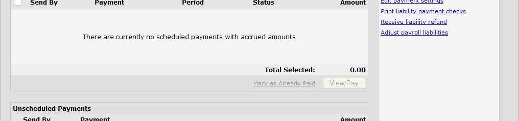
20 Set Up Payments Summary: Findings & Recommendations 2 people expected an Edit button at the end of the line or next to the Payment Group name, instead of the link to edit. They did not like the Click to Edit info text. Recommendation: Add an Edit button as suggested or use Editing scheme with button at the bottom of the table used elsewhere in Setup.
21 Flow B (All at once) Screen allows users to edit the payee, payment frequency and payment method for all payments all on one page.


22 Flow B (All at once): Findings & Recommendations 1 3 people (people that preferred flow A) were confused by this screen. Too much information on one screen. Felt more confident filling out payments one at a time. If they get a phone call (lose their focus), they d lose track of what they have and haven t set up. They d have to start over again. People that preferred flow B like that it is all on one screen it s clean, organized and takes fewer steps. They can compare across payments.
23 Flow B (All at once): Findings & Recommendations 2 An earlier version of this screen allowed people to Organize the payment groups. People found that very confusing, so we removed it after the 1 st day of testing. People had many reactions that were similar to flow A s findings (for example, they all noticed and liked the help links, but also want to see help info about each payment group). Recommendation: Make recommended changes from flow A that are applicable to flow B.
24 Pay Liabilities Screens Findings & Recommendations
25 Overall Findings Successes Overall, we re really on track. Resolved almost all issues from Test 1. Confidence and ease of use ratings were high, and observed accuracy was high. Have a clear understanding of when people expect payments to be in the register. Challenges Unscheduled payments functionality caused confusion. Hand writing checks use case caused confusion around printing checks. Online bill pay and other payment methods other than e- payments and checks need to be considered.
26 ACE: Findings Accuracy ("It is right") Observed and reported accuracy was high, with any notable exceptions noted in discussion of findings Confidence ("I believe it was done right") Gathered confidence rating (1-7) at end of task 2 Average confidence rating was 6.4 To do better: Handle hand writing checks and online bill pay better, clarify Unscheduled Payments Confidence in system is high (often 7), with subjects stating that their inexperience is primarily what can be improved Ease ("It was quick and easy to do") Gathered a single ease rating (1-7) at end of task 2 Average ease rating of 6, generally easy to use This is as easy as when my bookkeeper does it. Improvement from previous test, up from rating of 5.3 To do better: Improve non- printed checks use case, would happen naturally with ongoing use


27 Liability Payments Center Liability Payments Center shows scheduled, unscheduled and recent payments and allows users to make payments.


28 Liability Payments Center: Findings & Recommendations 1 Overall, all subjects liked the screen and were easily able to pay payments 4 people confused about the Unscheduled area. Some thought it includes only non- tax liabilities and some thought the system was detecting past payments and automatically including past agencies here. Recommendation: See if this is still an issue when users go though the full setup flow, including setting up non- tax liabilities. Consider a different label or help topic if it remains a problem. 1 person suggested renaming Scheduled Payments to To Do. Recommendation: Consider changing the name especially if we re changing Unscheduled Payments, also. Brainstorm ideas for this area as a team.
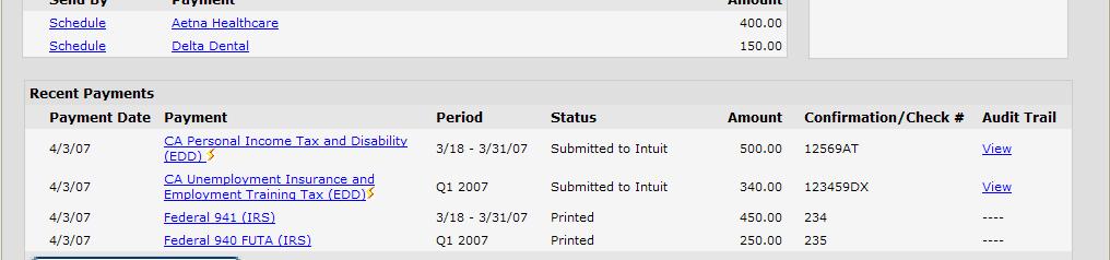
29 Liability Payments Center: Findings & Recommendations 2 Mark As Already Paid was much clearer to users than Mark As Paid was in usability test round 1. Some expected it to be a button. Recommendation: Keep the label as is, but switch it to a button. 1 person asked about the due date and suggested adding a Late By or No Later Than date column Recommendation: Include a help topic on how the Send By date is calculated. More successes: People understood the Send By label and the Status states. The Payment and Amount links behave as people expected. People preferred longer payment names without acronyms. Users were able to successfully find More Payment History. Other changes from the first round, such as changing the column order and adding e- payment icons, were all successful.


30 Review Payments Review Payments shows the details for all of the selected payments.


31 Review Payments: Findings & Recommendations 1 Most people easily saw that all of the payments are on the screen. People found the summary info per payment and the overall summary at the top useful. None of the users expected the payments to be in the register at this point.
32 Review Payments: Findings & Recommendations 2 1 person doesn t expect the amount on the check to be editable. Recommendation: Review how this function works elsewhere in QBOE to insure that editing make sense on this page. 2 people asked to see a more detailed breakdown of the Amount. Recommendation: Include a link to see the detailed breakdown of the Amount. Successes: People were able to find and use the Penalties and Other Fees tab successfully. People were able to change the Withdraw On Date successfully. People liked the Make Payments label and did not prefer Next or Continue.


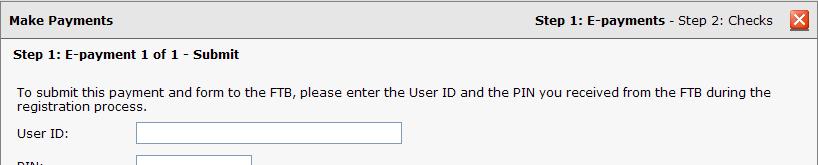
33 Make Payments: E-Payment Screens Step 1: E- Payment screens include Login and Confirmation Step 1: E Payment screens include Login and Confirmation. They allow the user to submit an e- payment and see the payment confirmation.

34 E-Payment Screens: Findings & Recommendations People liked that the Make Payments screens are in a pop- up because the pop- ups overlay the Review screen (screen with the check images). People would drag the pop- up around to refer back to the info below as needed. Login Users expected e- payments to be in the register after Submit, but not after Skip. 1 person would never save his login info. Recommendation: Make the checkbox setting sticky. 1 person expects to see the bank account info here. Recommendation: Include the bank account.

35 E-Payment Screens: Findings & Recommendations Confirmation 1 person disliked Important! You are not finished. because not finished implies he has something to do. He suggested Payment in process. Notification will be sent when payment complete. Recommendation: Clarify the wording. 1 person said Important! didn t stand out and suggested coloring the bar. Recommendation: In visual design, color the bar. 1 person would like to see which bank account the payment was from and their bank account balance after the payment. Recommendation: Consider showing that info.
36 Make Payments: Check Payments Step 2: Check Payments allows users to save their check payments and print their checks, if they want to.

37 Check Payments: Findings & Recommendations Some people that hand write checks or use online bill pay and never print checks were confused by the wording Save and Don t Print. Recommendations: Review the flow considering the hand writing checks and bill pay use cases. What happens when someone never prints a check? Consider adding a third payment option in Review Payments for people that don t pay by e- payment or check Other Payment or Online Bill Pay, Credit Card and Other. 1 person did not want a check number if he chooses not to print that check. If he isn t printing the check right away, he doesn t know what the check number will be. Recommendation: Consider leaving the Check Number blank if the user unchecks the To Print checkbox.
38 Check Payments: Findings & Recommendations Some people commented that if they weren t printing they d click Save & Don t Print versus unchecking the To Print checkboxes. People expected the checks to be in the register after they click Save. 1 person wants to see more info here about whether or not the payment is 1 person wants to see more info here about whether or not the payment is on time - Send By date or Status. Recommendation: Consider adding that info.


39 Summary & Ending Payment Center
. 1 person was confused by the Submitted to Intuit status.")

40 Summary & Ending Payment Center: Findings & Recommendations Summary People liked the information on this screen and the changes since Test 1 (more info in columns, column order, etc.). 1 person was confused by the Submitted to Intuit status. Recommendation: Consider clarifying this in the What s Next wording below. People had the same comments about the Important! You are not finished. wording and visual design as before. Recommendation: Make the same changes here. People liked the Done button label. Ending Payment Center There were no issues with this screen.
41 File & Pay Together Screens Findings & Recommendations
42 Overall Findings Successes Overall, file & pay together did very well. Confidence and ease of use ratings were high, and observed accuracy was high. Most of the screens were very clear to people. Challenges People want more information about file & pay together at the beginning of the process. How to show Form information on the Summary screen.
43 ACE: Findings Accuracy ("It is right") Observed and reported accuracy was high, with any notable exceptions noted in discussion of findings Confidence ("I believe it was done right") Gathered confidence rating (1-7) at end of task 3 Average confidence rating was 5.8 To do better: Provide more info about the process upfront Confidence in system is high (often 6 or 7), with subjects stating that their inexperience is primarily what can be improved Ease ("It was quick and easy to do") Ease ("It was quick and easy to do") Gathered a single ease rating (1-7) at end of task 3 Average ease rating of 6.8, very easy to use To do better: Would happen naturally with ongoing use


44 Form Interview screen Form Interview screen includes an introduction and the interview for filling out the form that goes with the e- payment.
. Recommendation: Consider adding more info to this screen.")

45 Form Interview screen: Findings & Recommendations Some people expected to see more information on this screen about the file & pay together process. They also said that they d probably learn more about this in Setup or if they lived in a state that had file & pay together (like Florida). Recommendation: Consider adding more info to this screen. If it gets too busy, split it into two steps. Or show an intro screen the first time the user files & pays together which introduces the concept. 1 person expected the interview fields to be intelligently pre- populated with information. For example, if the form is late insert the penalty amount automatically. Also didn t expect to see the question if it doesn t apply if the form isn t late, don t includethe question in the interview. Recommendation: Pre- fill fields when possible. Consider removing fields that don t apply.


46 Review, Submit & Confirmation Screens


47 Review, Submit & Confirmation screens: Findings & Recs Review People liked seeing a PDF of their form. 1 person expected the PDF form to be editable, but that isn t possible. Submit People thought this screen was clear. Confirmation There were no new issues with this screen. People had the same comments that they had in the Pay Liabilities flow.
48 Summary Screen Summary screen shows information about the forms and payments that were submitted, saved and printed.

49 Summary Screen: Findings & Recommendations People saw all of the info they expected to see here. Everyone noticed the form. Some people had questions about whether or not it needs its own line in the Summary table. Recommendation: Consider adding the Form link the e- payment row - to the Audit Trail or Confirmation column or to a new Form column. Review pros and cons of each option.