Brand, Messaging & Styles Guide
|
|
|
- Bryan Ford
- 5 years ago
- Views:
Transcription

1 Brand, Messaging & Styles Guide

2 2
3 Table of Contents Who We Are... Respecting the Brand The Power of Consistency Your Ambassadorship Engineering the Brand... The Brand Mark The Rationale The Tag line Logo Variations... Clear Space Guidelines... Logo Application... How Not to Use Color Palette Typography Imagery Brand Elements
4 Who We Are Respecting the Brand: Through conscientious contemplation, in-depth discussions and painstaking hard work, we found the root of what makes us who we are. And now we want to share that with you. No matter where you are in the world, we should all be on the same page in telling the TAO story. This book will help you differentiate between those times so we always tell the most appropriate story. That s the aim of these guidelines. This book was created to help you understand the thinking behind, and the use of, the TAO brand, its messaging and its visual identity. Think of it as the foundation on which you are building something BIG. What may seem like a bunch of rules and regulations on usage and style are really opportunities for every one of us to share the same story no matter where we are, what we do or whom we are speaking to. Great brands tell great stories. This book helps you tell the TAO story. The Power of Consistency: When a partner, customer or prospect sees the TAO brand and hears our consistent message, it reinforces our unique selling points in their minds. This begins the journey of brand recall. Brand recall is a psychological experience in which the more times a customer sees and hears the same communication, the more familiar they become with who we are, and therefore they learn to put their trust in us. And we all know people tend to do business with people and companies they trust. Delivering a consistent visual identity and message not only gives our audience, our partners and customers something nice to look at and to read, but it affects how they feel about us. It expands on our promise to be trusted advisors, it emphasizes our ability to deliver results and be responsible for what we do and say, and it encourages our partners to want to do business with us. 4
5 Who We Are No matter the business, we are still humans in a relationship with other humans and how we make them feel matters. If we re not all on the same page when it comes to the TAO brand, then we are nowhere. Consistency: Helps us manage perceptions Connotes our professionalism, purpose and stability Conveys our personality and attitude Eliminates brand confusion Instills confidence Protects our investment Builds on previous successes Your Ambassadorship: Each of us is responsible to be brand ambassadors. It s a big responsibility. This book isn t here to tell you what to do. It s here to empower you as a brand ambassador. The consistency of our brand depends on you. Each of us plays a big role in successfully representing our company and brand. This is your chance to embrace the powerful changes within our company and be confident in striving for greater consistency in who we are, what we do and how we are represented, while maintaining the flexibility that allows us to respond to the needs of our business partners. Don t let the daunting assumption of change and learning something new hinder your opportunities. If you use this guide, your job will be made 100 times easier. No more wondering which colors, logo, words or tone to use. No more random decisions about elements or messaging. No need to worry about the minute details it s all spelled out for you in these pages. As a creative professional and marketing guru, you can spend your valuable time focused on what you do best advocating and evangelizing the power of TAO to help our partners achieve greater levels of success. Following this guide enables you to write eloquent and provocative messages, create impelling visuals, and to meet your ultimate goal of effective marketing. 5


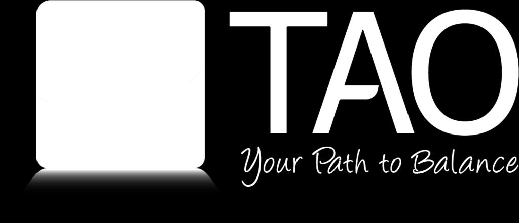
6 Engineering the Brand The Brand Mark: The Rationale: The brand mark is made up of a blue rounded square. The rounded square is typical of most application icons and suggest the platform is made for mobile application. The rounded corners are not only easier for our eyes to process, but they also make information within the shape easier to process. Rounded corners make effective content containers because they put focus inside the shape, unlike sharp corners. We tend to avoid sharp edges because in nature, they can present a threat. This provokes what neuroscience calls an avoidance response. The rounded corners and shadowing add depth and a bit of physical realism. The lotus flower was chosen as the iconography because it has many positive associations across different cultures. The lotus flower is often observed in nature emerging from a murky pond. The flower always looks clean and pure amongst the dirty water surrounding it. Therefore many cultures use the lotus flower as symbolism for rebirth, re-emergence and enlightenment. The lotus flower used in the design is made up of five overlaying petals representing five different attributes of the TAO Connect brand: Engagement, Assessment, Client Education, Accountability and Balance. These collective attributes working in tandem are the brands main differentiator from any other platform existing in the market. The Tag line: Your Path to Balance 6 The tagline is representative to the TAO journey. The guided journey is designed to assist users from negative feelings of instability to discovering positive feelings of balance and well-being.
: Vertical Logos (monochromatic): Horizontal Logos")
7 Logo Variations Vertical Logos (full color): Horizontal Logos (full color): Vertical Logos (monochromatic): Horizontal Logos (monochromatic): 7


8 Clear Space Guidelines Clear Space: Whenever you use the logo, it should be surrounded by clear space to ensure its visibility and impact. No graphic elements of any kind should invade this clear space zone. The clear space zone will always be relative to the size of the logo itself. The guides are lined up to the height of the lotus flower used in the brand mark. The height of the lotus flower is the clear space guide used on all four sides of the logo. The other variations of the logo with require the same clear space based on the relative size of the lotus flower. 8


9 Logo Application How Not To Use (applies to vertical and horizontal placements): 1. Do not change the color of the text. Logos featuring the tagline must use the purple from the palette for the text. 2. Do not combine the variations of the logo. 3. Do not alter or remove shading elements from the brand mark. 4. Do not remove the reflection in front of the brand mark. 5. Do not stretch elements in any direction. 9
10 Color Palette CMYK: 53, 0, 1, 0 CMYK: 66, 2, 0, 0 CMYK: 76, 25, 0, 0 CMYK: 99, 87, 3, 0 RGB: 101, 205, 243 RGB: 34, 192, 241 RGB: 0, 154, 217 RGB: 33, 64, 154 HEX: #65cdf3 HEX: #22c0f1 HEX: #009ad9 HEX: #21409a PAN: 297 C PAN: 298 C PAN: 2925 C PAN: 661 C CMYK: 9, 0, 16, 0 CMYK: 20, 1, 34, 0 CMYK: 26, 0, 42, 0 CMYK: 31, 0, 48, 0 CMYK: 40, 1, 58, 0 CMYK: 59, 5, 77, 0 RGB: 231, 243, 220 RGB: 206, 229, 185 RGB: 193, 223, 168 RGB: 180, 218, 159 RGB: 159, 206, 141 RGB: 115, 184, 106 HEX: #e7f3dc HEX: #cee5b9 HEX: #c1dfa8 HEX: #b4da9f HEX: #9fce8d HEX: #73b86a PAN: 7485 C PAN: 580 C PAN: 578 C PAN: 578 C PAN: 358 C PAN: 7489 C 10
11 Typography Corporate Typefaces: Typography plays an important role in the overall tone and quality of communications, reinforcing our personality and ensuring clarity and harmony. The corporate typeface is DIN - Light, Alternative and Condensed. It is the primary typeface used throughout TAO branded collateral. This typeface was chosen because of it s clean, modern and simple look. Utilize all three variations to help visually establish hierarchy. The secondary typeface used in the logo s tag line is Angelina, however we use this sparingly (tagline and quotations only), since there is only one weight in it s font family. The web-safe font available is Arial. It was chosen for it s clean and simple look, as well as, its wide availability across different platforms and softwares. DIN Light ABCDEFGHIJKLMNOPQRSTUVWXYZ abcdefghijklmnopqrstuvwxyz DIN Alternate ABCDEFGHIJKLMNOPQRSTUVWXYZ abcdefghijklmnopqrstuvwxyz DIN Condensed ABCDEFGHIJKLMNOPQRSTUVWXYZ abcdefghijklmnopqrstuvwxyz Angelina ABCDEFGHIJKLMNOPQRSTUVWXYZ abcdefghijklmnopqrstuvwxyz Arial - All Weights ABCDEFGHIJKLMNOPQRSTUVWXYZ abcdefghijklmnopqrstuvwxyz


12 Imagery Types of Images: Marketing is all about communicating your value to the customer. The right styling and consistent imagery can help not only convey quality, but also to help successfully tell the company story and create alignment across the brand. TAO wants to communicate a warm, humanized brand that is approachable and relatable to it s market. Using lifestyle images with subjects engaged online help the viewer relate on a human level. 12


13 Brand Elements How To Use the TAO Background The following assets are available to use when designing layouts. All elements used must utilize one of the color hues in the color palette as an overlay. Here are four example variations of the TAO background. It can be either used as full bleed background or as a treatment to an image background. See poster and banner examples below: 13
14 TAO Connect (844)