A NOTE ON BRAND GUIDELINES
|
|
|
- Tamsyn Caldwell
- 5 years ago
- Views:
Transcription
1 BRAND GUIDELINES

2 A NOTE ON BRAND GUIDELINES This brand book should serve as a guide for how to properly use the VIVO logo and voice in your internal collateral and public campaigns. They cover all elements needed to produce elements consistent with the VIVO brand, and when used properly, maintian a unified face across all of our campaigns. Please refer to this when developing any internal or external communications for VIVO Realty. BRAND GUIDELINES 1
3 A NOTE ON VIVO REALTY VIVO means living in Latin. We are named VIVO because of our passion for living, real estate and helping people live better lives. CORE VALUES 1. Exceed expectations 2. Grow through education and be different 3. Be brutally honest and communicate effectively 4. Create a healthy work-life balance and have fun 5. Work as a team and have a family spirit BRAND GUIDELINES 2


4 LOGO DO S AND DON TS DO x x/8 Blue indicates Clear Space. The blue area must be kept free of other elements. Grey padding indicates Safe Zone. Magenta indicates type and element alignment and boundaries. The minimum required Clear Space is defined by one quarter the width of the logo(x) The logo can be used in three ways: 1. On a white background 2. On a VIVO Dark Grey background 3. On a simple, uncluttered image space Maintain a Minimum Size of.5 x.5 DON T Don t stretch or distort Don t change fonts/colors Don t use the logo on a solid colored background Don t use the logo on a cluttered photo background BRAND GUIDELINES 3
5 PRIMARY PALETTE VIVO Leaf Green VIVO Leaf Green VIVO Grey C 30 M 0 Y 100 K 0 R 190 G 214 B 48 PANTONE 382C C 10 M 0 Y 35 K 0 R 231 G 238 B 183 PANTONE 372C Set at 50% on white C 0 M 0 Y 0 K 35 R 177 G 179 B 181 PANTONE Black 4C SECONDARY PALETTE VIVO Buttercup C 3 M 13 Y 82 K 0 R 248 G 212 B 75 PANTONE 128C VIVO Powder Blue C 20 M 7 Y 5 K 0 R 199 G 218 B 231 PANTONE 545C VIVO Dark Grey C 0 M 0 Y 0 K 90 R 218 G 216 B 214 PANTONE Black 2C BRAND GUIDELINES 4
6 PRINT TYPOGRAPHY - HEADLINE This will be used in all instances except for LIVE web fonts. DIN Condensed Bold Aa ABCDEFGHIJKLMNOPQRSTUVWXYZ abcdefghijklmnopqrstuvwxyz PRINT TYPOGRAPHY - BODY Brandon Grotesque Light Aa ABCDEFGHIJKLMNOPQRSTUVWXYZ abcdefghijklmnopqrstuvwxyz Brandon Grotesque Bold Aa ABCDEFGHIJKLMNOPQRSTUVWXYZ abcdefghijklmnopqrstuvwxyz EXAMPLE OF PRINT COPY IN USE VIVO BUYERS GUIDE So first of all, congratulations for deciding to be a part of the dream of home ownership. There is truly nothing like owning your own home. Whether you re a first-time home buyer or looking for a second home VIVO will make the experience as simple as possible. Below is a quick buyer s guide to purchasing a home. Please feel free to reference back to these steps to get yourself comfortable with the buy process. 1. Pre-Approval The critical first step to buying a home is to meet with a qualified home lender and have them prepare a mortgage pre-approval. A pre-approval involves submitting an application and receiving an approval for a mortgage prior to selecting a home for purchase. Once you have it, you re on your way to becoming a home owner! BRAND GUIDELINES 5
7 WEB TYPOGRAPHY - HEADLINE This is to be used in cases where you need LIVE web fonts, such as website copy. Images such as banner ads and facebook posts containing copy should use the print fonts as they are uploaded as a flat image. Oswald Bold Aa ABCDEFGHIJKLMNOPQRSTUVWXYZ abcdefghijklmnopqrstuvwxyz WEB TYPOGRAPHY - BODY Arial Regular Aa ABCDEFGHIJKLMNOPQRSTUVWXYZ abcdefghijklmnopqrstuvwxyz Arial Bold Aa ABCDEFGHIJKLMNOPQRSTUVWXYZ abcdefghijklmnopqrstuvwxyz EXAMPLE OF WEB COPY IN USE VIVO BUYERS GUIDE So first of all, congratulations for deciding to be a part of the dream of home ownership. There is truly nothing like owning your own home. Whether you re a first-time home buyer or looking for a second home VIVO will make the experience as simple as possible. Below is a quick buyer s guide to purchasing a home. Please feel free to reference back to these steps to get yourself comfortable with the buy process. 1. Pre-Approval The critical first step to buying a home is to meet with a qualified home lender and have them prepare a mortgage pre-approval. A pre-approval involves submitting an application and receiving an approval for a mortgage prior to selecting a home for purchase. Once you have it, you re on your way to becoming a home owner! BRAND GUIDELINES 6
8 IMAGERY - ICONOGRAPHY All icons should be minimal in style and reflect the simplicity of the VIVO leaf. Icons should always be used as a secondary element to reference a category or call out a service. Icons may never be used as the central graphical element in a campaign. Suggested icon use: Headers and category callouts, minimal use in listings, service offerings, division of sections in collateral. OUTLINED Primarily used in print SOLID Primarily used in digital BRAND GUIDELINES 7
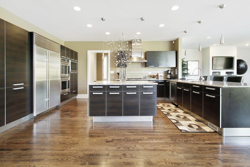
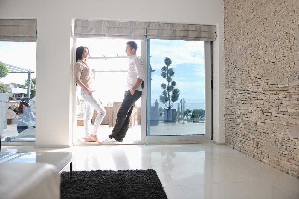
9 IMAGERY - PHOTOGRAPHY Our imagery is: Slightly undersaturated yet bright, and natural Capturing a moment in time where the subject is unaware of the photographer Aspirational but not pretentious Modern and youthful but not childish Unique and personal Friendly and casual Showing appealing and attractive home environments Selling a lifestyle Focused on the people rather than the place Our imagery evokes a feeling of home. BRAND GUIDELINES 8


10 BRAND GUIDELINES 9
11 ADDITIONAL ELEMENTS Our tagline: WHERE YOU VIVO WHERE YOU VIVO Our tagline should be used in conjunction with the logo as needed. It can be either VIVO Dark Grey or reversed out in white Our hashtag: #STARTLIVING #STARTLIVING Our hashtag should be attached to all external collateral. It s a great way to build brand recognition and lets people quickly and easily find anything VIVO-related on social media. When on a busy image, it should be contained within the VIVO Leaf Green swipe. THE VIVO NAME The VIVO brand name should ALWAYS BE CAPITALIZED. There is no instance in which it should be upper/lower. BRAND GUIDELINES 10

12 VIVO IN ACTION 300x600 web banner WITHOUT headline x/8 VIVO Elements can be combined in a number of ways to best fit the content of your collateral. The following are a few examples of how it all comes together. x/8 Tagline This ad has no headline copy this is a good opportunity to use the VIVO tagline Hashtag 728x90 web banner WITH headline Headline in DIN Bold as banner ads are uploaded as flat images. x/8 x/8 Subheadline in Brandon Grotesque Light Hashtag BRAND GUIDELINES 11

13 Print Ad Variations on VIVO Greens and Grey can be used for headlines to establish heirarchy and break copy x/8 Solid color bars using primary or secondary colors can be used to separate key information x/8 Hashtag can be used outside of the green swipe when in an area that allows it to not blend into the background BRAND GUIDELINES 12

14 VIVO Buttercup fits well in this summer-themed image Facebook Profile The secondary palette can be used to reflect colors in the photography or for special collateral such as seasonal or event pieces. Social media is a great place to use this as content is constantly updated and often seasonal. VIVO Leaf Green is still used in the standard callout BRAND GUIDELINES 13
15 VIVO LUXURY The VIVO Luxury brand is to be used when marketing anything over $500k. Commercial properties do not fall under the VIVO Luxury brand. COLOR PALETTE VIVO Black VIVO Leaf Green VIVO White LUXURY C 0 M 0 Y 0 K 100 C 30 M 0 Y 100 K 0 C 0 M 0 Y 0 K 0 R 0 G 0 B 0 R 190 G 214 B 48 R 255 G 255 B 255 PANTONE Black 6C PANTONE 382C IMAGERY - PHOTOGRAPHY A similar feel and tone should be applied to the photography however luxury environments should be featured more prominently. Examples follow. WHAT STAYS THE SAME? Clear space, typography guidelines and icon usage are the same for both the Everyday and Luxury brands. BRAND GUIDELINES 14


16 BRAND GUIDELINES 15
17 THANK YOU If you have any questions or concerns in regards to usage, please contact BRAND GUIDELINES 16