TABLE OF CONTENTS. Keep it simple, make it significant 3. Our brand 4. Our values 5. Vision and brand promise 6. Tone of voice 7.
|
|
|
- Scot Webb
- 5 years ago
- Views:
Transcription
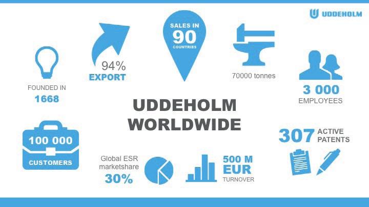
1
2 TABLE OF CONTENTS Keep it simple, make it significant 3 Our brand 4 Our values 5 Vision and brand promise 6 Tone of voice 7 Boilerplate 8 Logotype 9 Corporate colours 10 Typography 13 Corporate pictures 15 Product name and marking 18 Examples of using the profile 20 The Brand book and Profile can be downloaded from Uddeholm s intranet and Mediaworlds
3 KEEP IT SIMPLE, MAKE IT SIGNIFICANT It is all about you. It is you and your work that make a difference and propel Uddeholm to be the world s premium provider of business enhancing tool steel solutions. In this work, our brand is a major asset, and the graphic profile is one important tool in the ongoing efforts to further strengthen the brand. This booklet is a guide that helps us nurture our brand and graphic identity. It provides information, guidance and practical advice. Keep on doing the great work you are doing already! PÄR EMANUELSSON, VICE PRESIDENT MARKETING & SALES PAGE 3
4 OUR BRAND Uddeholm has premium clients all over the world. We want to make it easier for them to hear us and listen to our message. To achieve this, coherent marketing is an important tool and a key to success. A brand consists of many things. For Uddeholm, it s our history, our knowledge, our values and our high quality products that accompany our name all over the world. And it s you. All of us, together. We are brand ambassadors who feel proud to be a part of Uddeholm and know what benefits and advantages our products will give our customers. As ambassadors, we meet clients in many different settings. In sales meetings, through correspondence, on our website or at exhibitions. Therefore it s important to speak in the same way. So that no matter where we are in the world or through whichever channels we use, our audience always recognizes and remembers the voice of Uddeholm. PAGE 4
5 BRAND VALUES The power of the brand lies in being known for something good. We are known to be the world s leading player in our industry, delivering premium solutions to clients worldwide. Our four core values sum up the momentum of the brand and create the foundation for our communication. These values help us drive the development of the industry forward and strengthen our position: #1 in high performance tool steel. COMMITTED We love what we do and put our whole soul into the task of producing solutions that strengthen the business of our customers. RELIABLE We take responsibility and keep our promises. INNOVATIVE We think differently and we continuously deliver new solutions that enhance the competitiveness of our customers. PROACTIVE We listen, and we detect opportunities where others see problems. Therefore, we can offer our customers solutions to problems before they even arise. PAGE 5
6 VISION AND BRAND PROMISE VISION BRAND PROMISE To deliver solutions to our customers that enhance competitiveness and create added value for their business. PAGE 6
7 TONE OF VOICE Our voice and tone should reflect our core values. We walk the talk: We pride ourselves in our knowledge of tool steel. We are always professional whilst we are personal. We are honest and trustworthy. We express ourselves clearly so that nobody misunderstands. We are humble, we listen and learn from each other and our customers. We are dedicated to quality and deliver top-of-the-line solutions. We are customer focused. PAGE 7

8 Since 1668 we have been providing a wide range of innovative cutting-edge solutions for our customers in demanding segments. Our dedicated employees work in almost ninety countries, together we deliver improved competitiveness to clients worldwide. Welcome to Uddeholm, #1 in high performance tool steel. BOILERPLATE A boilerplate is a short summary of who we are and what we do, expressed in a way that attracts all sorts of target groups. It is a useful text and should be used worldwide in all channels when we explain what Uddeholm is. OUR BOILERPLATE Since 1668 we have been providing a wide range of innovative cutting-edge solutions for our customers in demanding segments. Our dedicated employees work in almost ninety countries and together we deliver improved competitiveness to clients worldwide. Welcome to Uddeholm, #1 in high performance tool steel. Since 1668 we have been providing a wide range of innovative cutting-edge solutions for our customers in demanding segments. Our dedicated employees work in almost ninety countries, together we deliver improved competitiveness to clients worldwide. Welcome to Uddeholm, #1 in high performance tool steel. The boilerplate can be used in the bottom of an ad or somewhere on the website. It is also very useful when writing a press release. PAGE 8
9 THE LOGOTYPE Our brand logotype is displayed in one way only. Everywhere and every time. It should be used in full and in our blue color. As one clear and crisp consignor. PAGE 9
10 CORPORATE COLOURS Colours are an important part of a brand s visual identity. Uddeholm s main colour is blue. When showing the brand the blue colour is used either as background or in text or graphic. The overall impression should always be crisp and clear with a blue touch. MAIN COLOUR PMS 299 CMYK 86, 8, 0, 0 RGB 0, 163, 224 HTML 00A3E0 NCS S 1060-B It is important to use the colour indications as they are designed to give the best results depending on where they are used. However, it is good to be aware that colours may look different on a computer monitor or in printed material. PAGE 10
11 SUPPORTIVE COLOURS There are also four supportive colours in our palette. Their task is to support the main colour and allow some variation. WHITE 80% BLACK 70% BLACK 10% BLACK CMYK 0, 0, 0, 0 CMYK 0, 0, 0, 80 CMYK 0, 0, 0, 70 CMYK 0, 0, 0, 10 RGB 255, 255, 255 RGB 87, 87, 86 RGB 112, 111, 111 RGB 237, 237, 237 HTML ffffff HTML HTML 6f6f6e HTML ececec One example of how to use the main and supportive colours. PAGE 11


12 COLOURS FOR CHARTS, GRAPHS AND OTHER GRAPHICAL ELEMENTS To give further life to the graphic expression there are four complementary colours. They should be used very moderately and always combined with the main colours. These colours can be used to clarify and create interest for graphics. CMYK 0, 63, 80, 0 RGB 236, 118, 61 HTML #eb763c CMYK 95, 73, 30, 17 RGB 29, 68, 111 HTML #1c446f CMYK 63, 10, 85, 0 RGB 110, 168, 74 HTML #6da84a CMYK 45, 0, 3, 0 RGB 130, 207, 238 HTML #81cfed The complementary colours can only be used when creating graphics, charts or graphs. Some examples of how to use the colours for graphics. PAGE 12
13 OUR TYPEFACE Since we are a worldwide company it is important to make it as easy as possible for every employee to use our profile guide. Therefore Arial is the recommended typeface when communicating in internal or external channels. But there are exceptions: if you need to produce printed material for an exhibition or event, then use Helvetica instead of Arial. Please don t hesitate to ask our Brand Manager if you have any questions. ARIAL Use Arial in the everyday communication, such as: digital presentations (Powerpoint) intranet and apps e-marketing letters in Word agreements Arial is a common typface in every computer and should cause as little conflict as possible when used in different envirionments and different computers. HELVETICA Use Helvetica when producing materials, such as: roll-ups brochures give-aways marketing materials such as ads and other campaign material Helvetica is a classic and well designed typface that is easy to read and adds a high quality touch to our visual identity. PAGE 13
14 HOW TO USE THE TYPEFACE COLOUR AND STYLE Consistency in the use of typography makes our visual identity strong and clear. Therefore, the typefaces we use have capital letters in headlines to reinforce that the message comes from Uddeholm. The only exception is for our product names, which we always write in upper- and lowercase. MAIN HEADLINE Use Arial Black, 80% black and capital letters when writing a main headline. Keep the headlines short and significant. For variation you can sometimes use our Uddeholm blue when writing a main headline. But remember to be consistent throughout the document. If your headline demands a longer formulation you should write it in upper- and lowercases. SUB HEADLINE Use Arial Black, Uddeholm blue and capital letters when writing a sub headline. Keep the sub headline short and significant. For variation you can sometimes use our Uddeholm blue when writing a sub headline. Remember to be consistent throughout the document. BODYTEXT Use Arial regular, 70% black writing for body text. FACTUAL HEADLINE Use Arial bold, 80% black and capital letters when writing a factual headline. FACTUAL BODYTEXT Use Arial regular, 70% black when writing a factual body text. HIGHLIGHTS Use Arial regular italic, 70% black when writing a highlight. For variation you can sometimes use our Uddeholm blue when writing a highlight. Remember to be consistent throughout the document. For further inspiration see examples of using the profile or contact our Brand Manager if you have any questions. PAGE 14


15 CORPORATE PICTURES Pictures are strong communicators and the fastest way to express our brand. The aim of the pictures is to make an impression to the receiver and enhance the message and our brand values. Uddeholm s corporate pictures are divided into five categories to make them easier to use and apply to different needs and target groups. OPERATIONAL PICTURES When using pictures they should be presented in their original form. No cutting, shadows or other effect should be added. EXAMPLE OF DONT S HISTORICAL PICTURES PRODUCT PICTURES ILLUSTRATIONS AND ICONS Download all the approved pictures, icons and illustrations at Uddeholm s intranet and Mediaworlds. PAGE 15


16 OPERATIONAL PICTURES The pictures convey a clear and modern feeling of our company. When picturing people, we want to show a mixture of men and women. The pictures should communicate a story with a positive and professional feeling. When showing our tool steel it is important that the products are polished and reflect high quality. All approved images can be downloaded in our Mediaworlds. HISTORICAL PICTURES Sometimes there is a need to look back and maybe also show our plant in Hagfors. In those cases there are a number of historical and plant pictures that can be used. All approved images can be downloaded in our Mediaworlds. PAGE 16


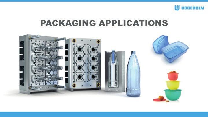
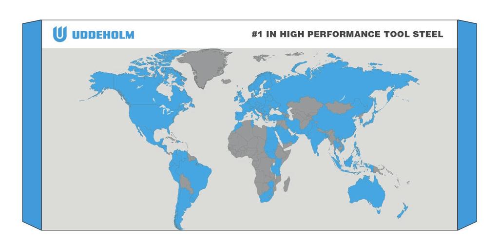
17 PRODUCT PICTURES In some cases there will be a need to show a simplified process of what we do and what advantage our offer fills. We have several sharp illustrations made in 3D that enhance different business areas or different end products. All approved images can be downloaded in our Mediaworlds. ILLUSTRATIONS AND ICONS Pictorical communication is a fast and crisp way to enhance a message. In our gallery there are a number of icons that can be used to reinforce headlines. The blue world map shows the countries and areas where we are present. Our illustrations and icons are available in grey and Uddeholm blue, but can also be used in white when our corporate colors are used as background. All approved images can be downloaded in our Mediaworlds. PAGE 17
18 PRODUCT NAME Our brand is recognized worldwide. Our brand together with the product name will assure instant recognition for our products and pave the way for sales. When describing our product names always write it in both upper- and lowercase and always in combination with our brandname. Uddeholm Dievar (Example of how we write our product names) PAGE 18
19 PRODUCT MARKING For marking the products, Uddeholm uses a variety of stickers for pasting on the end of the products. The purpose is to differentiate them from each other and, thereby, create a distinct, consistent and easy-to-read professional marking. Depending on size and form of the product, we use different shapes of stickers. For Uddeholm, this is a way to act professionally. For the customer, the markings ensure that their purchased product is always of the same high quality and stems from Uddeholm. Therefore: always make sure that products are marked upon shipping. Uddeholm Vanadis 4 Extra SuperClean PAGE 19
20 EXAMPLES AND INSPIRATION WHEN USING THE UDDEHOLM PROFILE In this section, you will see examples of different materials. It is important that we communicate our brand with a consistent appearance. If you have any questions, please contact the Uddeholm Brand Manager.


21 EXAMPLES AND INSPIRATION CORPORATE STATIONARY SIGNATURE PAGE 21


22 EXAMPLES AND INSPIRATION DIGITAL PRESENTATION POWERPOINT TEMPLATE PAGE 22

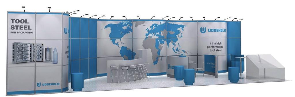
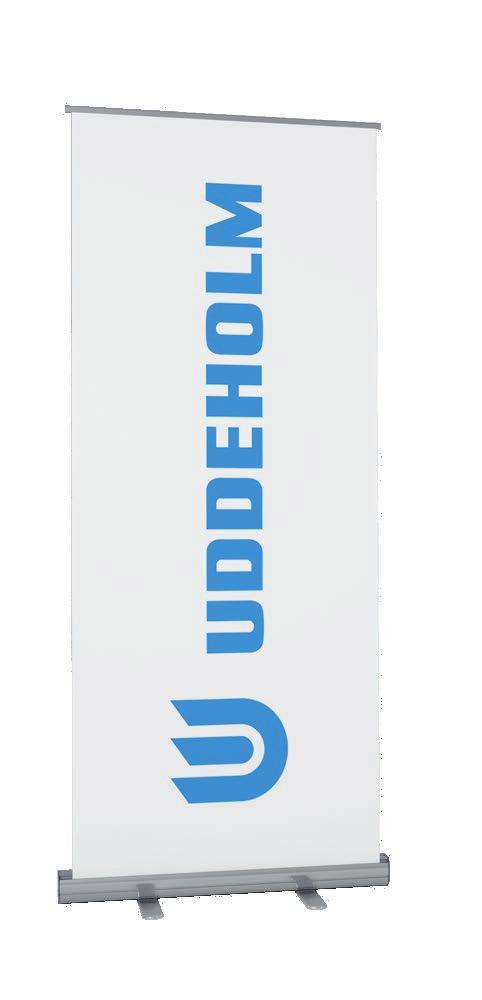
23 EXAMPLES AND INSPIRATION ROLL-UPS FLAGS BACK-DROP EXHIBITIONS PAGE 23

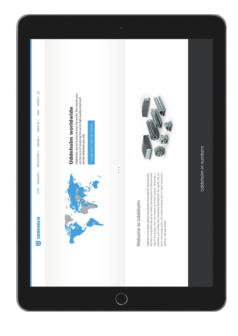

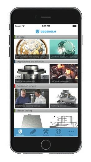
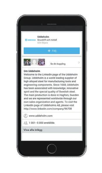
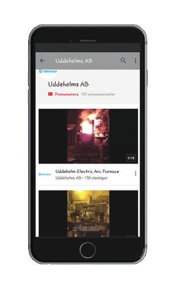
24 EXAMPLES AND INSPIRATION SOCIAL MEDIA APPS & WEBSITE PAGE 24


25 EXAMPLES AND INSPIRATION PRODUCT BROCHURES APPLICATION BROCHURES SALES BROCHURES BROCHURES FRONT COVERS PAGE 25


26 EXAMPLES AND INSPIRATION APPLICATION BROCHURES PRODUCT BROCHURES BROCHURES SPREAD PAGE 26
27 Feb 2016 Please note that ads and campaign material are not included in this version. If there are any questions do not hesitate to contact the Brand Manager at Uddeholm.