MAT 1272 STATISTICS LESSON Organizing and Graphing Qualitative Data
|
|
|
- Lee Cannon
- 5 years ago
- Views:
Transcription

1 MAT 1272 STATISTICS LESSON Organizing and Graphing Qualitative Data
2 2.1.1 Raw Data Raw Data Data recorded in the sequence in which they are collected and before they are processed or ranked are called raw data.
, and so forth. The data in Table 2.1 are quantitative raw data")
3 Suppose we collect information on the ages (in years) of 50 students selected from a university. The data values, in the order they are collected, are recorded in Table 2.1. For instance, the first student's age is 21, the second student's age is 19 (second number in the first row), and so forth. The data in Table 2.1 are quantitative raw data

4 Qualitative data Suppose we ask the same 50 students about their student status. The responses of the students are recorded in Table 2.2. In this table, F, SO, J, and SE are the abbreviations for freshman, sophomore, junior, and senior, respectively. This is an example of qualitative (or categorical) raw data.
5 2.1.2 Frequency Distributions The number of adults who belong to a certain category is called the frequency of that category. A frequency distribution exhibits how the frequencies are distributed over various categories. Table 2.3 is called a frequency distribution table or simply a frequency table.
6
7

8
9
, and the sum of the percentages is always 100 (or approximately 100 if the percentages are rounded) Pew Research Center conducted a national survey of")
10 The sum of the relative frequencies is always 1.00 (or approximately 1.00 if the relative frequencies are rounded), and the sum of the percentages is always 100 (or approximately 100 if the percentages are rounded) Pew Research Center conducted a national survey of 10,013 adults January 23 to March 16, 2014, to find the political views of adults in the United States. As the above bar chart shows, 12% of the adults polled said that they were consistently liberal, 22% indicated that they were mostly liberal, and so on. In this survey, Pew Research Center also found that, overall, the percentage of Americans who indicated that they were consistently conservative or consistently liberal has increased from 10% to 21% during the past two decades. Note that in this chart, the bars are drawn horizontally.
11 In order they appear Bar Graph A graph made of bars whose heights represent the frequencies of respective categories is called a bar graph. Pareto Chart A Pareto chart is a bar graph with bars arranged by their heights in descending order. To make a Pareto chart, arrange the bars according to their heights such that the bar with the largest height appears first on the left side, and then subsequent bars are arranged in descending order with the bar with the smallest height appearing last on the right side.
12 2.1.4 Graphical Presentation of Qualitative Data Bar Graphs Pareto chart for the frequency distribution of Table 2.4. Figure 2.2 To construct a bar graph (also called a bar chart), we mark the various categories on the horizontal axis as in Figure 2.1. Note that all categories are represented by intervals of the same width. We mark the frequencies on the vertical axis. Then we draw one bar for each category such that the height of the bar represents the frequency of the corresponding category. We leave a small gap between adjacent bars. Figure 2.1 gives the bar graph for the frequency distribution of Table 2.4.


13 Pie Chart A circle divided into portions that represent the relative frequencies or percentages of a population or a sample belonging to different categories is called a pie chart. Figure 2.3 Pie chart for the percentage distribution of Table 2.5.
14 Sara polled students in the cafeteria to determine what they would like added to the menu. Her results are shown below. Compute the relative frequency (percentage) of each choice to the nearest percent. [Note: Due to rounding, relative frequencies may not add to exactly 100%.] What is the difference between frequency and relative frequency? Refer to the table in this slide to do the interpretation and explain the similarities and differences.
15
17/40 = 42.")
16 ) 57.5% of the elements belong to category Y. c d)17/40 = 42.5% of the elements belong to categories N or D. e) f)
17 2.7 In a 2013 survey of employees conducted by Financial Finesse Inc., employees were asked about their overall financial stress levels. The following table shows the results of this survey ( (a) Draw a pie chart for this percentage distribution. (b) Make a Pareto chart for this percentage distribution.

 Draw a pie chart for this percentage distribution.")
18 2.7 In a 2013 survey of employees conducted by Financial Finesse Inc., employees were asked about their overall financial stress levels. The following table shows the results of this survey ( (a) Draw a pie chart for this percentage distribution. (b) Make a Pareto chart for this percentage distribution.
19 A staff member at a local grocery store was assigned the job of inspecting all containers of yogurt in the store to determine the number of days to expiry date for each container. Containers that had already expired but were still on the shelves were given a value of 0 for number of days to expiry. The following table gives the frequency distribution of the number of days to expiry date.
20 Table of frequency, relative frequency, %
21
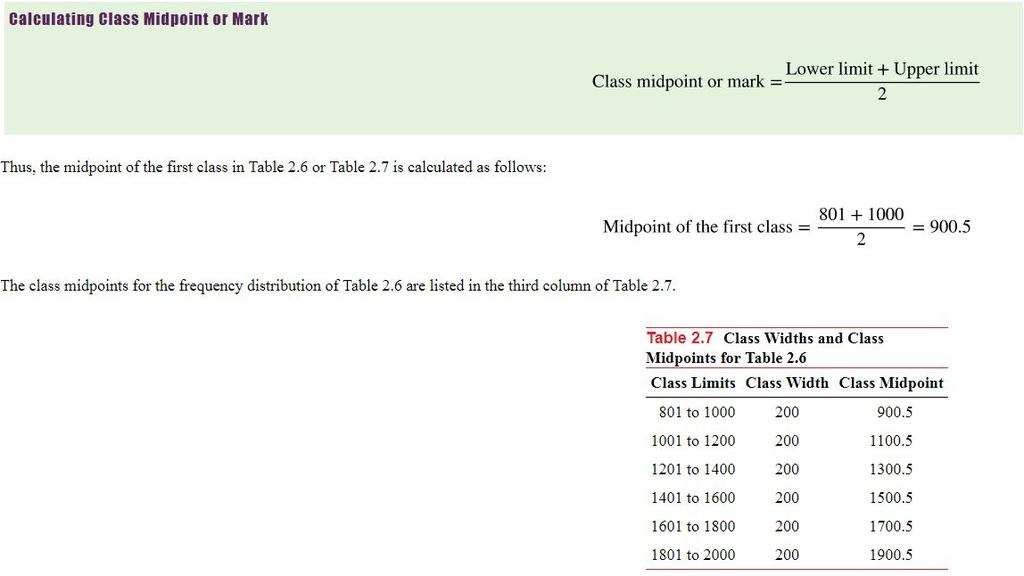
22 Frequency distribution Frequency Distribution for Quantitative Data A frequency distribution for quantitative data lists all the classes and the number of values that belong to each class. Data presented in the form of a frequency distribution are called grouped data.

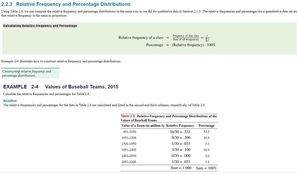
23 2.2.3 Relative Frequency and Percentage Distributions
24
25
26
27
28
29
30
31
32
33
34
35
36
37
38
39
40
Quantitative Methods. Presenting Data in Tables and Charts. Basic Business Statistics, 10e 2006 Prentice-Hall, Inc. Chap 2-1
 Quantitative Methods Presenting Data in Tables and Charts Basic Business Statistics, 10e 2006 Prentice-Hall, Inc. Chap 2-1 Learning Objectives In this chapter you learn: To develop tables and charts for
Why Learn Statistics?
 Why Learn Statistics? So you are able to make better sense of the ubiquitous use of numbers: Business memos Business research Technical reports Technical journals Newspaper articles Magazine articles Basic
Chapter 2 Ch2.1 Organizing Qualitative Data
 Chapter 2 Ch2.1 Organizing Qualitative Data Example 1 : Identity Theft Identity fraud occurs someone else s personal information is used to open credit card accounts, apply for a job, receive benefits,
An ordered array is an arrangement of data in either ascending or descending order.
 2.1 Ordered Array An ordered array is an arrangement of data in either ascending or descending order. Example 1 People across Hong Kong participate in various walks to raise funds for charity. Recently,
PRESENTING DATA ATM 16% Automated or live telephone 2% Drive-through service at branch 17% In person at branch 41% Internet 24% Banking Preference
 Presenting data 1 2 PRESENTING DATA The information that is collected must be presented effectively for statistical inference. Categorical and numerical data can be presented efficiently using charts and
Business Statistics: A Decision-Making Approach 7 th Edition
 Business Statistics: A Decision-Making Approach 7 th Edition Chapter 2 Graphs, Charts, and Tables Describing Your Data Business Statistics: A Decision-Making Approach, 7e 2008 Prentice-Hall, Inc. Chap
CHAPTER 2 SECTION 2: GRAPHICAL AND TABULAR DESCRIPTIVE TECHNIQUES
 CHAPTER 2 SECTION 2: GRAPHICAL AND TABULAR DESCRIPTIVE TECHNIQUES MULTIPLE CHOICE 35. Which of the following statements about pie charts is false? a. A pie chart is a graphical representation of a relative
CHAPTER 2: ORGANIZING AND VISUALIZING VARIABLES
 2-1 Organizing and Visualizing Variables Organizing and Visualizing Variables 2-1 Statistics for Managers Using Microsoft Excel 8th Edition Levine SOLUTIONS MANUAL Full download at: https://testbankreal.com/download/statistics-for-managers-using-microsoftexcel-8th-edition-levine-solutions-manual/
CHAPTER 2: ORGANIZING AND VISUALIZING VARIABLES
 Organizing and Visualizing Variables 2-1 CHAPTER 2: ORGANIZING AND VISUALIZING VARIABLES SCENARIO 2-1 An insurance company evaluates many numerical variables about a person before deciding on an appropriate
CHAPTER 2: ORGANIZING AND VISUALIZING VARIABLES
 Statistics for Managers Using Microsoft Excel 8th Edition Levine Solutions Manual Full Download: http://testbanklive.com/download/statistics-for-managers-using-microsoft-excel-8th-edition-levine-solutions-manu
Chapter 2. Describing Data (Descriptive Statistics)
") Chapter 2. Describing Data (Descriptive Statistics) Jie Zhang Accounting and Information Systems Department College of Business Administration The University of Texas at El Paso jzhang6@utep.edu Jie Zhang,
Chapter 2. Describing Data (Descriptive Statistics) Jie Zhang Accounting and Information Systems Department College of Business Administration The University of Texas at El Paso jzhang6@utep.edu Jie Zhang,
CHAPTER 2: Descriptive Statistics: Tabular and Graphical Methods Essentials of Business Statistics, 4th Edition Page 1 of 127
 2 CHAPTER 2: Descriptive Statistics: Tabular and Graphical Methods 34 Essentials of Business Statistics, 4th Edition Page 1 of 127 2.1 Learning Objectives When you have mastered the material in this chapter,
Lecture 10. Outline. 1-1 Introduction. 1-1 Introduction. 1-1 Introduction. Introduction to Statistics
 Outline Lecture 10 Introduction to 1-1 Introduction 1-2 Descriptive and Inferential 1-3 Variables and Types of Data 1-4 Sampling Techniques 1- Observational and Experimental Studies 1-6 Computers and Calculators
STA Rev. F Learning Objectives. Learning Objectives (Cont.) Module 2 Organizing Data
 Module 2 Organizing Data") STA 2023 Module 2 Organizing Data Rev.F08 1 Learning Objectives Upon completing this module, you should be able to: 1. Classify variables and data as either qualitative or quantitative. 2. Distinguish
STA 2023 Module 2 Organizing Data Rev.F08 1 Learning Objectives Upon completing this module, you should be able to: 1. Classify variables and data as either qualitative or quantitative. 2. Distinguish
Variables and data types
 Variables and data types (*) Data comes from observations. (*) Each observation yields values for one or more variables. (*) Qualitative variables: The characteristic is categorical. E.g., gender, ethnicity,
BUSS1020 Quantitative Business Analysis
 BUSS1020 Quantitative Business Analysis Week 1 - Introduction and Collecting Data Process of statistical analysis 1. Define the objective, and understand the data we need to collect. 2. Collect the required
STA Module 2A Organizing Data and Comparing Distributions (Part I)
") STA 2023 Module 2A Organizing Data and Comparing Distributions (Part I) 1 Learning Objectives Upon completing this module, you should be able to: 1. Classify variables and data as either qualitative or
STA 2023 Module 2A Organizing Data and Comparing Distributions (Part I) 1 Learning Objectives Upon completing this module, you should be able to: 1. Classify variables and data as either qualitative or
STAT 206: Chapter 2 (Organizing and Visualizing Variables)
") STAT 206: Chapter 2 (Organizing and Visualizing Variables) Methods to Organize and Visualize Variables For Categorical Variables: Summary Table; contingency table (2.1) Bar chart, pie chart, Pareto chart,
STAT 206: Chapter 2 (Organizing and Visualizing Variables) Methods to Organize and Visualize Variables For Categorical Variables: Summary Table; contingency table (2.1) Bar chart, pie chart, Pareto chart,
Slides Prepared by JOHN S. LOUCKS. St. Edward s s University Thomson/South-Western. Slide
 s Prepared by JOHN S. LOUCKS St. Edward s s University 1 Chapter 1 Data and Statistics Applications in Business and Economics Data Data Sources Descriptive Statistics Statistical Inference Computers and
Displaying Bivariate Numerical Data
 Price ($ 000's) OPIM 303, Managerial Statistics H Guy Williams, 2006 Displaying Bivariate Numerical Data 250.000 Price / Square Footage 200.000 150.000 100.000 50.000 - - 500 1,000 1,500 2,000 2,500 3,000
!"#$%&'() !(4#)3%*,0*=>&83*. !"#$%&'()*+*,-./0*,-.,0*,--1*234%5"6*789:4)&"60*;6:<
 !(4#)3%*,0*=>&83*. !#$%&'()*+*,-./0*,-.,0*,--1*234%56*789:4)&60*;6:<") !"#$%&'()?%'46&@&6'*468* A&594>&@&6'*A4%&4B>35!(4#)3%*,0*=>&83*. Contents 2.1 Organizing Categorical Variables. 2.2 Organizing Numerical Variables Classes and Excel Bins Stacked and Unstacked Data 2.3
!"#$%&'()?%'46&@&6'*468* A&594>&@&6'*A4%&4B>35!(4#)3%*,0*=>&83*. Contents 2.1 Organizing Categorical Variables. 2.2 Organizing Numerical Variables Classes and Excel Bins Stacked and Unstacked Data 2.3
Computing Descriptive Statistics Argosy University
 2014 Argosy University 2 Computing Descriptive Statistics: Ever Wonder What Secrets They Hold? The Mean, Mode, Median, Variability, and Standard Deviation Introduction Before gaining an appreciation for
Data Visualization. Prof.Sushila Aghav-Palwe
 Data Visualization By Prof.Sushila Aghav-Palwe Importance of Graphs in BI Business intelligence or BI is a technology-driven process that aims at collecting data and analyze it to extract actionable insights
Module - 01 Lecture - 03 Descriptive Statistics: Graphical Approaches
 Introduction of Data Analytics Prof. Nandan Sudarsanam and Prof. B. Ravindran Department of Management Studies and Department of Computer Science and Engineering Indian Institution of Technology, Madras
Rational Me. A Math 6 Pre-AP Project
 Rational Me A Math 6 Pre-AP Project Our bodies are mostly made of 6 elements We also have 1.5% of trace elements 65% Oxygen 18% 10% 3% 1.5% Carbon Hydrogen Nitrogen Calcium 1% Phosphorus Rational Me: Project
1 BASIC CHARTING. 1.1 Introduction
 1 BASIC CHARTING 1.1 Introduction This section covers the basic principles of how to create and modify a chart in Excel. With Excel 2016, the charting process is user-friendly and offers many ways to amplify
Econ 3790: Business and Economics Statistics. Instructor: Yogesh Uppal
 Econ 3790: Business and Economics Statistics Instructor: Yogesh Uppal Email: yuppal@ysu.edu Chapter 2 Summarizing Qualitative Data Frequency distribution Relative frequency distribution Bar graph Pie chart
統計學 Fall 2004 授課教師 統計系余清祥 日期 2004年9月14日 第一週 什麼是統計 Slide 1
 Fall 2004 2004 9 14 1 ?, (Uncertainty), 2 3 4 Chapter 1 Data and Statistics Applications in Business and Economics Data Data Sources Descriptive Statistics Statistical Inference 5 Applications in Business
Ordered Array (nib) Frequency Distribution. Chapter 2 Descriptive Statistics: Tabular and Graphical Methods
 Frequency Distribution. Chapter 2 Descriptive Statistics: Tabular and Graphical Methods") Chapter Descriptive Statistics: Tabular and Graphical Methods Ordered Array (nib) Organizes a data set by sorting it in either ascending or descending order Advantages & Disadvantages Useful in preparing
Chapter Descriptive Statistics: Tabular and Graphical Methods Ordered Array (nib) Organizes a data set by sorting it in either ascending or descending order Advantages & Disadvantages Useful in preparing
Pareto Charts [04-25] Finding and Displaying Critical Categories
![Pareto Charts [04-25] Finding and Displaying Critical Categories](/thumbs/72/68045074.jpg "Pareto Charts [04-25] Finding and Displaying Critical Categories") Introduction Pareto Charts [04-25] Finding and Displaying Critical Categories Introduction Pareto Charts are a very simple way to graphically show a priority breakdown among categories along some dimension/measure
Introduction Pareto Charts [04-25] Finding and Displaying Critical Categories Introduction Pareto Charts are a very simple way to graphically show a priority breakdown among categories along some dimension/measure
Fundamental Elements of Statistics
 Fundamental Elements of Statistics Slide Statistics the science of data Collection Evaluation (classification, summary, organization and analysis) Interpretation Slide Population Sample Sample: A subset
Week 13, 11/12/12-11/16/12, Notes: Quantitative Summaries, both Numerical and Graphical.
 Week 13, 11/12/12-11/16/12, Notes: Quantitative Summaries, both Numerical and Graphical. 1 Monday s, 11/12/12, notes: Numerical Summaries of Quantitative Varibles Chapter 3 of your textbook deals with
I214 Repor ting quantitative data
 I214 Repor ting quantitative data November 4, 2008 (with thanks to Gary Kass and Edward Tufte) Why graphs? Ex: The Harris Poll #100, Oct 15, 2007 American adults have their choice of many different cuisines
20. Alternative Ranking Using Criterium Decision Plus (Multi-attribute Utility Analysis)
") The selection of the preferred alternative, using a structured decision process, begins with creation of the decision hierarchy. The hierarchy is the clear organization of the goal, listing of categories
The selection of the preferred alternative, using a structured decision process, begins with creation of the decision hierarchy. The hierarchy is the clear organization of the goal, listing of categories
9/10/2007. Marketing Arithmetic. Budgeting. Budgeting. Marketing Arithmetic Key Concepts. Historical Census Data: Secondary Data Source
 Marketing Arithmetic Strategic Marketing Dr. R. J. Fontenot Marketing Arithmetic Key Concepts Stats are hip Finding Historical Census Data Budgeting Important Financial Documents Calculating Trends Breakeven
A is used to answer questions about the quantity of what is being measured. A quantitative variable is comprised of numeric values.
 Stats: Modeling the World Chapter 2 Chapter 2: Data What are data? In order to determine the context of data, consider the W s Who What (and in what units) When Where Why How There are two major ways to
Aug 1 9:38 AM. 1. Be able to determine the appropriate display for categorical variables.
 Chapter 3 Displaying and Describing Categorical Data Objectives: Students will: 1. Be able to determine the appropriate display for categorical variables. 2. Be able to summarize the distribution of a
New Perspectives on Microsoft Excel Module 4: Analyzing and Charting Financial Data
 New Perspectives on Microsoft Excel 2016 Module 4: Analyzing and Charting Financial Data Objectives, Part 1 Use the PMT function to calculate a loan payment Create an embedded pie chart Apply styles to
PARETO CHART. We have what it takes! Continuous quality improvement - our tool for delivering... service of greater worth.
 TMC Quality Improvement Program Self-Instructional Modules We have what it takes! THE PDCA CYCLE SERIES Continuous quality improvement - our tool for delivering... service of greater worth. PARETO CHART
CHAPTER 2. Descriptive Statistics: Tabular and Graphical Presentations CONTENTS
 CHAPTER 2 Descriptive Statistics: Tabular and Graphical Presentations CONTENTS STATISTICS IN PRACTICE: COLGATE-PALMOLIVE COMPANY 2.1 SUMMARIZING CATEGORICAL DATA Frequency Distribution Relative Frequency
Statistics and data analysis procedures can be divided into two general categories: quantitative techniques and graphical techniques.
 http://en.wikipedia.org/wiki/seven_tools_of_quality http://deming.eng.clemson.edu/pub/tutorials/qctools/qct.htm http://en.wikipedia.org/wiki/5_whys http://en.wikipedia.org/wiki/brainstorming http://syque.com/quality_tools/toolbook/brainstorm/example.htm
CHAPTER 10. Graphs, Good and Bad
 CHAPTER 10 Graphs, Good and Bad DISPLAYING DATA The first part of this course dealt with the production of data, through random sampling and randomized comparative experiments. This particular unit focuses
Exploring Microsoft Office Excel 2007
 Exploring Microsoft Office Excel 2007 Chapter 3: Charts: Delivering a Message Robert Grauer, Keith Mulbery, Judy Scheeren Committed to Shaping the Next Generation of IT Experts. Copyright 2008 Prentice-Hall.
ICTCM 28th International Conference on Technology in Collegiate Mathematics
 HOW TO DRAW AND RECOGNIZE MISREADING GRAPHS PART I Aniekan Asukwo Ebiefung University of Tennessee at Chattanooga Department of Mathematics, 615 McCallie Ave, Chattanooga, TN 37403 Aniekan-ebiefung@utc.edu
Creating Simple Report from Excel
 Creating Simple Report from Excel 1.1 Connect to Excel workbook 1. Select Connect Microsoft Excel. In the Open File dialog box, select the 2015 Sales.xlsx file. 2. The file will be loaded to Tableau, and
Displaying Distributions - Qualitative Variables
 Displaying Distributions - Qualitative Variables Lecture 12 Sections 4.3.1-4.3.2 Robb T. Koether Hampden-Sydney College Tue, Feb 2, 2010 Robb T. Koether (Hampden-Sydney College)Displaying Distributions
Topic 1: Descriptive Statistics
 Topic 1: Descriptive Statistics Econ 245_Topic 1 page1 Reference: N.C &T.: Chapter 1 Objectives: Basic Statistical Definitions Methods of Displaying Data Definitions: S : a numerical piece of information
Test Name: Test 1 Review
 Test Name: Test 1 Review 1. Determine whether the statement describes a population or a sample. The heights of all the corn plants at Mr. Lonardo's greenhouse. 2. Determine whether the statement describes
Math 1 Variable Manipulation Part 8 Working with Data
 Name: Math 1 Variable Manipulation Part 8 Working with Data Date: 1 INTERPRETING DATA USING NUMBER LINE PLOTS Data can be represented in various visual forms including dot plots, histograms, and box plots.
Math 1 Variable Manipulation Part 8 Working with Data
 Math 1 Variable Manipulation Part 8 Working with Data 1 INTERPRETING DATA USING NUMBER LINE PLOTS Data can be represented in various visual forms including dot plots, histograms, and box plots. Suppose
Chapter 1 Data and Descriptive Statistics
 1.1 Introduction Chapter 1 Data and Descriptive Statistics Statistics is the art and science of collecting, summarizing, analyzing and interpreting data. The field of statistics can be broadly divided
Practice Assessment Material 1
 Practice Assessment Material 1 Spreadsheet Software Note: this practice material is intended to familiarise students with the type of task they can expect in an AAT assessment. For a complete practice
Radio buttons. Tick Boxes. Drop down list. Spreadsheets Revision Booklet. Entering Data. Each cell can contain one of the following things
 Spreadsheets Revision Booklet Entering Data Each cell can contain one of the following things Spreadsheets can be used to: Record data Sort data (in ascending A-Z, 1-10 or descending (Z-A,10-1) order Search
Excel 2011 Charts - Introduction Excel 2011 Series The University of Akron. Table of Contents COURSE OVERVIEW... 2
 Table of Contents COURSE OVERVIEW... 2 DISCUSSION... 2 OBJECTIVES... 2 COURSE TOPICS... 2 LESSON 1: CREATE A CHART QUICK AND EASY... 3 DISCUSSION... 3 CREATE THE CHART... 4 Task A Create the Chart... 4
Introduction to Statistics
 Introduction to Statistics Sherif Khalifa Sherif Khalifa () Introduction to Statistics 1 / 36 Every day businesses make decisions that determine whether companies will be profitable and flourish or whether
How do you know which chart to use?
 How do you know which chart to use? In this PowerPoint, each chart will be defined and described with an example of the data it is most appropriately suited to represent. How are charts used in other classes?
Gush vs. Bore: A Look at the Statistics of Sampling
 Gush vs. Bore: A Look at the Statistics of Sampling Open the Fathom file Random_Samples.ftm. Imagine that in a nation somewhere nearby, a presidential election will soon be held with two candidates named
MAS187/AEF258. University of Newcastle upon Tyne
 MAS187/AEF258 University of Newcastle upon Tyne 2005-6 Contents 1 Collecting and Presenting Data 5 1.1 Introduction...................................... 5 1.1.1 Examples...................................
Section 1.1 Analyzing Categorical Data
 Section 1.1 Analyzing Categorical Data Categorical Variables place individuals into one of several groups or categories The values of a categorical variable are labels for the different categories The
Manual on Training Needs Assessment
 Figure 10: Tips for Conducting an Interview Begin with a few rapport- building questions. Obtain permission to record the interview. Avoid adhering rigidly to the question sequence. Be flexible, but ensure
Excel 2016: Charts - Full Page
 Excel 2016: Charts - Full Page gcflearnfree.org/excel2016/charts/1/ Introduction It can be difficult to interpret Excel workbooks that contain a lot of data. Charts allow you to illustrate your workbook
Chart Recipe ebook. by Mynda Treacy
 Chart Recipe ebook by Mynda Treacy Knowing the best chart for your message is essential if you are to produce effective dashboard reports that clearly and succinctly convey your message. M y O n l i n
User Manual
 User Manual www.nmr.co.uk Information Partnerships 1 CONTENTS 1. INTRODUCTION 3 2. ACCESSING THE SYSTEM 4 3. SELECTING A HERD AND VIEWING A COMPONENT 4 4. FEED MONITOR 5 4.1 Feed monitor graphs 5 4.2 Protein
Section 9: Presenting and describing quantitative data
 Section 9: Presenting and describing quantitative data Australian Catholic University 2014 ALL RIGHTS RESERVED. No part of this work covered by the copyright herein may be reproduced or used in any form
Data familiarisation and description
 BUSINESS STATISTICS Data familiarisation and description Week 1 Descriptive Statistics I, Excel I The U.S. Space Shuttle Challenger 28 January 1986, Challenger exploded soon after take-off, killing all
Module 102, Using Information and Tools for Quality Management, Part 2
 Welcome to the Orientation to the Office of Developmental Programs - ODP. This lesson is Part 2 of a two-part webcast focused on Using Information and Tools for Quality Management. The information presented
Sorting Concept. Sorting of data. Skill
 6. Advanced Excel Aim: In this lesson, you will learn: Organize the given data. Calculate percentage, sum, average using functions option in a spreadsheet. To represent data in multiple ways. Tejas: Our
function relations and domain of functions
 function relations and domain of functions Module 3 : Investigation 2 MAT 170 Precalculus September 7, 2016 what is a function? Recall from last time, that a function consists of 3 parts : (1) The set
CHAPTER 1 Defining and Collecting Data
 CHAPTER 1 Defining and Collecting Data In this book we will use Define the variables for which you want to reach conclusions Collect the data from appropriate sources Organize the data collected by developing
Lecture 7. DATA 8 Summer Histograms
 DATA 8 Summer 2018 Lecture 7 Histograms Slides created by John DeNero (denero@berkeley.edu) and Ani Adhikari (adhikari@berkeley.edu) Contributions by Fahad Kamran (fhdkmrn@berkeley.edu) and Vinitra Swamy
ASTEROID. Profiler Module. ASTEROID Support: Telephone
 ASTEROID Profiler Module ASTEROID Support: Telephone +61 3 9223 2428 Email asteroid.support@roymorgan.com April 2017 Course Objectives At the end of this session you will be able to understand and confidently
Chapter 3. Displaying and Summarizing Quantitative Data. 1 of 66 05/21/ :00 AM
 Chapter 3 Displaying and Summarizing Quantitative Data D. Raffle 5/19/2015 1 of 66 05/21/2015 11:00 AM Intro In this chapter, we will discuss summarizing the distribution of numeric or quantitative variables.
Supplier Relationship Management Demo
 Supplier Relationship Management Demo J.Madrenas,A.Fàbregues,C.Sierra IIIA(CSIC)Barcelona Tableofcontents Introduction...3 Application...4 Running the application...5 Introduce contracts...5 Introduce
Quality Management in Construction Projects. Dr. Nabil El Sawalhi
 Quality Management in Construction Projects Dr. Nabil El Sawalhi 1 Quality Definition The American Society for Quality (ASQ) glossary defines quality as A subjective term for which, each person has his
Top N Pareto Front Search Add-In (Version 1) Guide
 Guide") Top N Pareto Front Search Add-In (Version 1) Guide Authored by: Sarah Burke, PhD, Scientific Test & Analysis Techniques Center of Excellence Christine Anderson-Cook, PhD, Los Alamos National Laboratory
Top N Pareto Front Search Add-In (Version 1) Guide Authored by: Sarah Burke, PhD, Scientific Test & Analysis Techniques Center of Excellence Christine Anderson-Cook, PhD, Los Alamos National Laboratory
Biodiversity and Ecosystems
 Biodiversity and Ecosystems 1.1 Importance of Biodiversity 1.2 Parts of an Ecosystem 1.3 Stable Ecosystems (quick recap on food webs/chains here) 1.4 Sampling Ecosystems 1.5 Biological Keys 1.Biodiversity
Determining Effective Data Display with Charts
 Determining Effective Data Display with Charts 1 Column Line Pie Stock XY (Scatter) Area Bubble Chart Types Covered 2 1 Visualizing Data 3 Data Graphics Principles 4 2 Data Graphics Principles Above all
1. Contingency Table (Cross Tabulation Table)
") II. Descriptive Statistics C. Bivariate Data In this section Contingency Table (Cross Tabulation Table) Box and Whisker Plot Line Graph Scatter Plot 1. Contingency Table (Cross Tabulation Table) Bivariate
II. Descriptive Statistics C. Bivariate Data In this section Contingency Table (Cross Tabulation Table) Box and Whisker Plot Line Graph Scatter Plot 1. Contingency Table (Cross Tabulation Table) Bivariate
Chapter 1. * Data = Organized collection of info. (numerical/symbolic) together w/ context.
 together w/ context.") Chapter 1 Objectives (1) To understand the concept of data in statistics, (2) Learn to recognize its context & components, (3) Recognize the 2 basic variable types. Concept briefs: * Data = Organized collection
Chapter 1 Objectives (1) To understand the concept of data in statistics, (2) Learn to recognize its context & components, (3) Recognize the 2 basic variable types. Concept briefs: * Data = Organized collection
TABLE OF CONTENTS OBJECTIVE... 2 MARKET DRIVERS... 2 PROBLEM DEVELOPMENT... 2 A GENERIC INTRODUCTION TO THE SOLUTION... 3 BENEFITS... 3 EXAMPLES...
 TABLE OF CONTENTS OBJECTIVE... 2 MARKET DRIVERS... 2 PROBLEM DEVELOPMENT... 2 A GENERIC INTRODUCTION TO THE SOLUTION... 3 BENEFITS... 3 EXAMPLES... 4 Document created and owned by Lakshmi Page 1 of 8 Objective
Making Sense of Data
 Tips for Revising Making Sense of Data Make sure you know what you will be tested on. The main topics are listed below. The examples show you what to do. Plan a revision timetable. Always revise actively
Summary Statistics Using Frequency
 Summary Statistics Using Frequency Brawijaya Professional Statistical Analysis BPSA MALANG Jl. Kertoasri 66 Malang (0341) 580342 Summary Statistics Using Frequencies Summaries of individual variables provide
Sorting Concept. Sorting of data. Skill
 6. Advanced Excel Aim: In this lesson, you will learn: To Organize the given data in a spreadsheet. To Calculate percentage, sum, average using functions option in a spreadsheet. To represent data in multiple
Data Visualization. Non-Programming approach to Visualize Data
 Data Visualization Non-Programming approach to Visualize Data Dr. Omer Ayoub Senior Data Scientist, House of Mathematical and Statistical Sciences, King Abdul Aziz Univerrsity, Jeddah, Saudi Arabia Dr.
LEAN PRODUCTION SYSTEM
 LEAN PRODUCTION SYSTEM Introduction Lean Overview Process Control Tools 1. Flow Chart / Diagram 2. Check Sheet 3. Histogram 4. Pareto Chart / Diagram 5. Cause-and-Effect Diagram 6. Why-Why Diagram 7. Scatter
Fairer Finance Data Portal A How-to Guide for Premium Users
 Contents Fairer Finance Data Portal A How-to Guide for Premium Users... 2 How do I log on?... 2 What can I see from the Home Screen page?... 3 How do the Customer Experience Ratings work?... 4 What can
GRADE 11 NOVEMBER 2015 MATHEMATICAL LITERACY P2
 NATIONAL SENIOR CERTIFICATE GRADE 11 NOVEMBER 2015 MATHEMATICAL LITERACY P2 MARKS: 100 TIME: 2 hours *imlit2* This question paper consists of 12 pages, including an annexure of 3 pages. 2 MATHEMATICAL
Microsoft Office: Excel 2013
 Microsoft Office: Excel 2013 Intro to Charts University Information Technology Services Training, Outreach and Learning Technologies Copyright 2014 KSU Department of University Information Technology Services
Statistics Quality: Control - Statistical Process Control and Using Control Charts
 Statistics Quality: Control - Statistical Process Control and Using Control Charts Processes Processing an application for admission to a university and deciding whether or not to admit the student. Reviewing
6. Advanced Excel. Moz: Good. How are the consultants planning to proceed?
 Aim: In 6. Advanced Excel Tejas: Our teacher said that the local Kirana shop owner wanted some help with his business and asked us to become his consultants! Moz: What kind of help does he need? Jyoti:
1. What is a key difference between an Affinity Diagram and other tools?
 1) AFFINITY DIAGRAM 1. What is a key difference between an Affinity Diagram and other tools? Affinity Diagram builds the hierarchy 'bottom-up', starting from the basic elements and working up, as opposed
Topic 1 Review Questions Set 1
 Topic 1 Review Questions Set 1 Base your answers to questions 1-5 on your knowledge of Earth Science, the Earth Science Reference Tables, and the diagrams below. The diagrams represent three samples of
DDBA8437: Central Tendency and Variability Video Podcast Transcript
 DDBA8437: Central Tendency and Variability Video Podcast Transcript JENNIFER ANN MORROW: Today's demonstration will review measures of central tendency and variability. My name is Dr. Jennifer Ann Morrow.
2012 Pearson Addison-Wesley
 11 OUTPUT AND COSTS What do General Motors, PennPower, and Campus Sweaters, have in common? Like every firm, They must decide how much to produce. How many people to employ. How much and what type of
Project and Portfolio Management Center
 Project and Portfolio Management Center Software Version: 9.42 Portfolio Management Configuration Guide Go to HELP CENTER ONLINE http://admhelp.microfocus.com/ppm/ Document Release Date: September 2017
Finding patterns in data: charts and tables
 4 Finding patterns in data: charts and tables Prerequisites Some understanding of sampling methods (Chapter 3: Collecting data: surveys and samples) would be useful but is not essential. Objectives To
Analytics Transition Year Module 2
 Analytics Transition Year Module 2 Overview of Project Module 1 Module 2 Module 3 Module 4 Overview Introduction to the challenge Using Analytics to understand the problem Interpretation of Analysis New
.Scouting Tools District Level
 my.scouting Tools my.scouting Tools is best experienced using Firefox 14 or greater, Google Chrome 21 or greater, Apple Safari 6 or greater, and Internet Explorer 9.0 or greater. 1 The Training Manager
PEAT S ENTERPRISE RISK MANAGEMENT & RISK REGISTERS: Key Features and Functions
 PEAT S ENTERPRISE RISK MANAGEMENT & RISK REGISTERS: Key Features and Functions Copyright 2005-2014 Dr. Johnathan Mun. All rights reserved. Dublin, California. admin@realoptionsvaluation.com 1 PEAT s Enterprise