Approach at Marketing. by Douglas Meyer
|
|
|
- Chad Ross
- 5 years ago
- Views:
Transcription
1 Approach at Marketing by Douglas Meyer Department of Art & Design College of Liberal Arts California Polytectic Stae University San Luis Obispo, California Fall 2009
2 Abstract In this senior paper I wanted to work on marketing a chair through different angles of design. These angles include logo design, photography, packaging design and a few advertising works to go along. I felt that the broad parts of this project would help in creating a portfolio piece that I have designed from the ground up. In reading my paper you will see the different approaches that were made and what ones worked. In all the pieces I am going to have to research to find the best way to approach these made up problems. i
3 Table of Contents Chapter I Introduction Statement of Problem Purpose or Objective of the Study Limitaions of Study Glossary of the Terms Chapter II Review of Research Chapter III Procedures and Results Chapter IV Summary and Recommendations Bibliography Images of Project ii
4 Chapter 1 Introduction Designers have a dual duty; contractually to their clients and morally to the later users and recipients of their work. ~ Hans Hger Statement of the Problem Graphic Design, with its educational process, has lead me to explore different ways of marketing a product through its logo, product photography, package design and advertisement through poster design and a bookmark. Taking these five different pieces to help market this product, I wanted to focus on how unity through design can be used to benefit a company. I chose this project to gain more experience in corporate identity and package design. All of these pieces are centered on the promotion of a chair that I designed and produced in the summer of Through the design of the various pieces I wanted sell the idea that this chair is made to be comfortable and suitable to be use while reading. Purpose or Objective of the Study In developing my senior project the goal was to finish a well rounded portfolio piece that would display the amount of research and work that I put in to my projects. In this portfolio piece I wanted to show the different skills that I have obtained through my education. These skills are graphic design, photography and 3d design. Through the graphic design 1
5 I wanted to demonstrate how a strong series of work can come together. I feel that a good eye for photography is key when creating powerful projects. This is the reason why I chose to do my own product photography. Being crafty in presenting a project to a client is a handy skill to have in the field. I wanted to give a feel of my crafty skills through the package and the chair. When working on my senior project I wanted to put extra effort towards getting a better understanding of package design and how it can help sell a product to more than its target audience. The last goal of my senior project was to demonstrate that I know from start to finish how to market a product. Limitations of the Study Due to the time restrictions of the 10 week quarter and the budget of a college student there are many limitations on complete development of the project. The short quarter system limits the number of different pieces that can be designed for this furniture company. Some of the other possible pieces would be a brochure, product catalog, stationary and/ or other marketing tools that a business needs. Due to my budget, a full mock-up of the package will not be able to be printed and built. Also, not having the resources to perform case studies to see if the product would sell limits the development of the project. 2
6 Glossary of Terms Audience - The target consumer segment the brand message aims to address. Corporate Identity - A consistent design scheme consisting of standard typefaces, layouts, and colors, to ensure a uniform approach to design regardless of who was designing the individual components of the corporate communications. Package Design - The structural and graphic development of a container in which product is packed, transported, presented, used and serves to support the intended brand position. Logo - Any identifying mark that officially represents a brand. Environmentally Friendly - minimizing harm to natural world: designed to minimize harm to the natural world, e.g. by using biodegradable ingredients 3
7 Chapter II - Review of Research In structuring my research, I had to first decide on a design style that would help market this chair and other contemporary furniture. In narrowing down the style I decided to follow the contemporary look of what Mac and Incase are doing because they have both been successful companies that use design to there advantage. The looks of their designs are simple, using a grid and white space to shift the audience s focus to the featured product. Some examples of this style of design can be seen in research images attached. Once I narrowed down the style, I went further and looked into how Ikea, my target retailer, markets the products they sell. Looking through the Ikea s catalog and website I noticed that a lot of the products are displayed on a white background. This goes along with the direction of the style that I chose as well as helping to set up ideas on approaching the product photography. I found different ways that photography could be approached while studying other product photography. In the search to take my photography further I had to study how lighting affects the feel and look of a product. Further research of furniture companies logos was done to gain a better idea of the design language in this market. A few of the logos that I focused on were Spacify, Moroso and Applaro. Research of these contemporary furniture companies helped set up a good base in approaching the logo design of my company. Example of these companies logos can be seen in the attached page. Looking over how both Mac and Incase approaches 4
8 their package design and advertisement helps in establishing a way to go about design of my pieces: package, poster and bookmark. In the development of this project a big concern was creating a company that approaches its business in an environmentally friendly fashion. Other research of what colors symbolize was used in development of both the Pax and Tullia logos. In establishing the Pax logo I decided to add an icon that would best represent the company s ideals. Research of what different animals symbolize helped create an icon that fits the furniture company. In observation of the two successful businesses, Mac and Incase, I learned that a applying a unified cohesive design throughout a corporation makes it easier for a company to be universally recognized. Knowing this theory, I applied it to my senior project the best that I could. 5
9 Chapter III Procedures and Results Before getting started on the different pieces of the project I had to first outline what this company is about. Brainstorming to pull ideas as well as key issues that I want to carry throughout the company such as the comfort provided, environmentally friendly and durability of its products. Outlining the key points of the furniture company I had to settle on a name for both the company itself and the product that I am marketing. Playing off the idea of peace and comfort provided by this company I decided to go with the name Pax, which is the latin word for peace. The name pushing the idea that the products designed by this company help provides peace of mind through the comfort, longevity and ease of use. Running with the idea of peace I decided to carry it through the product names. I settled on the Irish word Tullia, which means peaceful, for the Tullia. I want to push the idea that this product will help gather peace of mind to allow your full attention towards what you re concentrating while sitting in the chair. After establishing the names of the company and the product, I got started with the pulling the ideas that I wanted to represent through the logo. Durability, environmentally friendliness, contemporary styling and conscious decision making what I wanted to push through the company logo. When designing the logo, there were many tools and directions that I was able to use to represent the company in a professional manner. Color choice, type choice, simplicity of logo, and an icon were the main elements of the logo that I felt could be pushed to represent this furniture company. In the color choice I went 6
10 with blue and green. Blue which represents calm was picked to help push the idea of being at peace. Green, the other color, was used to help portray the philosophy of being environmentally friendly as well as the use of more natural materials. Observing how companies design through the contemporary style I focus on the type that s going to be used in the logo to help portray this feeling of the style. Sketching out and playing with different variation that I could come up with help pinpoint a positive direction for the type of the logo (logo, 1). Creating a type that has similar curves and line thickness helped push the idea of cohesiveness and brought the logo together. Deciding to use an icon with the type to help push some of the key points that I wanted to focused on was my next step. Researching the symbolism of different animals I came across a few animals that would help represent the furniture company. I decided to go with a turtle because symbolizes. a self-contained, creative source, Earth, informed decisions and adaptability which are a few points of the company that I wanted to push. After deciding to go with a turtle I had to design it to fit in the same design language as the type that I previously decided to go with. Playing around with different ideas of how to illustrate the turtle I decided to go with a version that plays off the text (logo, 2). Pulling the bottom of the x for the legs and the shape that the inside of the p creates help establish an icon that fits. Once having the text of pax and the turtle in direction that I wanted I had to put them together. In earlier studies of the type I noticed that the x has a directional flow from left to right which is what I decided to play off of. Lining up the back leg of the turtle with the end of the x helps pull your eye from the word pax 7
11 to the turtle icon (logo, 3). Playing off the organic look of the chair s wood as well as common angles that the chair has were the main points that I considered with creating the Tullia logo. I decided to go with a sans-serif typeface Minion which has common elements throughout its letters to match the common angels of what the chair has. Also being a san-serif I felt that it would match the natural feel of the materials that were used in the chair. I wanted to go with a color that would fit and symbolize Tullia in the best manner. Deciding to go with the color orange which is a healing color and stimulates enthusiasm and creativity (Johnson). I felt that this would help give off the benefits of the chair with its comfortability. The biggest element of this project was the design of the package. Concern about the end user and having the packaging stand out were main concerns when designing the package. Starting out with what I had, which was the pieces of the chair, I decided to lay them out as they would go inside a box. In this process I came up with three directions of where I could take the packaging. First is your normal box, second was a wrap that would hold the pieces together, and lastly a combination of the two (Package, 1-2). With the box idea I decided that it would be a awkward object to lift a box that is little over 35 inches in height by 44 inches in length and under 5 inches in depth (Package, 3). Adding a handle to a box of this size would be hard to pick up with having your arm bent as you carry it. Having a wrap would save on packaging materials but would not protect the product in transportation. However this way of packaging would be easier to carry by allowing it 8
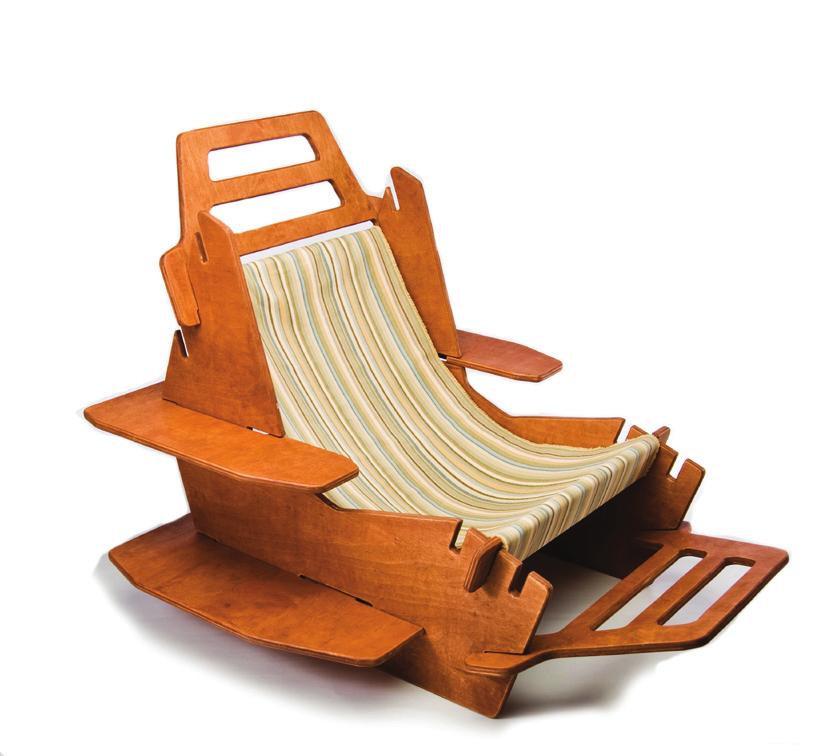
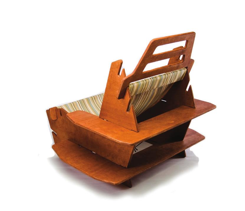
12 to be put on your shoulder for transportation. Taking what I found out through the different packaging I decided to go with a u shape box that would help get over some of the issues that I came across. The pieces of the chair allowed me to create this box that has a handle that s lower to allow the person carrying it be a comfortable standing position without the elbow being bent to lift the package off the ground. This would help put the lifting in your legs and not your arm. The other option that presented itself was the ability to put the chair on top of your shoulder to carry it. Design of the box in this u shape only made the outside dimensions 2 inches wider. After deciding on the shape of the box I had to go about the design of what s on the package. Knowing my direction of the packaging which is a clean contemporary design that has emphases on the product, I started to think of ways that the product photography could benefit with the packaging. Playing off the shape of the package, I decided to photography the chair from a 45-degree angle. This would allow me to place the product photo in a way that plays off the dimensions of the u shape box. Knowing what I wanted before stepping into the studio to do the photography gave me a good basis to start from. Playing off the clean and organized look of contemporary design I decided to photograph the chair on a high key background (Photo, 1-6). This would allow for a white background and minimal ink used when printing. A few of the aspects of the chair that I wanted to focus on through the photography were the textures of the chair. The wood grain, finish, fabric and representing the available adjustments of the chair is what I was focus on in the photo shoot. In the lighting of the chair I was concerned with not creating harsh shadows. To accomplish this I had to set up the lights in a way 9
13 to illuminate the chair from every angle. Working with the shape of the package and photography I began with setting up a grid. Playing of the angles that the box creates and usable open space to apply graphics is where I started. Since the box is not symmetrical, I decided to establish a grid that follows the shape of the box, which would be reversed, on the back of the package. In the design of the package, I wanted to put emphases on the most important things, create a hierarchy in the layout. I wanted to create a flow with the eye from the company name down to the product while using the box shape to my benefit. On the backside of the package I wanted mirror the front while adding some information of the product. An example of this can be seen in the attached image of the package (Package, 4). After designing the package of the product I wanted to bring the rest of the pieces together by following the ideas that I had in the package. Using the white space, photography and type that were established I went on with laying out the poster and bookmark. I wanted to create an intriguing poster to draw the viewer in (Poster, 1). Focused on the product photography, I wanted to bring the viewer closer to read the descriptive type. In the type that s provided on the poster I describe the comfort of the product and a little of the ideals of the company as a selling points. The poster was designed as an advertisement to help gain interests in the product and lead the viewer to gaining further information about the poster. Much like the poster the bookmark is designed to spark interest in the chair produced by Pax and lead you to finding out other information. In the design of 10
14 the bookmark I wanted to create a piece that would be interesting to the audience through its abstract and not overwhelming design (Bookmark, 1). On one side of the bookmark is the furniture company logo, photo of the chair and name of the chair. In designing the back of the bookmark I decided to go two directions, one photography and the other illustration, both pulling off the packaging. 11
15 Chapter IV Summary and Recommendations In my senior project I gained not only experience of marketing a product through design that speaks the same language through out its entirety but also what is involved in amount of work in marketing a product. Looking back on how both Mac and Incase bring themselves together through design and how I design the Tullia s package, poster and bookmark gave me a better understanding of how design can help market a product. Not only marketing a product but also how a company can stand out through design can benefit them. With in the design of the logo I gained a better idea of how to find the correct direction and why it is the correct direction. A few of the directions of the icon I was trying to make something fit and found out it was better to base off my icon off what I had. Basing the icon off the elements of the logo helped bring it together and look more professional. Please refer to the logo development sketches (Logo, 1). The package, which involved the greatest amount of time to develop, helped to gather a better idea of the role of packaging has with a product. Not only protects the product during shipping and individual transportation but helps sell the product in various ways. In addition through doing this project I recognized that stuff markets better using unity through out graphic materials of a corporation. Also not being overwhelming to the audience/consumer in the graphic designed materials helps for a faster read. This is important because their is only a small window of time that a person spends looking at a product before deciding to purchase it or not. A major recommendation that I have would be to do as much research as you can of each 12
16 pieces direction and what you want the audience would gain from it. For example benefits of making the package a certain way for the consumer to easily move the product from the store to inside the home. If I had more time while working on this product it would be good to test it out in the public to see their thoughts. This would help in a better finish of what works in both the packaging and if the design gives off the correct feel of product. In other words testing of the products advertisement to see what is effective and what needs to be improved on. Overall I am happy with what I designed and during the process I found better ways to direct my time, while designing, in better ways. One of the ways that I had to pick up which help is knowing the direction of a piece and knowing where this piece will end up at. 13
17 Bibliography Johnson, David. Color Psychology Pearson Education, Inc. < please.com/spot/colors1.html>

18 Logo, 1 15

19 Logo, 2 16
20 Logo, 3 Logo, 4 17

21 Package, 1 18

22 Package, 2 19
23 Package, 3 20

24 Package, 4 21

25 Comfort is not far away with 9 quick and simple postions 100% organic cotton supports your shoulders and lower spine Shelving for the books you love Constructed out of a single sheet of Stained FSC Birch Maple Veneer Further comfort with the optional footrest Trouble-free assembly with no tools required Disassemble effortless for easy moving For more information visit us at Package, 4 continued 22
26 23

27 Bookmark, 1 Bookmark, 2 24

28 Photo, 1-3 Photo,