Best Practices in Dashboard Design
|
|
|
- Magdalen Gilmore
- 6 years ago
- Views:
Transcription
1 Best Practices in Dashboard Design Dan Bulos
2 Agenda What is a Dashboard? Dashboard Best Practices Dashboard Components Navigation


3 Metaphors Go Only So Far Monitors a Continuous Process At a Glance Gauge Oriented


4 Reporting Spectrum Managed Dashboards Analysis P r o d u c t i o n Customization & Distribution Alternatives Highly Formatted Programmer Developed Tables, Crosstabs, Charts, Graphs Parameter Driven Ease of Development & Usage Paramount Guided Analytics Line Developed Interactive Navigation Depth & Quickness of Analytics Advanced Visualization Staff Developed D i s c o v e r y

5 Dashboard Definition Visual Display of the most important information needed to achieve one or more objectives which fits entirely on a single computer screen so it can be monitored at a glance Information Dashboard Design By Stephen Few


6 What Makes a Good Dashboard Some are Better Than Others
7 Dashboard - Best Practices Key Data/Metrics In Context Dense Information Not Cluttered Single Page Graphically Oriented Zero Learning Curve Access to Supporting Details Highlight Exceptions


8 General Design Considerations Single Page Graphical No Scrolling Nothing Hidden Linked Content All Relevant Info One Place to Look Not Data Driven Better Dashboard Design Displays Patterns Abstract Data Minimal Grids Domain Aware Leverages Knowledge Disparate Data Guided Analytics

9 Key Data/Metrics in Context Key Data/Metrics High level performance metrics Generally tied to goals and bonuses Focus on actionable data Disparate sources Context The 3Ts = Target, Trend, Typical Similar/Related Data/Metrics Basis for interpretation
10 Dense, not Cluttered Dense Information All relevant data/metrics Different perspectives Not Cluttered At a Glance It is not how much, but how well Easy to view, not an eye chart The Visual Display of Quantitative Information Data-Ink Ratio ( Edward R. Tufte ) Non-essential ink should be removed Supporting ink (axis lines) = low visual impact
11 Zero Learning Curve Dashboard viewing is not a person s job Oriented at casual users, line mgt, & execs Little/No accumulated experience Each viewing is the first time Dashboards are not analytical tools But they provide guided analytics Targeted to a Person/Role/Problem Set


12 Exception Oriented Outliers should POP out Highlight Both Problems Opportunities What is an Exception? > 1 Std Dev, 2. Five9s When action needs be taken Visual Cues Color Size Shape Boldness Position Icons


13 Supporting Detail Dashboards are not an end unto themselves Associated Layers Contextual Content Updates Root Cause Analysis Links to New Pages Guided Analytics Hierarchical Drill-Down Ad Hoc Analysis Update Dashboard Webparts Detail Reports

14 Dashboard Components Scorecards Diagrams Grids Charts Gauges Maps Tree Map Decomp Tree And So Much More

15 First a Word on Color Use Color Sparingly Generally Soft Colors Highlighting Bold Colors Different Colors = Different Meaning Try shades of grey Use a Single Hue Increase the intensity for low to high values Remember - 7% of men are color blind A dashboard is not a painting Usefulness is Paramount
16 Grids When to use: Values are familiar Need to lookup a value Small differences are important Mixed units of measure Design Considerations Try to keep square-ish Comparisons are done by column Limit length with Top/Bottom

17 Grid Embellishments Highlights Items of interest Data Bars Helpful to read magnitude Color Scales/Icons Can overwhelm the data Arrows Used for change over time Icons are best used to: Replace data to save space Show variance or score

18 Scorecards Are a special type of grid Created for KPIs and Objectives Can be methodology oriented Balanced Scorecard, 6 Sigma, Used as a navigation aid A list with data Scorecards are less about data and more about process
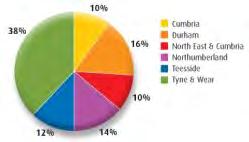
 Pie Charts Part to Whole Only works with small sets Hard to visually quantify A lot of space for not much")
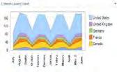
19 Basic Charts Lines Charts Time Series oriented Highlights trend, patterns or variability Highlights relationships between series Trend lines & projections can be added Bar Chart Comparison Oriented Categorical comparisons within a dimension Nominal comparisons across data (sales to cost) Pie Charts Part to Whole Only works with small sets Hard to visually quantify A lot of space for not much data


20 Interlude: Form vs. Function If the dashboard is not visually appealing, people will not go to it If the dashboard is not effective and practical, people will not use it 1 Page 6#s Pretty Yes! Useful? What is fun the first time Might be boring the 100 th time Too Dense?


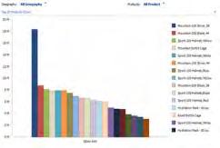
21 Bar Charts Horizontal Long labels Pattern comparisons Long-ish lists Vertical Groups with in groups Stacked and 100% Bars Pareto Charts Doesn t work for large numbers of groups Bars are easily drilled into


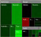
22 Hybrids Charts in Grids Great Data-Ink Ratio Effective Mixing Of Charts & Values Introduction of Sparklines & Bullet Graphs


23 Bullet Graphs A bullet graph is a variation of a bar graph developed by Stephen Few. Seemingly inspired by the traditional thermometer charts and progress bars found in many dashboards, the bullet graph serves as a replacement for dashboard gauges and meters Symmetry s Variation Sales Costs Black Bar = Value Green/Red Bar = Target Blue Pointer = Last Year


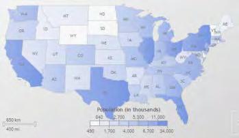
24 Maps Useful in showing regional components Maps are great for demographics Maps are highly specialized Be careful of charts within a map Impact grids can be effective


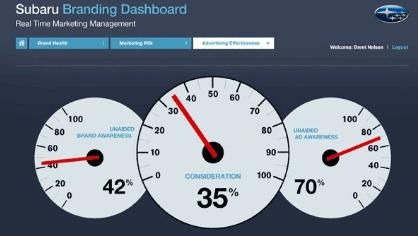
25 Gauges Hard to set gauge scale for the general case When using a set of gauges expected value should be straight up Best for continuous process Poor Data-Ink Ratio


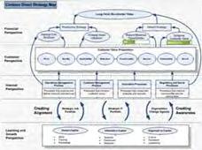
26 Diagrams Balanced Scorecard Strategy Map Process Diagram Diagrams are underutilized Graphical Representations Impact Diagram Root Cause/Fishbone Diagram
27 Graphical Excellence Show the data Focus on the substance of the numbers Don t distort the data Present many numbers in a small space Encourage comparisons Show data in several perspectives The Visual Display of Quantitative Information Edward R. Tufte
28 Screen Layout Number of Frames Up to 4 is good, no more than 6 Frame Proportions Size = implied importance Uniform otherwise Location Top left = primary focus Bottom right = supporting detail Off page = irrelevant Printing The dirty little secret
29 Frame Options Different frame on same page Must fit on the page Can drill from here to new page New page in same browser Easy to get back Full page available New browser tab/window Allows for comparisons Users must close windows/tabs


30 Navigation Framework A tiered set of dashboards based on role or function A set of grids, graphs, or visualizations that examine a single metric A set of detailed reports or ad-hoc analytics
31 Navigation Identify the key dimensions for the metric Customer, product, department Drill into one or more of these Top 10 rankings Identify the audience Marketing manager Drill to product Sales Manager Drill to customer
32 Navigation - What to Show
33 Microsoft Software Components Reporting Services Formal report view Highly formatted Performance Point Server Analytical Charts and Graphs Less control over format Built in Slice and Dice Excel Services Shared user-created content Fast changing
34 Summary Choose the right tool for the job Simple is better Conserve your screen real estate Use color to highlight Put focus on the data not the decoration
35 Symmetry Founded in 1986 Experienced Consultants Each with over 15 years of BI experience Microsoft Relationship Gold Certified Partner Microsoft-nominated BI Partner Advisory Council member since 1999 Licensed Technology to Microsoft SQL Server Accelerator for BI Internal Microsoft Consulting SQL Server PerformancePoint Server Internal departmental BI application development

36 Resources Show Me the Numbers: Designing Tables and Graphs to Enlighten Stephen Few Information Dashboard Design: The Effective Visual Communication of Data Stephen Few The Visual Display of Quantitative Information, 2nd edition Edward R. Tufte Symmetry Corp
37 Questions?
Data Visualization. Prof.Sushila Aghav-Palwe
 Data Visualization By Prof.Sushila Aghav-Palwe Importance of Graphs in BI Business intelligence or BI is a technology-driven process that aims at collecting data and analyze it to extract actionable insights
Contents Getting Started... 7 Sample Dashboards... 12
 P6 Analytics Reference Manual Release 3.4 September 2014 Contents Getting Started... 7 About P6 Analytics... 7 Prerequisites to Use Analytics... 8 About Analyses... 9 About... 9 About Dashboards... 10
P6 Analytics Reference Manual
 P6 Analytics Reference Manual Release 3.2 December 2013 Contents Getting Started... 7 About P6 Analytics... 7 Prerequisites to Use Analytics... 8 About Analyses... 9 About... 9 About Dashboards... 10
Data Visualization. Non-Programming approach to Visualize Data
 Data Visualization Non-Programming approach to Visualize Data Dr. Omer Ayoub Senior Data Scientist, House of Mathematical and Statistical Sciences, King Abdul Aziz Univerrsity, Jeddah, Saudi Arabia Dr.
REPORT BUILDER AND PERFORMANCEPOINT 2013 COMBO PACK
 CENTER OF KNOWLEDGE, PATH TO SUCCESS Website: REPORT BUILDER AND PERFORMANCEPOINT 2013 COMBO PACK Course: 55060A; Duration: 5 Days; Instructor-led WHAT YOU WILL LEARN This five-day instructor-led course
Contents Getting Started... 9 Sample Dashboards... 17
 Analytics Reference Guide 16 R1 March 2016 Contents Getting Started... 9 About Oracle Primavera Analytics... 10 Prerequisites to Use Primavera Analytics... 11 About Analyses... 11 About s... 12 About
REPORT BUILDER AND PERFORMANCEPOINT 2010 COMBO PACK
 CENTER OF KNOWLEDGE, PATH TO SUCCESS Website: REPORT BUILDER AND PERFORMANCEPOINT 2010 COMBO PACK Course: 55059A; Duration: 5 Days; Instructor-led WHAT YOU WILL LEARN This five-day instructor-led course
Introduction. Netwoven, Inc. 1
 Introduction According to Gartner Group, Business Intelligence is still an area where considerable investment is being made by companies to maximize their investments and get the most return. Microsoft
HORIZON Business Intelligence
 HORIZON Business Intelligence The Art of Analysis Ryan Hodges, HORIZON 360 BI Development Manager 5/22/2017 Objective Apply the tools of an artist to the work of a data analyst Art Color Form Flow Narrative
SharePoint 2013 Business Intelligence
 SharePoint 2013 Business Intelligence 55042; 4 Days, Instructor-led Course Description This 4-day instructor-led course provides students with the necessary knowledge to work with all the associated SharePoint
Microsoft Dynamics NAV
 Microsoft Dynamics NAV Maximising value through business insight Business Intelligence White Paper November 2016 CONTENTS Reports were tedious. Earlier it would take days for manual collation. Now all
DATA MANAGEMENT BASICS. July 19, 2017 September 8, 2017
 DATA MANAGEMENT BASICS July 19, 2017 September 8, 2017 OBJECTIVES Enthuse evaluative thinking Encourage performance measurement Build knowledge of concepts related to: o Data collection o Data analysis
Leveraging Data. Data Visualization Best Practices
 Leveraging Data Data Visualization Best Practices 1 Introductions Greg Kiefer Kiefer Consulting, Inc. Chris Hughes Oracle Bradley Burch Kiefer Consulting, Inc. Paul Flanigan California Department of Motor
Customize your data visualizations with Power BI
 Customize your data visualizations with Power BI Take your reports to the next level. Follow our step-by-step guide and get useful tips for making the most of your data Paweł Szczecki Predica s CEO Expert
Microsoft SharePoint 2013 Business Intelligence
 1800 ULEARN (853 276) www.ddls.com.au Microsoft 55042 - SharePoint 2013 Business Intelligence Length 3 days Price $2750.00 (inc GST) Version A Overview This three-day instructor-led course provides students
INTELLIGENCE. Transforming Industrial Data into Actionable Information PRODUCT DATASHEET
 Transforming Industrial Data into Actionable Information People, processes, and devices every day they generate masses of time-series and plant-floor transactional data, yet without operational and business
Intelligence. Transforming Industrial Data into Actionable Information
 Intelligence Transforming Industrial Data into Actionable Information People, processes, and devices every day they generate masses of time-series and plant-floor transactional data, yet without operational
Make the Smartest Decisions at the Right Time!
 Where do I stand on my Profit for the current month and year?? What percentage of turnover is generated through new clients over the past one year?? What cost head accounts for most of my Expenses?? How
Excel 2011 Charts - Introduction Excel 2011 Series The University of Akron. Table of Contents COURSE OVERVIEW... 2
 Table of Contents COURSE OVERVIEW... 2 DISCUSSION... 2 OBJECTIVES... 2 COURSE TOPICS... 2 LESSON 1: CREATE A CHART QUICK AND EASY... 3 DISCUSSION... 3 CREATE THE CHART... 4 Task A Create the Chart... 4
Data Visualization and Dashboard Projects. Quickstart Guide
 Data Visualization and Dashboard Projects Quickstart Guide Introduction So, you re launching a data visualization and dashboards project? Not to worry, this quick guide will help you understand the best
9º Encuentro Danysoft en Microsoft º Encuentro Danysoft en Microsoft
 SharePoint is the business collaboration platform for the enterprise and the Internet SharePoint enables Deliver the best productivity experience Cut costs with a unified infrastructure Rapidly adapt to
SharePoint 2013 PerformancePoint Services
 SharePoint 2013 PerformancePoint Services Course 55057; 3 Days, Instructor-led Course Description This three-day instructor-led course provides students with the necessary knowledge to work with PerformancePoint
State Analytical Reporting System (STARS)
") Table of Contents Human Resources Analytics Dashboards and Reports... 3 WORKFORCE DEPLOYMENT... 4 WORKFORCE DEMOGRAPHICS... 8 COMPENSATION... 11 RETENTION... 16 TIME AND LABOR ANALYSIS... 21 ACCRUAL...
Table of Contents Human Resources Analytics Dashboards and Reports... 3 WORKFORCE DEPLOYMENT... 4 WORKFORCE DEMOGRAPHICS... 8 COMPENSATION... 11 RETENTION... 16 TIME AND LABOR ANALYSIS... 21 ACCRUAL...
"Charting the Course... MOC B PerformancePoint 2010 Designing and Implementing Scorecards and Dashboards Course Summary
 Course Summary Description This instructor-led course provides students with the necessary knowledge to develop Scorecards and Dashboards using PerformancePoint 2010 in their own work environment. The
SharePoint 2013 Business Intelligence
 SharePoint 2013 Business Intelligence Duration: 5 Days Course Code: M55042 Overview: This three-day instructor-led course provides students with the necessary knowledge to work with all the associated
Determining Effective Data Display with Charts
 Determining Effective Data Display with Charts 1 Column Line Pie Stock XY (Scatter) Area Bubble Chart Types Covered 2 1 Visualizing Data 3 Data Graphics Principles 4 2 Data Graphics Principles Above all
20. Alternative Ranking Using Criterium Decision Plus (Multi-attribute Utility Analysis)
") The selection of the preferred alternative, using a structured decision process, begins with creation of the decision hierarchy. The hierarchy is the clear organization of the goal, listing of categories
The selection of the preferred alternative, using a structured decision process, begins with creation of the decision hierarchy. The hierarchy is the clear organization of the goal, listing of categories
VISUAL BI EXTENSIONS (VBX) FOR SAP LUMIRA DESIGNER
 FOR SAP LUMIRA DESIGNER") VISUAL BI EXTENSIONS (VBX) FOR SAP LUMIRA DESIGNER Product Roadmap Gopal Krishnamurthy Founder/CEO, Visual BI Solutions www.visualbi.com 2018 Visual BI Solutions, Inc. All rights reserved. Friday March
VISUAL BI EXTENSIONS (VBX) FOR SAP LUMIRA DESIGNER Product Roadmap Gopal Krishnamurthy Founder/CEO, Visual BI Solutions www.visualbi.com 2018 Visual BI Solutions, Inc. All rights reserved. Friday March
CREATE INSTANT VISIBILITY INTO KEY MANUFACTURING METRICS
 CREATE INSTANT VISIBILITY INTO KEY MANUFACTURING METRICS The QualityWorX Dashboard provides the most comprehensive, easy-to-use reporting platform for production and quality management in the industry.
Scorecarding with IBM Planning Analytics
 Scorecarding with IBM Planning Analytics Elevating the role of metrics in high-participation planning Highlights Link high-participation planning, budgeting and forecasting processes to actual performance
Oracle Utilities Analytics Dasboards for Distribution Analytics, Outage Analytics
 Oracle Utilities Analytics Dasboards for Distribution Analytics, Outage Analytics Metric Reference Guide Release 2.5.2 E49006-06 August 2015 Oracle Utilities Analytics Dasboards for Distribution Analytics,
Analyze This! Actionable Information for Your Managers
 Analyze This! Actionable Information for Your Managers Mark McClenahan Product Owner, Development 2016 Epicor Software Corporation Mark McClenahan Product Owner, Development 17 years with Epicor Has experience
Oracle Revenue Management and Billing Product Manager s Workbench. User Guide. Version Revision 1.1. E December, 2018
 Oracle Revenue Management and Billing Product Manager s Workbench Version 2.7.0.0.0 User Guide Revision 1.1 E88591-01 December, 2018 Copyright 2017, Oracle and/or its affiliates. All rights reserved. 1
Sage 200c Business Intelligence Datasheet
 Sage 200c Business Intelligence Datasheet Business Intelligence provides you with full business wide analytics to enable you to make fast, informed decisions, complete with management dashboards. It helps
Seven Basic Quality Tools. SE 450 Software Processes & Product Metrics 1
 Seven Basic Quality Tools SE 450 Software Processes & Product Metrics 1 The Seven Basic Tools Checklists (Checksheets) Pareto Diagrams Histograms Run Charts Scatter Diagrams (Scatter Plots) Control Charts
points in a line over time.
 Chart types Published: 2018-07-07 Dashboard charts in the ExtraHop system offer multiple ways to visualize metric data, which can help you answer questions about your network behavior. You select a chart
Become a PowerPoint Guru [Sample Chapters]
![Become a PowerPoint Guru [Sample Chapters]](/thumbs/73/68573509.jpg "Become a PowerPoint Guru [Sample Chapters]") Become a PowerPoint Guru [Sample Chapters] Learn How to Create Effective Presentations By Dave Tracy dave@learnppt.com Thank you for your interest in my ebook. This PDF includes a sampling of content from
Become a PowerPoint Guru [Sample Chapters] Learn How to Create Effective Presentations By Dave Tracy dave@learnppt.com Thank you for your interest in my ebook. This PDF includes a sampling of content from
GYANVRIKSH INTERACTIVE PVT LTD III Foor, QZ Plaza, Opp Haveli Restaurant, Kothaguda, Kondapur Hyderabad , &
 Introduction and Getting Started (Desktop & Server) Why Tableau? History of Tableau Products of Tableau Tableau Desktop Tableau Server Tableau Public Tableau Online Tableau Reader Architecture of Tableau
START Saratoga Taking Action and Report Tool Help Document
 www.pwc.com/workforce-analytics START Saratoga Taking Action and Report Tool Help Document Table of contents Introduction...1 Dashboard... 2 Common report features... 3 Metrics... 5 Contact for Further
COURSE SYLLABUS COURSE TITLE:
 1 COURSE SYLLABUS COURSE TITLE: FORMAT: CERTIFICATION EXAMS: 50596A Dashboards for Monitoring, Analyzing, and Managing Instructor-led None This course syllabus should be used to determine whether the course
Quantitative Methods. Presenting Data in Tables and Charts. Basic Business Statistics, 10e 2006 Prentice-Hall, Inc. Chap 2-1
 Quantitative Methods Presenting Data in Tables and Charts Basic Business Statistics, 10e 2006 Prentice-Hall, Inc. Chap 2-1 Learning Objectives In this chapter you learn: To develop tables and charts for
Microsoft Office PerformancePoint Server 2007 End-to-End
 Microsoft Office PerformancePoint Server 2007 End-to-End Course 50141 - Five Days - Instructor-led - Hands on Written and delivered by industry experts, this five-day course provides students with the
Welcome to the topic on the analytic content and applications that are made possible in SAP Business One version by running on SAP HANA.
 Welcome to the topic on the analytic content and applications that are made possible in SAP Business One version by running on SAP HANA. 1 At the end of this course, you will be able to describe the reporting
Capacity Management - Telling the story
 Capacity Management - Telling the story What is a Story? It is either: a. an account of incidents or events b. a statement regarding the facts pertinent to a situation in question Data is nothing more
CRM Business Intelligence Wizard for Dynamics 365
 CRM Business Intelligence Wizard for Dynamics 365 Course Level: 200 This class reviews the unique CRM reporting capabilities of Advanced Find views & charts, reports using the built-in report wizard, custom
Making Data Beautiful for Business Users Tips for Creating Rich, Visual, and Actionable User Experiences
 Making Data Beautiful for Business Users Tips for Creating Rich, Visual, and Actionable User Experiences David Stodder Director of Research for Business Intelligence TDWI September 23, 2014 Sponsor 2 Speakers
Data Visualization Best Practices. Tim Vlamis Friday, March 10, 2017 NCOAUG Winter Training
 Data Visualization Best Practices Tim Vlamis Friday, March 10, 2017 NCOAUG Winter Training Day @VlamisSoftware Vlamis Software Solutions Vlamis Software founded in 1992 in Kansas City, Missouri Developed
Displaying information in SharePoint Using Excel Services, Reporting Services and PerformancePoint
 Displaying information in SharePoint Using Excel Services, Reporting Services and PerformancePoint SharePoint Saturday Washington DC August 11, 12 & 13, 2011 Agenda Many SharePoint users and developers
Project and Portfolio Management Center
 Project and Portfolio Management Center Software Version: 9.42 Portfolio Management Configuration Guide Go to HELP CENTER ONLINE http://admhelp.microfocus.com/ppm/ Document Release Date: September 2017
Sage 200 Business Intelligence Datasheet
 Sage 200 Datasheet comes as standard as part of Sage 200 giving you a unified and integrated view of important data, with complete management dashboards, and analysis. Sage 200 helps you to make better
Realizing the Power of Microsoft Reporting
 Realizing the Power of Microsoft Reporting SQL Saturday #187 - Richmond 1118 West Main Street Richmond, Virginia 23230 804.355.0511 2012 CapTech Ventures, Inc. IT Management Consulting Systems Integration
MS-20466: Implementing Data Models and Reports with Microsoft SQL Server
 MS-20466: Implementing Data Models and Reports with Microsoft SQL Server Description The focus of this five-day instructor-led course is on creating managed enterprise BI solutions. It describes how to
Oracle Utilities Analytics Dashboards for Customer Analytics, Revenue Analytics, and Credit & Collections Analytics
 Oracle Utilities Analytics Dashboards for Customer Analytics, Revenue Analytics, and Credit & Collections Analytics Release 2.5.0.0.1 E49003-02 February 2014 Oracle Utilities Analytics Dashboards for Customer
INTRODUCTION
 INTRODUCTION As more organizations are storing their business information via web services, Executive Dashboards are becoming a popular way for C Level executives to manage information and programs across
CAREER MANAGER, CAREER MANAGER SENIOR LEADER, VP OR PARTNER, HR TALENT CONSULTANT AND EXCEPTION APPROVER
 CAREER MANAGER, CAREER MANAGER SENIOR LEADER, VP OR PARTNER, HR TALENT CONSULTANT AND EXCEPTION APPROVER SALARY PLANNING (PROPOSE AND APPROVE MERIT, MSA, MERIT LUMP SUM INCREASES) Career managers with
DETAILED COURSE AGENDA
 DETAILED COURSE AGENDA Dynamics 365 University: Business Intelligence Wizard Detailed Agenda Course Level: 200 Microsoft Dynamics CRM Online offers powerful reporting and analytics. This class will review
Oracle Utilities Analytics Dashboards for Operational Device Analytics
 Oracle Utilities Analytics Dashboards for Operational Device Analytics Release 2.5.1 Service Pack 1 E49008-04 November 2014 Oracle Utilities Analytics Dashboards for Operational Device Analytics E49008-04
Chart Recipe ebook. by Mynda Treacy
 Chart Recipe ebook by Mynda Treacy Knowing the best chart for your message is essential if you are to produce effective dashboard reports that clearly and succinctly convey your message. M y O n l i n
Selecting the Right SAP BusinessObjects BI Client Product Based on Your Business Requirements for SAP BW Customers
 Product Based on Your Business Requirements for SAP BW Customers Ingo Hilgefort Director Solution Management Disclaimer This presentation outlines our general product direction and should not be relied
Extreme Makeover: Reporting Edition Seven reporting strategies to deliver action! Prepared for NLIT 2018
 Extreme Makeover: Reporting Edition Seven reporting strategies to deliver action! Prepared for NLIT 2018 Table of Contents Agenda About the Presenters and Grant Thornton Challenge: Current Status Quo Applied
User s Guide. (c) worksample by William Blank, technical writer, C-Secure Scorecard Balanced Performance Management System:
 worksample by William Blank, technical writer, C-Secure Scorecard Balanced Performance Management System:") unenduser.fm Page 1 Friday, January 24, 2003 9:52 AM C-Secure Scorecard Balanced Performance Management System: User s Guide Introduction The C-Secure SCORECARD Balanced Performance Management System provides
unenduser.fm Page 1 Friday, January 24, 2003 9:52 AM C-Secure Scorecard Balanced Performance Management System: User s Guide Introduction The C-Secure SCORECARD Balanced Performance Management System provides
Michael Weilant, FSA, MAAA,
 How to drive in the fast lane: Management Dashboards Actuaries Club of the Southwest AUSTIN 2009 Jean-Marc Fix, FSA, MAAA VP, Research & Development Optimum Re Insurance Acknowledgement Thanks to Michael
Why Reporting in Dynamics AX2012 is Difficult and what you can do about it
 Why Reporting in Dynamics AX2012 is Difficult and what you can do about it Written By: Gina Pabalan Director, Data & Analytics https://www.linkedin.com/in/ginapabalan Reporting in the Context of an ERP
HR Business Partner Guide
 HR Business Partner Guide March 2017 v0.1 Page 1 of 10 Overview This guide is for HR Business Partners. It explains HR functions and common actions HR available to business partners and assumes that the
Transform data into insight and action with Adaptive BI
 Transform data into insight and action with Adaptive BI Making Technology Work Project Portfolio Management Do the right projects, do them right Modern Intranet Synergize, organize and innovate with an
White Paper. Microsoft PerformancePoint Server 2007 Monitoring and Analytics CTP2
 White Paper Microsoft PerformancePoint Server 2007 Monitoring and Analytics CTP2 June 2007 Executive Summary Business intelligence (BI) delivers on a simple promise: improved business performance by delivering
Can Advanced Analytics Improve Manufacturing Quality?
 Can Advanced Analytics Improve Manufacturing Quality? Erica Pettigrew BA Practice Director (513) 662-6888 Ext. 210 Erica.Pettigrew@vertexcs.com Jeffrey Anderson Sr. Solution Strategist (513) 662-6888 Ext.
Data Direct Introduction. Version: 2.0
 Version: 2.0 Table of Contents 1 Document History... 4 2 Acronyms and Definitions... 4 3 Data Direct... 5 3.1 Data Analysis and Reporting... 5 3.2 Data Direct Architecture... 5 3.3 Hosting... 6 3.4 Licensing...
Oracle BI 11g R1: Create Analyses and Dashboards
 Oracle University Contact Us: + 38516306373 Oracle BI 11g R1: Create Analyses and Dashboards Duration: 5 Days What you will learn This Oracle BI 11g R1: Create Analyses and Dashboards course for Release
BRAND MONITORING SYSTEM
 BRAND MONITORING SYSTEM THE CLIENT PROBLEM Most corporations run brand tracking surveys with consumers regularly. However as historical data grows in volume across categories, it becomes more difficult
Plant Performance. Product Data Sheet Plant Performance November 2011 Page 1
 November 2011 Page 1 The icis Application allows for Web based plant performance analysis and cycle time results direct from your desktop browser. The application contains numerous features such as: Connection
Contents Working with Oracle Primavera P6 EPPM, P6 Analytics, and P6 Reporting Database... 5 For More Information Legal Notices...
 P6 EPPM and P6 Analytics System Architecture Data Sheet R3.4 September 2014 Contents Working with Oracle Primavera P6 EPPM, P6 Analytics, and P6 Reporting Database... 5 About P6 Analytics... 6 About Oracle
Fast Start. prorm Fast Start. User Guide. promx AG Nordring Nuremberg
 Fast Start prorm Fast Start User Guide promx AG Nordring 100 90409 Nuremberg E-Mail: sales@promx.net 2 Table of Contents 1. Introduction 5 1.1 About prorm Fast Start 5 1.2 prorm Fast Start Navigation 5
Solution Architect with 18 years experience in business, visual production and technology. AIIM Certified Enterprise Content Management Practitioner
 Solution Architect with 18 years experience in business, visual production and technology. AIIM Certified Enterprise Content Management Practitioner Currently IT Project Manager & SharePoint Architect
Fast Start. prorm Fast Start. User Guide. promx GmbH Nordring Nuremberg
 Fast Start prorm Fast Start User Guide promx GmbH Nordring 100 90409 Nuremberg E-Mail: sales@promx.net 2 Table of Contents 1. Introduction 5 1.1 About prorm Fast Start 5 1.2 prorm Fast Start Navigation
Digital Dashboards: Best Practices and Lessons Learned
 Digital Dashboards: Best Practices and Lessons Learned March 18, 2013 Martin Schneiderman President Information Age Associates 47 Murray Place Princeton, NJ 0540 USA mbs@iaa.com www.iaa.com 609-924-6936
Key Performance Indicator (KPI) Visualization Tools for Lean Manufacturing Facilities
 Visualization Tools for Lean Manufacturing Facilities") Key Performance Indicator (KPI) Visualization Tools for Lean Manufacturing Facilities As a production process becomes more complex, the availability and exchange of information become more critical to
Key Performance Indicator (KPI) Visualization Tools for Lean Manufacturing Facilities As a production process becomes more complex, the availability and exchange of information become more critical to
PeopleSoft v9.2. Human Capital Management Highlights and Enhancements. Rocky Mountain RUG March 6, 2014
 PeopleSoft v9.2 Human Capital Management Highlights and Enhancements Rocky Mountain RUG March 6, 2014 Agenda About SpearMC and Your Presenter PeopleSoft v9.2 HCM Highlights and Enhancements General Enhancements
Pg Alliance Data
 Pg. Speaker Biography Brock Dietrich has been at Alliance Data for 19 years, with his first 10 years in the Credit Risk Analytics organization before moving into a variety of Information Technology roles.
IBM Planning Analytics Express
 Performance management and business intelligence for midsize organisations IBM Planning is a performance management (PM) and business intelligence (BI) solution for midsize organisations. It delivers the
DASHBOARDS, INFOGRAPHICS & EXECUTIVE SUMMARIES
 DASHBOARDS, INFOGRAPHICS & EXECUTIVE SUMMARIES AGENDA Context Dashboards Infographics Executive Summaries Questions OPEN & TRANSPARENT DASHBOARDS DASHBOARDS Single Screen Visual Objective Specific
Data Visualization In Oracle Business Intelligence 11g
 Data Visualization In Oracle Business Intelligence 11g Heartland OUG October 20, 2011 Dan Vlamis and Tim Vlamis Vlamis Software Solutions 816-781-2880 http://www.vlamis.com Copyright 2011, Vlamis Software
BP(A S) Taleo Performance User Guide
 Taleo Performance User Guide") BP(A S) Taleo Performance User Guide January 2008 Confidential Information It shall be agreed by the recipient of the document (hereafter referred to as "the other party") that confidential information
BP(A S) Taleo Performance User Guide January 2008 Confidential Information It shall be agreed by the recipient of the document (hereafter referred to as "the other party") that confidential information
Exploring Microsoft Office Excel 2007
 Exploring Microsoft Office Excel 2007 Chapter 3: Charts: Delivering a Message Robert Grauer, Keith Mulbery, Judy Scheeren Committed to Shaping the Next Generation of IT Experts. Copyright 2008 Prentice-Hall.
Multi-Dimensional Representations -- How Many Dimensions? Cluster Stack Visualization for Market Segmentation Analysis
 Multi-Dimensional Representations -- How Many Dimensions? Cluster Stack Visualization for Market Segmentation Analysis William Wright Oculus Info Inc. An earlier version of this paper appeared in the Symposium
IT117: Microsoft Power Business Intelligence
 IT117: Microsoft Power Business Intelligence IT117 Rev.001 CMCT COURSE OUTLINE Page 1 of 9 Training Description: This five-day instructor-led course is a complete high-level tour of the Microsoft Business
Implementing Data Models and Reports with Microsoft SQL Server
 20466 - Implementing Data Models and Reports with Microsoft SQL Server Duration: 5 Days Course Price: $2,975 Software Assurance Eligible Course Description Note: This course is designed for customers who
Data Visualization for Oracle BI 12c and Visual Analyzer. Tim Vlamis Thursday, December 7, 2017 New York Oracle User Group
 Data Visualization for Oracle BI 12c and Visual Analyzer Tim Vlamis Thursday, December 7, 2017 New York Oracle User Group Conference @VlamisSoftware Vlamis Software Solutions Vlamis Software founded in
SAS Human Capital Management 5.2
 SAS Human Capital Management 5.2 User s Guide SAS Documentation The correct bibliographic citation for this manual is as follows: SAS Institute Inc. 2010. SAS Human Capital Management 5.2: User s Guide.
Move from insight to action with interactive, self-service dashboards
 Move from insight to action with interactive, self-service dashboards Featuring Research From Gartner Introduction INSIDE THIS ISSUE Introduction... 1 Tips for Implementers: The Basics of Good Dashboard
COURSE SYLLABUS COURSE TITLE:
 BLUE BUFFALO PRESS LLC 50561A VISUALIZING SHAREPOINT BUSINESS INTELLIGENCE WITH NO CODE 1 COURSE SYLLABUS COURSE TITLE: FORMAT: CERTIFICATION EXAMS: 50561A Visualizing SharePoint Business Intelligence
Bar graph or Histogram? (Both allow you to compare groups.)
") Bar graph or Histogram? (Both allow you to compare groups.) We want to compare total revenues of five different companies. Key question: What is the revenue for each company? Bar graph We want to compare
Bar graph or Histogram? (Both allow you to compare groups.) We want to compare total revenues of five different companies. Key question: What is the revenue for each company? Bar graph We want to compare
Why Learn Statistics?
 Why Learn Statistics? So you are able to make better sense of the ubiquitous use of numbers: Business memos Business research Technical reports Technical journals Newspaper articles Magazine articles Basic
IBM Cognos Business Intelligence Version Getting Started Guide
 IBM Cognos Business Intelligence Version 10.2.2 Getting Started Guide Note Before using this information and the product it supports, read the information in Notices on page 51. Product Information This
Business Intelligence and Process Modelling
 Business Intelligence and Process Modelling F.W. Takes Universiteit Leiden Lecture 3: Business Intelligence & Visual Analytics BIPM Lecture 3: Business Intelligence & Visual Analytics 1 / 72 Business Intelligence
DIGITAL VERSION. Microsoft EXCEL Level 2 TRAINER APPROVED
 DIGITAL VERSION Microsoft EXCEL 2013 Level 2 TRAINER APPROVED Module 4 Displaying Data Graphically Module Objectives Creating Charts and Graphs Modifying and Formatting Charts Advanced Charting Features
TABLE OF CONTENTS ! +
 TABLE OF CONTENTS MEANINGFUL DASHBOARDS... 2 What is a Dashboard?... 2 Where are Dashboards Used?... 4 The Market View... 6 What Should You Look For?... 7 The Key Benefits... 9 Creating Meaningful Dashboards
Oracle Financial Services Revenue Management and Billing Relationship Manager s Workbench. User Guide. Version Revision 1.
 Oracle Financial Services Revenue Management and Billing Relationship Manager s Workbench Version 2.7.0.0.0 User Guide Revision 1.1 E88546-01 July, 2018 Copyright 2018, Oracle and/or its affiliates. All
Salient Interactive Miner 4.x
 Salient Interactive Miner 4.x Getting Started Getting Started in 6 Easy Steps Working with Salient Analyses Knowledge Manager Technology Summary Salient Interactive Miner Designed to Work the Way You Think
Jose Hernandez Director of Business Intelligence Dunn Solutions Group. Natasha Kishinevsky Business Intelligence Manager Dunn Solutions Group
 Jose Hernandez Director of Business Intelligence Dunn Solutions Group Natasha Kishinevsky Business Intelligence Manager Dunn Solutions Group Agenda Quick Introduction Setting the Stage: SAP BI Mobile What