I214 Repor ting quantitative data
|
|
|
- Joseph Woods
- 5 years ago
- Views:
Transcription
1 I214 Repor ting quantitative data November 4, 2008 (with thanks to Gary Kass and Edward Tufte)
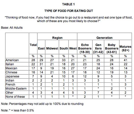
2 Why graphs? Ex: The Harris Poll #100, Oct 15, 2007 American adults have their choice of many different cuisines From pasta to burritos, the choices are almost endless. But what do Americans choose when eating out? American food, of course! Over one-quarter (28%) of U.S. adults say A merican food is what they are most likely to choose if they had the choice to go out to a restaurant and eat one type of food. Just under one-quarter (22%) say that they would most likely choose Italian while 17 percent would choose Mexican while 16 percent would choose Chinese if they had the choice to go out to a restaurant. Japanese is the next choice as seven percent say they would choose this type of cuisine. Much further down the list are Indian (2% say they would choose) and then French and Middle Eastern cuisine (1% would choose each). Finally, four percent say they would choose another type of food. or
3
4 Reporting results the easy way exact questions and answers SE9. How confident do you feel about your own searching abilities when using a search engine to find information online? Based on Internet users who have a used a search engine [N=1,165] % 48 Very confident 44 Somewhat confident 6 Not too confident 2 Not confident at all * Don t know/refused
5 Tabular displays Comparing dependent to independent variables Undergrads % n=120 Grads % n=200 Total % n=320 Satisfied 60 N=71 13 N=25 31 N=96 Dissatisfied 40 N=47 87 N= N=127 Total 100 n = n = n = 308 No ans. n = 2 n = 10 n= 12

6 Good information graphics Efficient minimizing non-data ink Meaningful displaying information relevant to the argument Unambiguous Self-explanatory, or at least difficult to misread
7 5 principles from E. Tufte Above all else show the data Maximize the data-ink ratio Erase non-data-ink, within reason Erase redundant data-ink Revise and edit Visual Display of Quantitative Information, p 103 and 105

8 Components of a chart labeling Title axis titles and labels legends notes scales of X, Y axis graphic representations of data


9 Area chart How the dependent relationship of parts of a whole varies over an independent variable Percentage: sum of the two always represents 100% Cumulative: sum varies according to elements
10 Column or bar Change within small data sets that vary over a nominal (ie, category) or interval scale Column: vertical rectangles Bar: horizontal

11 Seg mented column A column chart that represents the part-whole relationships of elements

12 Frequency pol ygo n; Histo gram Overall shape represents distribution of elements

13 Line charts Used to interpolate between data points and extrapolate future values Trends or change over time Looking for correlations between variables Lines: Connect "real" data points Curves: represent functional relations between data points or to interpolate data X must have numerical values!

14 Pie chart Good for displaying approximate percentages at a single point in time Caution: Makes exact comparisons difficult You cannot necessarily compare pie charts to each other Maybe use a bar chart instead?

15 Scatterpl ot One dimensional Show measurements over time Two-dimensional Convey an overall impression of the relation between two variables Some caution: Not good for following trends Should not be used with more than one independent variable
16 Analysis Polls including mobile phones Looking for significant differences across important groups Looking for correlation inferring causality

17 Maps Placing data on physical space
. graphic: www.uxmatters.")
18 Representi ng change with small multiples Small multiples Graphical depictions of variable information that share context, but not content. Edward Tufte Tufte, E. Envisioning Information. Cheshire, CT: Graphics Press (1990). graphic:
19 Reporting guidelines The reader should be able to reconstruct what you did Show the question Table 1: Opinion on food Are you satisfied or disssatisfied with the bagels at the Free Speech Movement Café? Satisfied Dissatisfied Undergrads % n= N=71 40 N=47 Grads % n= N=25 87 N=165 Total % n= N=96 69 N=127 Include all data ie, percentages and numbers of respondents Total No ans. 100 n = 118 n = n = 190 n = n = 308 n= 12

20 Reporting: last words Graphics are visual metaphors. They are rhetoric. Do you know the story you want to tell? the story your audience is seeing?
21 Appendix A: Good places to look for example reports Pew Internet pp. i- iv "What Do Americans Do on the Internet? Appendix B Harris Interactive Poll Stanford Time Study
Determining Effective Data Display with Charts
 Determining Effective Data Display with Charts 1 Column Line Pie Stock XY (Scatter) Area Bubble Chart Types Covered 2 1 Visualizing Data 3 Data Graphics Principles 4 2 Data Graphics Principles Above all
MAT 1272 STATISTICS LESSON Organizing and Graphing Qualitative Data
 MAT 1272 STATISTICS LESSON 2 2.1 Organizing and Graphing Qualitative Data 2.1.1 Raw Data Raw Data Data recorded in the sequence in which they are collected and before they are processed or ranked are called
Observations from the Winners of the 2013 Statistics Poster Competition Praise and Future Improvements
 Observations from the Winners of the 2013 Statistics Poster Competition Praise and Future Improvements Jürgen Symanzik*, Utah State University, Department of Mathematics and Statistics, Logan, UT 84322-3900,
Image Construction Rules for Visualizing the Non-Visual Managerial Data
 Image Construction Rules for Visualizing the Non-Visual Managerial Data Dr. Ping Zhang School of Information Studies Syracuse University, Syracuse, NY 13244 pzhang@syr.edu Data representations and their
Computing Descriptive Statistics Argosy University
 2014 Argosy University 2 Computing Descriptive Statistics: Ever Wonder What Secrets They Hold? The Mean, Mode, Median, Variability, and Standard Deviation Introduction Before gaining an appreciation for
CHAPTER 2 SECTION 2: GRAPHICAL AND TABULAR DESCRIPTIVE TECHNIQUES
 CHAPTER 2 SECTION 2: GRAPHICAL AND TABULAR DESCRIPTIVE TECHNIQUES MULTIPLE CHOICE 35. Which of the following statements about pie charts is false? a. A pie chart is a graphical representation of a relative
CHAPTER 2: Descriptive Statistics: Tabular and Graphical Methods Essentials of Business Statistics, 4th Edition Page 1 of 127
 2 CHAPTER 2: Descriptive Statistics: Tabular and Graphical Methods 34 Essentials of Business Statistics, 4th Edition Page 1 of 127 2.1 Learning Objectives When you have mastered the material in this chapter,
Leveraging Data. Data Visualization Best Practices
 Leveraging Data Data Visualization Best Practices 1 Introductions Greg Kiefer Kiefer Consulting, Inc. Chris Hughes Oracle Bradley Burch Kiefer Consulting, Inc. Paul Flanigan California Department of Motor
Introduction to Statistics
 Introduction to Statistics Sherif Khalifa Sherif Khalifa () Introduction to Statistics 1 / 36 Every day businesses make decisions that determine whether companies will be profitable and flourish or whether
1 BASIC CHARTING. 1.1 Introduction
 1 BASIC CHARTING 1.1 Introduction This section covers the basic principles of how to create and modify a chart in Excel. With Excel 2016, the charting process is user-friendly and offers many ways to amplify
Best Practices in Dashboard Design
 Best Practices in Dashboard Design Dan Bulos bulos@symcorp.com Agenda What is a Dashboard? Dashboard Best Practices Dashboard Components Navigation Metaphors Go Only So Far Monitors a Continuous Process
Chapter 2. Describing Data (Descriptive Statistics)
") Chapter 2. Describing Data (Descriptive Statistics) Jie Zhang Accounting and Information Systems Department College of Business Administration The University of Texas at El Paso jzhang6@utep.edu Jie Zhang,
Chapter 2. Describing Data (Descriptive Statistics) Jie Zhang Accounting and Information Systems Department College of Business Administration The University of Texas at El Paso jzhang6@utep.edu Jie Zhang,
Quantitative Methods. Presenting Data in Tables and Charts. Basic Business Statistics, 10e 2006 Prentice-Hall, Inc. Chap 2-1
 Quantitative Methods Presenting Data in Tables and Charts Basic Business Statistics, 10e 2006 Prentice-Hall, Inc. Chap 2-1 Learning Objectives In this chapter you learn: To develop tables and charts for
1. What is a key difference between an Affinity Diagram and other tools?
 1) AFFINITY DIAGRAM 1. What is a key difference between an Affinity Diagram and other tools? Affinity Diagram builds the hierarchy 'bottom-up', starting from the basic elements and working up, as opposed
CHAPTER 21A. What is a Confidence Interval?
 CHAPTER 21A What is a Confidence Interval? RECALL Parameter fixed, unknown number that describes the population Statistic known value calculated from a sample a statistic is used to estimate a parameter
Microsoft Office: Excel 2013
 Microsoft Office: Excel 2013 Intro to Charts University Information Technology Services Training, Outreach and Learning Technologies Copyright 2014 KSU Department of University Information Technology Services
Tables, graphs and maps
 Guidelines to visualise statistical information: Tables, graphs and maps THE CONTRACTOR IS ACTING UNDER A FRAMEWORK CONTRACT CONCLUDED WITH THE COMMISSION Statistical data producers, yes! As all of us
STA Module 2A Organizing Data and Comparing Distributions (Part I)
") STA 2023 Module 2A Organizing Data and Comparing Distributions (Part I) 1 Learning Objectives Upon completing this module, you should be able to: 1. Classify variables and data as either qualitative or
STA 2023 Module 2A Organizing Data and Comparing Distributions (Part I) 1 Learning Objectives Upon completing this module, you should be able to: 1. Classify variables and data as either qualitative or
13 Project Graphics Introduction
 Page 725 13 Project Graphics 13.0 Introduction In Chapter 11, we defined the steps involved in establishing a formal program plan with detailed schedules such that the total program can be effectively
CHAPTER 10. Graphs, Good and Bad
 CHAPTER 10 Graphs, Good and Bad DISPLAYING DATA The first part of this course dealt with the production of data, through random sampling and randomized comparative experiments. This particular unit focuses
STA Rev. F Learning Objectives. Learning Objectives (Cont.) Module 2 Organizing Data
 Module 2 Organizing Data") STA 2023 Module 2 Organizing Data Rev.F08 1 Learning Objectives Upon completing this module, you should be able to: 1. Classify variables and data as either qualitative or quantitative. 2. Distinguish
STA 2023 Module 2 Organizing Data Rev.F08 1 Learning Objectives Upon completing this module, you should be able to: 1. Classify variables and data as either qualitative or quantitative. 2. Distinguish
An Approach to Investigating Visualisation Tools to Make Statistics More Accessible: Focus on small and medium sized businesses
 An Approach to Investigating Visualisation Tools to Make Statistics More Accessible: Focus on small and medium sized businesses Paper presented at the Seminar on Innovative Approaches to Turning Statistics
Chapter 2 Ch2.1 Organizing Qualitative Data
 Chapter 2 Ch2.1 Organizing Qualitative Data Example 1 : Identity Theft Identity fraud occurs someone else s personal information is used to open credit card accounts, apply for a job, receive benefits,
Variables and data types
 Variables and data types (*) Data comes from observations. (*) Each observation yields values for one or more variables. (*) Qualitative variables: The characteristic is categorical. E.g., gender, ethnicity,
Basic applied techniques
 white paper Basic applied techniques Choose the right stat to make better decisions white paper Basic applied techniques 2 The information age has changed the way many of us do our jobs. In the 1980s,
Displaying Bivariate Numerical Data
 Price ($ 000's) OPIM 303, Managerial Statistics H Guy Williams, 2006 Displaying Bivariate Numerical Data 250.000 Price / Square Footage 200.000 150.000 100.000 50.000 - - 500 1,000 1,500 2,000 2,500 3,000
2 THINKING LIKE AN ECONOMIST
 2 THINKING LIKE AN ECONOMIST LEARNING OBJECTIVES: By the end of this chapter, students should understand: how economists apply the methods of science. how assumptions and models can shed light on the world.
Business Statistics: A Decision-Making Approach 7 th Edition
 Business Statistics: A Decision-Making Approach 7 th Edition Chapter 2 Graphs, Charts, and Tables Describing Your Data Business Statistics: A Decision-Making Approach, 7e 2008 Prentice-Hall, Inc. Chap
ICTCM 28th International Conference on Technology in Collegiate Mathematics
 HOW TO DRAW AND RECOGNIZE MISREADING GRAPHS PART I Aniekan Asukwo Ebiefung University of Tennessee at Chattanooga Department of Mathematics, 615 McCallie Ave, Chattanooga, TN 37403 Aniekan-ebiefung@utc.edu
22S:105 Statistical Methods and Computing. What is statistics? Introduction
 22S:105 Statistical Methods and Computing Introduction Lecture 1 January 21, 2015 Kate Cowles 374 SH, 335-0727 kate-cowles@uiowa.edu 1 2 What is statistics? Statistics is the science of using data to make
Chapter 8 Script. Welcome to Chapter 8, Are Your Curves Normal? Probability and Why It Counts.
 Chapter 8 Script Slide 1 Are Your Curves Normal? Probability and Why It Counts Hi Jed Utsinger again. Welcome to Chapter 8, Are Your Curves Normal? Probability and Why It Counts. Now, I don t want any
Topic 1: Descriptive Statistics
 Topic 1: Descriptive Statistics Econ 245_Topic 1 page1 Reference: N.C &T.: Chapter 1 Objectives: Basic Statistical Definitions Methods of Displaying Data Definitions: S : a numerical piece of information
Thought Question 2: Here is a plot that has some problems. Give two reasons why this is not a good plot.
 Lecture 7 Graphs Thought Question 1: Suppose you have been keeping track of your living expenses and find that you spend 50% of your money on rent, 25% on food, and 25% on other expenses. Draw a pie chart
How to Get More Value from Your Survey Data
 Technical report How to Get More Value from Your Survey Data Discover four advanced analysis techniques that make survey research more effective Table of contents Introduction..............................................................3
Become a PowerPoint Guru [Sample Chapters]
![Become a PowerPoint Guru [Sample Chapters]](/thumbs/73/68573509.jpg "Become a PowerPoint Guru [Sample Chapters]") Become a PowerPoint Guru [Sample Chapters] Learn How to Create Effective Presentations By Dave Tracy dave@learnppt.com Thank you for your interest in my ebook. This PDF includes a sampling of content from
Become a PowerPoint Guru [Sample Chapters] Learn How to Create Effective Presentations By Dave Tracy dave@learnppt.com Thank you for your interest in my ebook. This PDF includes a sampling of content from
22S:105 Statistical Methods and Computing. What is statistics? Introduction
 22S:105 Statistical Methods and Computing Introduction Lecture 1 January 18, 2017 Kate Cowles 374 SH, 335-0727 kate-cowles@uiowa.edu 1 2 What is statistics? Statistics is the science of using data to make
Why Learn Statistics?
 Why Learn Statistics? So you are able to make better sense of the ubiquitous use of numbers: Business memos Business research Technical reports Technical journals Newspaper articles Magazine articles Basic
points in a line over time.
 Chart types Published: 2018-07-07 Dashboard charts in the ExtraHop system offer multiple ways to visualize metric data, which can help you answer questions about your network behavior. You select a chart
Work place Core Skills Unit
 Work place Core Skills Unit NUMERACY SCQF level 3 Assessment Support Pack What are Core Skills? Core Skills are skills and abilities which everyone needs in their work. This is true for every job in every
Distinguish between different types of numerical data and different data collection processes.
 Level: Diploma in Business Learning Outcomes 1.1 1.3 Distinguish between different types of numerical data and different data collection processes. Introduce the course by defining statistics and explaining
Module - 01 Lecture - 03 Descriptive Statistics: Graphical Approaches
 Introduction of Data Analytics Prof. Nandan Sudarsanam and Prof. B. Ravindran Department of Management Studies and Department of Computer Science and Engineering Indian Institution of Technology, Madras
User s Guide. (c) worksample by William Blank, technical writer, C-Secure Scorecard Balanced Performance Management System:
 worksample by William Blank, technical writer, C-Secure Scorecard Balanced Performance Management System:") unenduser.fm Page 1 Friday, January 24, 2003 9:52 AM C-Secure Scorecard Balanced Performance Management System: User s Guide Introduction The C-Secure SCORECARD Balanced Performance Management System provides
unenduser.fm Page 1 Friday, January 24, 2003 9:52 AM C-Secure Scorecard Balanced Performance Management System: User s Guide Introduction The C-Secure SCORECARD Balanced Performance Management System provides
20. Alternative Ranking Using Criterium Decision Plus (Multi-attribute Utility Analysis)
") The selection of the preferred alternative, using a structured decision process, begins with creation of the decision hierarchy. The hierarchy is the clear organization of the goal, listing of categories
The selection of the preferred alternative, using a structured decision process, begins with creation of the decision hierarchy. The hierarchy is the clear organization of the goal, listing of categories
CHAPTER 2: ORGANIZING AND VISUALIZING VARIABLES
 Organizing and Visualizing Variables 2-1 CHAPTER 2: ORGANIZING AND VISUALIZING VARIABLES SCENARIO 2-1 An insurance company evaluates many numerical variables about a person before deciding on an appropriate
Mathematics in Contemporary Society - Chapter 5 (Spring 2018)
") City University of New York (CUNY) CUNY Academic Works Open Educational Resources Queensborough Community College Spring 218 Mathematics in Contemporary Society - Chapter (Spring 218) Patrick J. Wallach
City University of New York (CUNY) CUNY Academic Works Open Educational Resources Queensborough Community College Spring 218 Mathematics in Contemporary Society - Chapter (Spring 218) Patrick J. Wallach
CHAPTER 2: ORGANIZING AND VISUALIZING VARIABLES
 2-1 Organizing and Visualizing Variables Organizing and Visualizing Variables 2-1 Statistics for Managers Using Microsoft Excel 8th Edition Levine SOLUTIONS MANUAL Full download at: https://testbankreal.com/download/statistics-for-managers-using-microsoftexcel-8th-edition-levine-solutions-manual/
Exploring Microsoft Office Excel 2007
 Exploring Microsoft Office Excel 2007 Chapter 3: Charts: Delivering a Message Robert Grauer, Keith Mulbery, Judy Scheeren Committed to Shaping the Next Generation of IT Experts. Copyright 2008 Prentice-Hall.
Data Visualization. Prof.Sushila Aghav-Palwe
 Data Visualization By Prof.Sushila Aghav-Palwe Importance of Graphs in BI Business intelligence or BI is a technology-driven process that aims at collecting data and analyze it to extract actionable insights
Ordered Array (nib) Frequency Distribution. Chapter 2 Descriptive Statistics: Tabular and Graphical Methods
 Frequency Distribution. Chapter 2 Descriptive Statistics: Tabular and Graphical Methods") Chapter Descriptive Statistics: Tabular and Graphical Methods Ordered Array (nib) Organizes a data set by sorting it in either ascending or descending order Advantages & Disadvantages Useful in preparing
Chapter Descriptive Statistics: Tabular and Graphical Methods Ordered Array (nib) Organizes a data set by sorting it in either ascending or descending order Advantages & Disadvantages Useful in preparing
An ordered array is an arrangement of data in either ascending or descending order.
 2.1 Ordered Array An ordered array is an arrangement of data in either ascending or descending order. Example 1 People across Hong Kong participate in various walks to raise funds for charity. Recently,
CHAPTER 2: ORGANIZING AND VISUALIZING VARIABLES
 Statistics for Managers Using Microsoft Excel 8th Edition Levine Solutions Manual Full Download: http://testbanklive.com/download/statistics-for-managers-using-microsoft-excel-8th-edition-levine-solutions-manu
BUSS1020 Quantitative Business Analysis
 BUSS1020 Quantitative Business Analysis Week 1 - Introduction and Collecting Data Process of statistical analysis 1. Define the objective, and understand the data we need to collect. 2. Collect the required
Introduction to Statistics. Measures of Central Tendency and Dispersion
 Introduction to Statistics Measures of Central Tendency and Dispersion The phrase descriptive statistics is used generically in place of measures of central tendency and dispersion for inferential statistics.
Measuring real impact, not just values
 Measuring real impact, not just values Does your measurement recipe have the right ingredients? Historically, media metrics have measured the dollar amount of a placement as though it were advertising.
Exploring Microsoft Office Excel 2010 Comprehensive Grauer Poatsy Mulbery Hogan First Edition
 Exploring Microsoft Office Excel 2010 Comprehensive Grauer Poatsy Mulbery Hogan First Edition Pearson Education Limited Edinburgh Gate Harlow Essex CM20 2JE England and Associated Companies throughout
Excel 2016: Charts - Full Page
 Excel 2016: Charts - Full Page gcflearnfree.org/excel2016/charts/1/ Introduction It can be difficult to interpret Excel workbooks that contain a lot of data. Charts allow you to illustrate your workbook
Section 1.1 Analyzing Categorical Data
 Section 1.1 Analyzing Categorical Data Categorical Variables place individuals into one of several groups or categories The values of a categorical variable are labels for the different categories The
Which Chart or Graph is Right for you?
 Which Chart or Graph is Right for you? You know that data can answer your business questions, but how do you visualize your data to answer those questions in a way that is easily understandable? Choosing
WORKPLACE CORE SKILLS ASSESSMENT
 WORKPLACE CORE SKILLS ASSESSMENT SUPPORT PACK NUMERACY SCQF Level 5 Part 1: Information for assessors Part 2: Exemplar assessment tasks Part 3: Exemplar recording documentation 1 2 Part 1: Information
Econ 3790: Business and Economics Statistics. Instructor: Yogesh Uppal
 Econ 3790: Business and Economics Statistics Instructor: Yogesh Uppal Email: yuppal@ysu.edu Chapter 2 Summarizing Qualitative Data Frequency distribution Relative frequency distribution Bar graph Pie chart
DATA MANAGEMENT BASICS. July 19, 2017 September 8, 2017
 DATA MANAGEMENT BASICS July 19, 2017 September 8, 2017 OBJECTIVES Enthuse evaluative thinking Encourage performance measurement Build knowledge of concepts related to: o Data collection o Data analysis
Animal Cloning. American Anti-Vivisection Society. Produced for. Prepared by. December 22, 2006
 Animal Cloning Produced for American Anti-Vivisection Society Prepared by December 22, 2006 Copyright 2006. Opinion Research Corporation. All rights reserved. Table of Contents Page Methodology...2 Executive
Session 5. Organizing database
 Session 5 Organizing database ARTNeT Consultant Witada Anukoonwattaka, PhD Thammasat University, Thailand witada@econ.tu.ac.th 1 Data Processing Data Coding Data Input Data Editing Data Manipulation Scale
PRESENTING DATA ATM 16% Automated or live telephone 2% Drive-through service at branch 17% In person at branch 41% Internet 24% Banking Preference
 Presenting data 1 2 PRESENTING DATA The information that is collected must be presented effectively for statistical inference. Categorical and numerical data can be presented efficiently using charts and
Chart Recipe ebook. by Mynda Treacy
 Chart Recipe ebook by Mynda Treacy Knowing the best chart for your message is essential if you are to produce effective dashboard reports that clearly and succinctly convey your message. M y O n l i n
PV*SOL. The future is here. Simulation programs from Valentin Software. New: PV*SOL advanced
 PV*SOL The future is here Simulation programs from Valentin Software New: PV*SOL advanced New Program! PV*SOL Feature Overview Feature Grid Connected Systems X X X Off-Grid Systems In Preparation As Set
Bars and Pies Make Better Desserts than Figures
 56:9 1394 1400 (2010) Clinical Chemistry Bars and Pies Make Better Desserts than Figures Thomas M. Annesley * In a previous article on figures (1) I discussed line graphs and scattergrams, 2 of the most
DIGITAL VERSION. Microsoft EXCEL Level 2 TRAINER APPROVED
 DIGITAL VERSION Microsoft EXCEL 2013 Level 2 TRAINER APPROVED Module 4 Displaying Data Graphically Module Objectives Creating Charts and Graphs Modifying and Formatting Charts Advanced Charting Features
Continuous Improvement Toolkit. Graphical Analysis. Continuous Improvement Toolkit.
 Continuous Improvement Toolkit Graphical Analysis The Continuous Improvement Map Managing Risk FMEA Understanding Performance Check Sheets Data Collection PDPC RAID Log* Risk Assessment* Fault Tree Analysis
Effective Use of Charts and Graphics Introduction
 Purpose Format Effective Use of Charts and Graphics Introduction This tool provides guidelines and tips on how to effectively use various charts and graphs to communicate research findings. This tool is
Seven Basic Quality Tools. SE 450 Software Processes & Product Metrics 1
 Seven Basic Quality Tools SE 450 Software Processes & Product Metrics 1 The Seven Basic Tools Checklists (Checksheets) Pareto Diagrams Histograms Run Charts Scatter Diagrams (Scatter Plots) Control Charts
Gush vs. Bore: A Look at the Statistics of Sampling
 Gush vs. Bore: A Look at the Statistics of Sampling Open the Fathom file Random_Samples.ftm. Imagine that in a nation somewhere nearby, a presidential election will soon be held with two candidates named
 www.gibbizportal.com Gibraltar Business Portal Original Logo from May 2012 New Logo from June/July 2013 Gibraltar Business Portal Gibbizportal has been designed to be attractive to small businesses with
Statistics 201 Summary of Tools and Techniques
 Statistics 201 Summary of Tools and Techniques This document summarizes the many tools and techniques that you will be exposed to in STAT 201. The details of how to do these procedures is intentionally
Chart styles in Snap Survey Software. A summary of standard chart styles and advanced analysis options
 Chart styles in Snap Survey Software A summary of standard chart styles and advanced analysis options Table of Contents 3. About this report 4. How to view the charts used within this report 5. Bar Charts
Data Visualization. Non-Programming approach to Visualize Data
 Data Visualization Non-Programming approach to Visualize Data Dr. Omer Ayoub Senior Data Scientist, House of Mathematical and Statistical Sciences, King Abdul Aziz Univerrsity, Jeddah, Saudi Arabia Dr.
New Perspectives on Microsoft Excel Module 4: Analyzing and Charting Financial Data
 New Perspectives on Microsoft Excel 2016 Module 4: Analyzing and Charting Financial Data Objectives, Part 1 Use the PMT function to calculate a loan payment Create an embedded pie chart Apply styles to
The Mystery Behind Project Management Metrics. Reed Shell Blue Hippo Consulting
 The Mystery Behind Project Management Metrics Reed Shell Blue Hippo Consulting Presentation Take-Aways Two Tools for gathering and producing metrics 10 Step Process Goal/Question/Metric Deliverable Exercises
EMPLOYEE ENGAGEMENT MANAGEMENT INVENTORY
 Assessments EMPLOYEE ENGAGEMENT MANAGEMENT INVENTORY Individual Feedback Report PREPARED FOR JONATHAN M. DOE DECEMBER 30, 2011 ABC ORGANIZATION CONTENTS Introduction page 1 Results Summary Three Signs
IT Service Analyzer and Reporter
 IT Service Analyzer and Reporter A world of charts and charts options John Seifert, TeamQuest TeamQuest and the TeamQuest logo are registered trademarks in the US, EU and elsewhere. All other trademarks
Applying Statistical Techniques to implement High Maturity Practices At North Shore Technologies (NST) Anand Bhatnagar December 2015
 Anand Bhatnagar December 2015") Applying Statistical Techniques to implement High Maturity Practices At North Shore Technologies (NST) Anand Bhatnagar December 2015 For our audience some Key Features Say Yes when you understand Say No
Applying Statistical Techniques to implement High Maturity Practices At North Shore Technologies (NST) Anand Bhatnagar December 2015 For our audience some Key Features Say Yes when you understand Say No
Chapter 3. Table of Contents. Introduction. Empirical Methods for Demand Analysis
 Chapter 3 Empirical Methods for Demand Analysis Table of Contents 3.1 Elasticity 3.2 Regression Analysis 3.3 Properties & Significance of Coefficients 3.4 Regression Specification 3.5 Forecasting 3-2 Introduction
TABULAR REASONING LEARNING GUIDE
 TABULAR REASONING LEARNING GUIDE The materials used are developed from PEF files, Civil Service Documents in the Public Domain, and study guides developed by PEF. The State of New York Department of Civil
Chapter 5 Notes Page 1
 Chapter 5 Notes Page 1 COST BEHAVIOR When dealing with costs, it helps for you to determine what drives the cost in question. A Cost Driver (also called Cost Base) is an activity that is associated with,
S ECTION 2 PREPARING FOR THE TEST
 S ECTION 2 PREPARING FOR THE TEST This section of the Virginia Communication and Literacy Assessment (VCLA) Study Guide provides information to help you prepare to take the VCLA reading and writing subtests.
Chapter 13. Microeconomics. Monopolistic Competition: The Competitive Model in a More Realistic Setting
 Microeconomics Modified by: Yun Wang Florida International University Spring, 2018 1 Chapter 13 Monopolistic Competition: The Competitive Model in a More Realistic Setting Chapter Outline 13.1 Demand and
I can explain the law of supply and analyze changes in supply in response to price and determinants.
 I can explain the law of supply and analyze changes in supply in response to price and determinants. Success Criteria: Identify determinants of supply and accurately graph changes in supply. Basics of
WORKPLACE CORE SKILLS ASSESSMENT SUPPORT PACK
 WORKPLACE CORE SKILLS ASSESSMENT SUPPORT PACK NUMERACY SCQF Level 4 Part 1: Information for assessors Part 2: Exemplar assessment tasks Part 3: Exemplar recording documentation 1 Part 1: Information for
Chapter 13 Monopolistic Competition: The Competitive Model in a More Realistic Setting
 Economics 6 th edition 1 Chapter 13 Monopolistic Competition: The Competitive Model in a More Realistic Setting Modified by Yulin Hou For Principles of Microeconomics Florida International University Fall
Creating Simple Report from Excel
 Creating Simple Report from Excel 1.1 Connect to Excel workbook 1. Select Connect Microsoft Excel. In the Open File dialog box, select the 2015 Sales.xlsx file. 2. The file will be loaded to Tableau, and
Chapter 1 Data and Descriptive Statistics
 1.1 Introduction Chapter 1 Data and Descriptive Statistics Statistics is the art and science of collecting, summarizing, analyzing and interpreting data. The field of statistics can be broadly divided
Course on Data Analysis and Interpretation P Presented by B. Unmar. Sponsored by GGSU PART 1
 Course on Data Analysis and Interpretation P Presented by B. Unmar Sponsored by GGSU PART 1 1 Data Collection Methods Data collection is an important aspect of any type of research study. Inaccurate data
My Market Reports. Search Options. Working with All Reports. Inventory Report
 My Market Reports The My Market reports show a variety of information about the current and recent state of MLS s market. A graph and corresponding numeric table display statistics for each of five reports:
XL1A: Graph Nominal Frequency Data Using Excel2013 3/10/2017 V0E. Excel2013-Graph-Nominal0-Slides.pdf 1. Graph Nominal Frequency Data using Excel 2013
 XL1A: Graph Nominal Frequency Data Using Excel2013 3/10/2017 V0E Graph Nominal Frequency Data using Excel 2013 1 Goal: Graph Nominal Frequency Data 2 by Milo Schield Elected Member: International Statistical
1.1 Use equipment safely e.g. arrange hardware, cables, adjust seating, lighting, avoid hazards, take breaks 2 Start up computer systems
 Unit Title: Producing Charts Using ICT OCR unit number: 4 Level: Entry 3 Credit value: 3 Guided learning hours: 15 Unit reference number: K/502/1198 Learning Outcomes Assessment Criteria The Learner will:
10.2 Correlation. Plotting paired data points leads to a scatterplot. Each data pair becomes one dot in the scatterplot.
 10.2 Correlation Note: You will be tested only on material covered in these class notes. You may use your textbook as supplemental reading. At the end of this document you will find practice problems similar