brand guide may 2016
|
|
|
- Lester Willis
- 6 years ago
- Views:
Transcription

1 brand guide may 2016

2 Contents Our Purpose...4 Our Position...6 Our Identity...10 Logo...11 Format...12 Format with Tagline...14 Clear Space...16 Sizing...18 Scaling...19 Background...20 Color...22 Primary Palette...22 Single Color Use...23 Support Palette...24 Combined Palettes...24 Limited-Use Color...25 Color-Coded System...25 Typeface...26 Icons...27 imagery...28

3 Our Language...30 Our NAME...31 Styling...32 Message...33 Campaigns: Reach & Raise Mark...35 Formats...36 Clear Space...37 Sizing...38 Scaling...39 Background...40 color...42 Single-Color Use...43 Placement...44 Presenter Logos...45 Support Logos...46 Collateral...47 The Name...48 Written Format...48 Tagline...49 Imagery...50 Living Beyond Breast Cancer 3


4 Our Purpose


5 To ensure that no one impacted by breast cancer feels uninformed or alone. Living Beyond Breast Cancer 5

6 Our Position


7 We connect people who are impacted by breast cancer to high-quality and easy-to-access information and programs that provide a community of support. Living Beyond Breast Cancer 7
8 our position Our personality Warm Welcoming Supportive Our mission To connect you to trusted breast cancer information and a community of support Our character Inclusive Knowledgeable Reliable Our voice Our focus Attributes Clear Trusted Hopeful You, your loved ones and your healthcare providers Honest Relatable Compassionate 8 Brand Guide our position


9 our position Online In print Our methods On the phone In person Living Beyond Breast Cancer 9
10 Our Identity

11 logo Our logo is a symbol of connection connection to a community, connection to trusted information, connection to a network of support. The graphic shapes embrace one another in a trusted grip, communicating the reliable nature of our organization. The logo is accompanied by a logotype that boldly stands in all uppercase letters, with an emphasis on Living Beyond. This subtle weight shift helps to communicate hope that people are more than a breast cancer diagnosis. Note: For legal protection, the logo appears with the TM symbol on all printed and electronic material. Once the trademark application has been accepted and placed on file, the TM will be substituted with an R. Living Beyond Breast Cancer 11
12 Logo Format The logo is the signature symbol of Living Beyond Breast Cancer. It is composed of a graphic and a logotype. GRAPHIC The logo always features both the graphic and the logotype. Never redraw or alter the logo, including the placement and size relationship of the graphic to the logotype. The graphic is not used as a freestanding element except on social media where it functions as an icon and in responsive environments where minimum size requirements cannot be maintained (see page 27). LOGOTYPE The logotype is set in Brandon Grotesque Black and Brandon Grotesque Medium. Its two-line format is preset and should not be recreated for any purpose. It is never used as a freestanding element. 12 Brand Guide our identity
13 Format Living Beyond Breast Cancer has two logo formats stacked and horizontal. The horizontal format is most successful in wide spaces (see Guide covers on pg. 25). The stacked version works most successfully in square or narrower spaces. Logo StACked Horizontal Living Beyond Breast Cancer 13
14 Logo Format with Tagline Both the stacked and the horizontal format of the logo have a tagline lock-up. The tagline "With you, for you." appears directly under the mark centered on the stacked version and flush right on the horizontal format. The visual expression of the tagline font, size, placement and distance from the organization name is pre-set and connot be altered in any way. StACked version with tagline horizontal version with tagline 14 Brand Guide our identity
")
15 Format with Tagline The stacked and horizontal logo formats with the tagline lock-up should be used on all branded collateral. Exceptions to this rule are below. Logo The tagline lock up is not required: on co-branded initiatives such as Reach & Raise (see page 35). when the logo appears smaller than 1.5." for use on non-lbbc related material (sponsorships, joint initiatives, partnerships) on merchandise (tote bags, shirts, umbrellas, pens) when the tagline is being used as the focal point of a design or presented for emphasis as in the example below lbbc.org With you, for you. Living Beyond Breast Cancer 15
16 Logo Clear Space (minimum requirement) StACked and horizontal versions The logo requires equal clear space around all four sides in order to minimize distraction caused from surrounding type or graphics. The height from baseline to baseline of the logotype is the clear space measurement. 16 Brand Guide our identity
17 Clear Space (minimum requirement) tagline lock-up versions Logo The logo requires equal clear space around all four sides in order to minimize distraction caused from surrounding type or graphics. The height from the baseline of "Breast Cancer" to the baseline of the tagline is the clear space measurement. Living Beyond Breast Cancer 17
18 Logo Sizing StACked version While the logo is highly legible at most sizes, the version without the tagline must not appear smaller than 1" wide. The logo with the tagline must not appear smaller than 1.5." Smaller sizes will compromise the legibility of the logotype. 1" 1.5" horizontal version The version without the tagline must not appear smaller than 1.5" wide. The logo with the tagline must not appear smaller than 1.5." Smaller sizes will compromise the legibility of the logotype. 1.5" 2" Responsive environments If the logo becomes illegible due to screen size, it is acceptable to collapse the logo into the graphic (name and tagline are eliminated). In these cases, the graphic functions as the sole indicator of the organization. 18 Brand Guide our identity
19 Scaling Logo The logo is scaled proportionately without distortion. Stretching or compressing is never acceptable. Living Beyond Breast Cancer 19
20 Logo Background Guidelines apply to both logo formats. The logo always appears on a white background for maximum legibility. Color patterns and backgrounds will compromise the integrity of the logo and its effectiveness. 20 Brand Guide our identity
21 Background Guidelines apply to both logo formats. Logo In situations where the background cannot be controlled, the logo appears in one color only white logo on dark backgrounds, and berry logo on light backgrounds. If black is the only option for printing, berry should be substituted for black. One-color logos can be provided upon request. Living Beyond Breast Cancer 21
22 color Primary Palette Our primary color palette, berry and gold, signifies an important duality that is embedded in the organization s culture, a place where one can find strength and comfort, information and compassion, individual attention and community. This palette is dominant in all materials produced by Living Beyond Breast Cancer. The logo always appears in the two colors as shown at right unless a situation arises where reproduction is limited to one color. (See Single-Color Use, pg. 23). 100% Berry 70% Berry 100% Gold 70% Gold 22 Brand Guide our identity
23 Berry PMS 228 R 131 G 0 B 81 C 15 M 100 Y 11 K 41 HEX #8f1d59 Single-Color Use When two-color printing is not an option, the following rules apply with regard to the logo: an all-white logo should be used on dark backgrounds. an all-berry color logo should be used on light backgrounds. if limited to only one color, an all-berry logo should be used. an all-gold logo is never an option for single-color use. color Gold PMS 130 C / PMS 7549 U R 240 G 171 B 0 C 2 M 30 Y 100 K 0 HEX #f4a71c Notes: When color is not an option, the logo should be produced in black or reversed out to white. For offset printing in two colors on uncoated paper, the gold PMS color is This is the ONLY time that PMS 7549 should be used. Living Beyond Breast Cancer 23
24 color Support Palette The orange, blue, and grape support palette is used as an accent. Orange (PMS 164) R 255 G 127 B 69 HEX #ff8041 C 0 M 55 Y 75 K 0 Combined Palettes The primary and support palettes can be used together at full opacity or screened at any percentage. Screening allows for a full range of tone and expression from strength and clarity to quiet and compassionate. Aside from Limited-Use Color and the Color-Coded System (see page 25), no new colors should be used for any purpose. Consistency with color is critical to the integrity of the brand. Blue (PMS 7456) R 103 G 115 B 182 HEX #6773b6 C 72 M 50 Y 0 K 0 Grape (PMS 2617) R 73 G 14 B 103 HEX #490e67 C 83 M 100 Y 24 K Brand Guide our identity

 on")


25 Limited-Use Color Metallic gold and metallic silver can be used in limited situations. For example, they can designate a level of giving (gold level, silver level) on advancement materials. These are never used on marketing or promotional materials. PMS 8643 PMS 877 color Color-Coded System A unique color system is used on the Guide to Understanding series as a way of creating distinction and visual separation between the titles. This system should never be utilized on other collateral. It is specific to this series ONLY. Living Beyond Breast Cancer 25
26 typeface Living Beyond Breast Cancer uses a single-font approach to convey clarity and simplicity. Source Sans broad-based appeal signals inclusion. The heavier weights communicate strength and reliability, while the lighter weights message openness and accessibility. It is both flexible and legible at all sizes. Source Sans Pro Five Recommended Styles: Light: Aa Bb Cc Dd Ee Ff Gg Regular: Aa Bb Cc Dd Ee Ff Gg Semibold: Aa Bb Cc Dd Ee Ff Gg Bold: Aa Bb Cc Dd Ee Ff Gg Black: Aa Bb Cc Dd Ee Ff Gg 26 Brand Guide our identity
27 icons icons While Living Beyond Breast Cancer s visual identity does not include an official suite of icons, consistent treatment is required with those that are used. LBBC Graphic On all social media platforms, the logo's graphic is used as an icon to represent the organization. There is only one presentation of this graphic, which utilizes the primary color palette and is set against a white background. Use of this graphic as an icon is limited to social media and responsive environments in which the logo in its entirety cannot be viewed at the minimum size (see page 18). It is important that in all other instances, the graphic be locked up to the logotype and used as a logo, not as a symbol. Icons: Twitter Facebook Instagram YouTube Social Media Icons Icons for social media are presented in Living Beyond Breast Cancer s berry color. When placed against a dark background, they knock out to white. Living Beyond Breast Cancer 27


.")
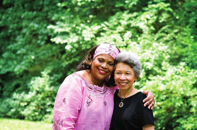
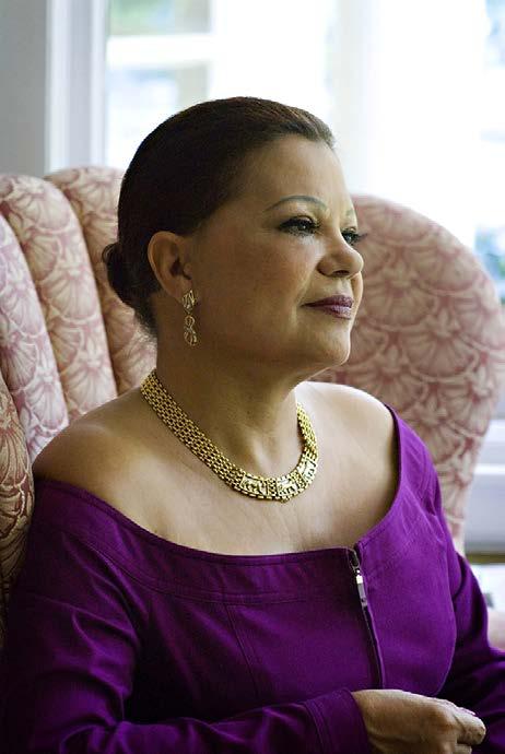
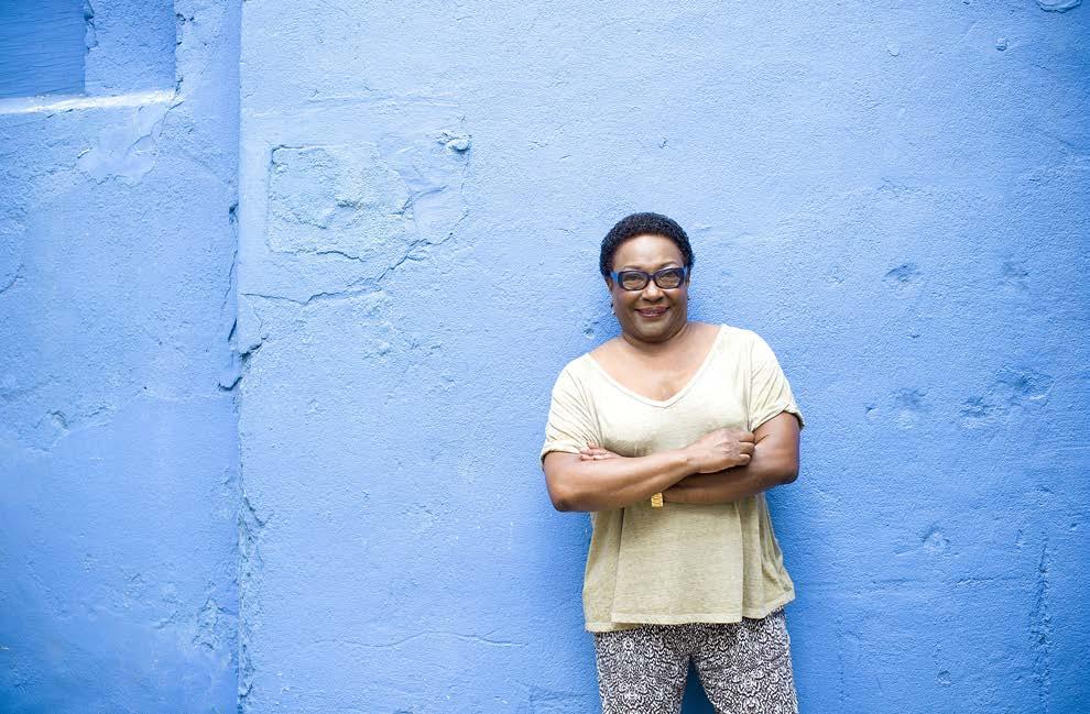
28 imagery Living Beyond Breast Cancer uses professional, high-quality imagery to authentically represent the message and goals of the organization as well as the people it impacts. Stock photography is never to be used. The official photo gallery features volunteers whose lives have been affected by breast cancer. It reflects a broad range of people of different ages, ethnicities, sexual orientations, races, genders and abilities. Photos are used to illustrate specific content and to express the position of the organization. Personally supplied snapshots of people impacted by breast cancer are acceptable for specific use such as Insight, conference program guides and online articles (e.g., the blog, social media posts). These photos represent a personal voice and are not intended to convey the personality or attitude of Living Beyond Breast Cancer. Photos can be used as full-bleed images or insets. 28 Brand Guide our identity


29 Living Beyond Breast Cancer 29 graphics


30 Our Language
31 our name Living Beyond Breast Cancer is the official name of the organization and should be used in full orally, in writing, and when referred to in print or electronic formats. It is never acceptable to abbreviate the name in any fashion except in the following instances: When a document introduces the organization by its full name but refers to it in multiple instances throughout the body of the document. In this case, the first mention should include the abbreviation in the format below. All mentions thereafter can be abbreviated to LBBC: Living Beyond Breast Cancer (LBBC) Oon Twitter and Instagram, where the name has been collapsed into the handle: LivingBeyondBC in the url where the name has been abbreviated to LBBC: LBBC.ORG Living Beyond Breast Cancer 31
32 our name Styling The Name When the name is written or typed, it should be styled with initial capitals and lowercase letters: Living Beyond Breast Cancer The Abbreviation The abbreviation should be set in uppercase when serving as a substitute for the full name: LBBC URLs The organization's URL should appear in uppercase letters. LBBC.ORG When displayed within a vanity url, the organization url should be lowercase. lbbc.org/infocus lbbc.org/get-support/get-involved lbbc.org/mbc360 lbbc.org/insight 32 Brand Guide our language
33 message Tagline The primary message of the organization is encapsulated in the tagline: With you, for you. It is contained within a logo lock-up (see page 14) and should be used on all branded material. Exceptions to the rule for use of the "logo format with tagline" can be found on page 14. Living Beyond Breast Cancer 33


34 campaigns Reach & Raise: Yoga for a Reason
35 mark ICONS SIMPLIFIED FOR SOCIAL MEDIA Reach & Raise is the annual fundraising event for Living Beyond Breast Cancer. The official mark is used on all related material. The mark includes the LBBC logo, campaign name and tagline as a unified visual. No part of this mark should ever be redrawn or altered. There are two official formats for the mark (see page 38). Exceptions: On LBBC-hosted social media accounts, the mark serves as an icon to represent the event. The tagline and LBBC logo are removed. YOGA FOR A REASON When appearing on LBBC-branded collateral (e.g., LBBC s website, brochures, newsletters), the mark can exist without the LBBC logo. YOGA FOR A REASON YOGA FOR A REASON Note: For legal protection, the mark appears with the TM symbol on all printed and electronic material. Once the trademark application has been accepted and placed on file, the TM will be substituted with an R. Living Beyond Breast Cancer 35

36 mark Formats Either format below is used for branding. Selection should be based on available space. The formats below should be used for all external publicity, marketing efforts and by partners, sponsors, individuals and organizations who are promoting the event on behalf of LBBC. No changes can be made to the size of the LBBC logo or its relationship to the Reach & Raise mark. YOGA FOR A REASON YOGA FOR A REASON Stacked Horizontal 36 Brand Guide campaigns
37 Clear Space (minimum requirement) The mark requires equal clear space around all four sides in order to minimize distraction caused from surrounding type or graphics. Whenever possible, increasing the clear space beyond what is outlined below is preferred. mark YOGA FOR A REASON YOGA FOR A REASON Living Beyond Breast Cancer 37
38 mark Sizing StACked format Horizontal format YOGA FOR A REASON YOGA FOR A REASON 2.25" 3.5" The stacked mark should not appear smaller than 2.25" wide. The horizontal mark should not appear smaller than 3.5" wide. Smaller sizes will compromise the legibility of the LBBC logo. The mark is scaled proportionately without distortion. 38 Brand Guide campaigns
39 Scaling mark YOGA FOR A REASON YOGA FOR A REASON The mark is scaled proportionately without distortion. Stretching or compressing is never acceptable. Living Beyond Breast Cancer 39
40 mark Background Guidelines apply to both formats. YOGA FOR A REASON YOGA FOR A REASON The mark always appears on a white background for maximum legibility. Color patterns and backgrounds will compromise the integrity of the mark and its effectiveness. 40 Brand Guide campaigns
41 Background Guidelines apply to both formats. mark Yoga for a reason Yoga for a reason In situations where the background cannot be controlled, the mark should appear in one color only white logo on dark backgrounds and berry logo on light backgrounds. If black is the only option for printing, berry should be substituted for black. One-color logos can be provided upon request. Living Beyond Breast Cancer 41
42 color Reach & Raise Color Palette The palette for this campaign combines the primary palette and the orange color from the support palette. (See color breakdowns on pages 21 and 22.) The three-color mark is used on all communications, marketing and promotional materials. 100%: Orange 100%: Gold YOGA FOR A REASON 80%: Berry gradation effect between berry and orange 42 Brand Guide campaigns
43 Single-Color Use When three color printing is not an option, the following rules apply with regard to the mark: color An all-white mark should be used on dark backgrounds. (See pg. 41) An all-berry (at 100%) mark with no gradations should be used on light backgrounds. This is required because of the co-branding. (See pg. 41) If limited to only one color, an all-berry (at 100%) mark with no gradations should be used. An all-gold mark is never an option for single-color use. Yoga for a reason Yoga for a reason Note: When color is not an option, the mark should be produced in black or reversed out to white. Living Beyond Breast Cancer 43
44 placement In order to bring attention to the campaign as well as maintain the critical connection of Reach & Raise to Living Beyond Breast Cancer, it is important that sponsor logos do not compete with the campaign mark. Presenter Logos Placement of external logos must comply with the minimum clear space rules. Increased clear space is encouraged whenever possible. Presenter logos should never be sized higher than the space from the bottom of the mark to the top of RAISE. In cases where one is left to use their judgment about the size and presentation of the presenter logos, the goal is to communicate that it is subordinate to the campaign mark. YOGA FOR A REASON Stacked Presented by LOGO 44 Brand Guide campaigns
45 Presenter Logos Rules for sponsor logo placement apply to both the stacked and horizontal formats. placement Presented by YOGA FOR A REASON LOGO horizontal Living Beyond Breast Cancer 45
46 placement Support Logos In order to create a clear hierarchy between the campaign mark, presenter logos and support logos, it is recommended that support logos be visually smaller communicating less importance than the presenter logo. Presented by YOGA FOR A REASON LOGO support logo support logo support logo support logo Stacked 46 Brand Guide campaigns

47 Collateral The Reach & Raise mark should be prominently sized and placed on promotional material. Photography is limited to single images whenever possible to minimize a cluttered appearance. Event photos are used for illustration purposes. placement Living Beyond Breast Cancer 47
48 The Name Written Format In all communication, marketing and promotional material, the campaign name is written with Initial capital letters for both words and an ampersand. Reach & Raise An and should never be used between Reach and Raise with the exception of the official url. At this time, ampersands cannot be used in urls. ReachAndRaise.org Reach & Raise is inextricably linked to Living Beyond Breast Cancer. When introducing the campaign for the first time both orally and in writing, it is: Living Beyond Breast Cancer s Reach & Raise In a document where the campaign name is referred to multiple times, after the first mention it can be collapsed to: LBBC s Reach & Raise 48 Brand Guide campaigns
49 Tagline The event tagline yoga FOR A REASON is used to provide context for Living Beyond Breast Cancer s Reach & Raise experience. It is used in conjunction with the logo (see page 39) and in forms of communication as a consistent reminder of what makes the event different from other fundraisers. These particular words best capture that experience. the name Rules for Use in Copy When yoga FOR A REASON is used as a headline, the text should appear in all caps using a font and text size consistent with the main copy. Example: yoga FOR A REASON Join thousands of people who want to make a difference in the lives. Iif the tagline is used within a body of copy, a font and text size consistent with the main copy should be used. Example: Living Beyond Breast Cancer s Reach & Raise participants will be doing yoga for a reason on Sunday, May 15. Living Beyond Breast Cancer 49
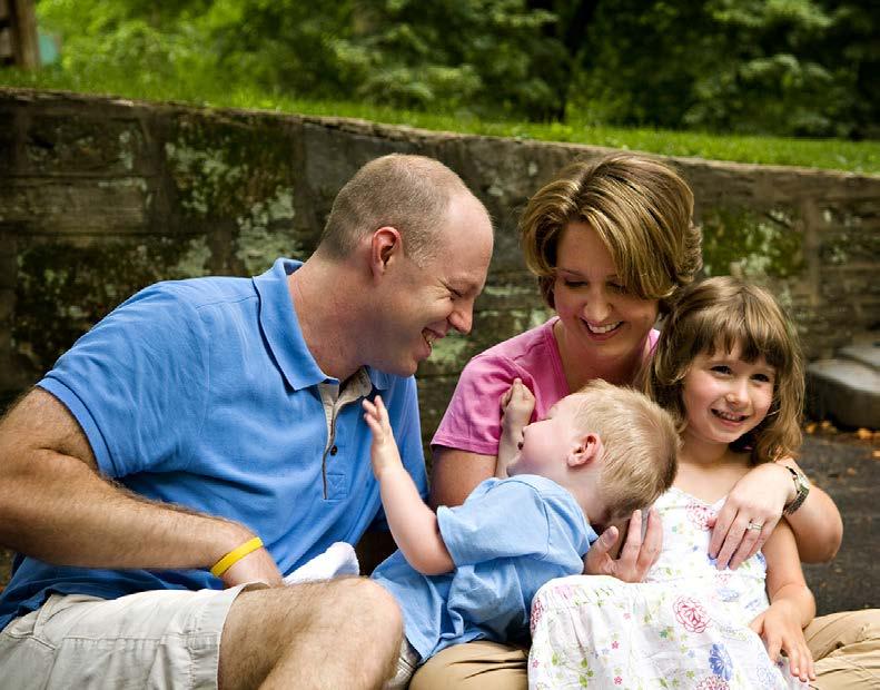
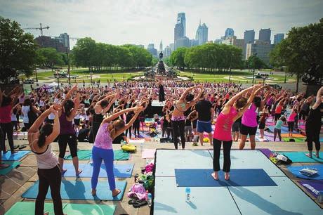
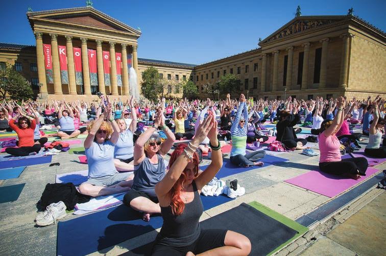
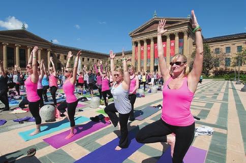
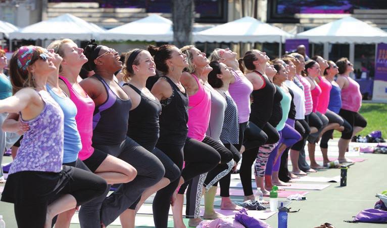
50 imagery Living Beyond Breast Cancer uses professional, high-quality imagery on all collateral to promote Reach & Raise. Photos can be used as full-bleed or insets. Single-image use is preferred over multiple images. Photo selection is based on the following: Environment Photos that feature landmarks or large open spaces help to communicate where the events take place. Community Photos that feature multiple people within a crowd setting are key to illustrating the communal nature of the events. Close-up photos of single individuals are discouraged, as they may appear to single out a certain type of participant. They also limit our ability to convey a sense of community. Diversity Every attempt is made to capture a diverse range of ages, ethnicities, races, physical abilities and genders. Whether one is a seasoned yogi or a first-time yoga-goer, LBBC strives to show a full range of participants in order to message that all are welcome and encouraged to participate. Activity Photos that illustrate simple, non-intimidating yoga poses convey the event s universal appeal. Anyone can do it. Group yoga poses message a low-impact activity, as opposed to a race or a competition. 50 Brand Guide campaigns


51 Living Beyond Breast Cancer 51 imagery
brand guide march 2016
 brand guide march 2016 Contents Our Purpose...4 Our Position...6 Our Identity...10 Logo...11 Format...12 Format with Tagline...14 Clear Space...16 Sizing...18 Scaling...19 Background...20 Color...22 Primary
Seattle Colleges Verbal Identity
 Brand Guide Seattle Colleges Verbal Identity WHAT IS VERBAL IDENTITY? Our verbal identity is the way we express our brand, connect with audiences, and inspire action through our tone of voice, our stories,
Brand Standards Guide
 Brand Standards Guide April 15, 2016 - Version 1.4 Nevada Health Link: Brand Standards Guide 1 Contents Brand Overview...3 Logos... 4 Primary Logo... 6-7 Secondary Logo... 8-9 Logo Clear Space...10-11
Brand & Trademark Guidelines
 Brand & Trademark Guidelines BloomReach brand & trademark guidelines SHOWCASED IN THE FOLLOWING PAGES ARE GUIDELINES FOR OUR IDENTITY SYSTEM. THIS RESOURCE IS DESIGNED TO HELP YOU UNDERSTAND HOW BEST TO
About AHIMA s IG Initiative. About IGHealthRate IGHEALTHRATE :
 STYLE GUIDE About AHIMA s IG Initiative Since 2012, AHIMA has committed to advancing information governance (IG) in the healthcare industry. Safe, high-quality, and cost-effective care for individuals
BRANDING STANDARDS MANUAL
 BRANDING STANDARDS MANUAL BRANDING MANUAL The goal of unified branding is to present College of the Redwoods identity through an easily remembered public image. A consistent, unified brand significantly
BRAND GUIDELINES. This document provides intitial guidance on the usage of the National Restaurant Association Educational Foundation logo.
 1 BRAND GUIDELINES This document provides intitial guidance on the usage of the National Restaurant Association Educational Foundation logo. Please contact Gordon Lambourne with any questions at Glambourne@nraef.org
T.F. Hudgins, Incorporated Corporate Identity. Logo Guidelines
 T.F. Hudgins, Incorporated Corporate Identity Logo Guidelines Introduction The T.F. Hudgins corporate logo is an easily recognizable design element that helps us communicate our brand to customers, associates,
A NOTE ON BRAND GUIDELINES
 BRAND GUIDELINES A NOTE ON BRAND GUIDELINES This brand book should serve as a guide for how to properly use the VIVO logo and voice in your internal collateral and public campaigns. They cover all elements
Digital Corporate Identity. Online 1.0
 Digital Corporate Identity Online 1.0 FNB Digital Corporate Identity > Online > Colour palettes > Primary and secondary 1. Primary Colour Palette 2. Secondary Colour Palette * When a flat/solid amber is
Florida Coastal School of Law. Brand Standards Guide 2012
 Florida Coastal School of Law Brand Standards Guide 2012 01 Contents 2 Introduction 3 Brand Architecture 4 Naming Conventions 5 Master Brand Logo 6 Promotional Brand Logo 7 Core Academic Identities 8 School
Graphics Standards and Brand Guidelines. Conquer every challenge with the brand that s Always on Duty.
 Graphics Standards and Brand Guidelines Conquer every challenge with the brand that s Always on Duty. 1 Brand Contents Overview 2 Brand Overview 3 4 Using the Guardian Logo 5 Incorrect Uses of the Logo
introduction WHY BRAND GUIDELINES? TABLE OF CONTENTS introduction 2 overview 3 about us mission vision impact areas tagline brand attributes
 brand guidelines introduction WHY BRAND GUIDELINES? Brand guidelines influence consistency in communication and help build positive brand recognition. They ensure that the strength of our brand is protected
Blessings in a Backpack Brand Design Guide
 Blessings in a Backpack Brand Design Guide What you will find in this document Brand Foundation Brand Policy Primary Colors Typography Logo General Application Guidelines Unexceptable Mark Usage Color
Global DMC Partners PARTNER BRANDING GUIDE Issued January 2014
 Global DMC Partners PARTNER BRANDING GUIDE Issued January 2014 TABLE OF CONTENTS Table of Contents INTRODUCTION 1 Building a Consistent Brand Image 1.1 LOGO & TAGLINE USAGE 2 Logo Clearspace Requirements
Brand Guidelines. January Acumatica Brand Identity Guide - Jan
 Brand Guidelines January 2014 Acumatica Brand Identity Guide - Jan 2014 1 Contents Intro Our Mission... Brand Promise... Brand Values... Guide Importance... 4 5 6 7 Graphic Elements Graphics... Iconography...
THE LAMAR BRAND is more than just a logo, color palette or website.
 THE LAMAR BRAND is more than just a logo, color palette or website. It is a living, breathing identity that represents our core business values. The branding of Lamar is intended for long term use. In
UNITED WAY OF DANE COUNTY BRANDING GUIDELINES
 UNITED WAY OF DANE COUNTY BRANDING GUIDELINES This Branding Toolkit was created to offer tools to assist you in consistently and proudly promoting and sharing information regarding United Way of Dane County.
TABLE OF CONTENTS BRAND STYLE GUIDE 2
 BRAND STYLE GUIDE TABLE OF CONTENTS Introduction...3 Legal Notice...4 Logos... 6-7 Color Palette...8 Fonts...9 Clear Space...10 Minimum Size...11 Unacceptable Logo Usage...12 Communication... 14-21 Classes...23
BRAND GUIDELINES. September 2017
 BRAND GUIDELINES September 2017 1 TABLE OF CONTENTS 3. Manifesto 4. Using The Brand Identity Guidelines 5. Brand Vision 6. Typography 7. Font Style Guide 8. Color Palette 9. Logo Usage 10. 360 Logo Hierarchy
BRAND IDENTITY CONTENTS LACOMBE REGIONAL TOURISM FIND YOUR WAY TO NEW MEMORIES...
 LACOMBE REGIONAL TOURISM BRAND IDENTITY Lacombe Regional Tourism expresses cultural exploration in a welcoming, warm and fun environment. Most people come to the region for natural experiences that they
B r a n d I d e n t i t y G u i d e l i n e s f o r t h e V i k u i t i I n g r e d i e n t B r a n d
 B r a n d I d e n t i t y G u i d e l i n e s f o r t h e V i k u i t i I n g r e d i e n t B r a n d 3Innovation Table of Contents page 1............................... Introduction page 2...............................
2 South Central College Brand Identity Guidelines
 Brand Style Guide 2 South Central College Brand Identity Guidelines Table of Contents OVERVIEW...4 Brand Promise Brand Pillars Brand Identity VOICE & TONE GUIDELINES...5 VISUAL STANDARDS...6 Color Fonts
Corporate Guidelines. Freescale Brand Identity. Logo usage. freescale.com. v1.1 /
 Corporate Guidelines Freescale Brand Identity Logo usage v1.1 / 6.8.11 Introduction Introduction How to Use These Guidelines Our voice must be unified in advertising, on the Web, in collateral, on the
Payfirma Brand Guidelines. Communicating the Payfirma Brand
 Payfirma Brand Guidelines Communicating the Payfirma Brand 2013 Welcome! 1 This is a guide to the basic elements that make up the Payfirma brand. Have a read, it will help you get to know us a little better.
CONTENTS ABOUT 02 BRAND PURPOSE 04 LOGO GUIDELINES PREFERRED LOGO 06 VERTICAL LOGO 07 ONE COLOR LOGO 08 KICKBACK AS TEXT 09 LOGO CLEARANCE 10
 STYLE GUIDE CONTENTS 01 02 03 04 05 06 07 08 09 ABOUT 02 BRAND PURPOSE 04 LOGO GUIDELINES PREFERRED LOGO 06 VERTICAL LOGO 07 ONE COLOR LOGO 08 KICKBACK AS TEXT 09 LOGO CLEARANCE 10 ICON GUIDELINES ICON
Brand Style Guide. How to use the Lifeway brand to maintain a cohesive identity in all mediums of visual communication
 How to use the Lifeway brand to maintain a cohesive identity in all mediums of visual communication 1 BRAND STYLE GUIDE Our brand is our most valuable asset in visual communications. It embodies the boldness,
WD Brand Guidelines & Graphic Standards Manual 02/2015
 WD Brand Guidelines & Graphic Standards Manual 02/2015 Contents Overview 02 / WD as a registered trademark 03 / Overview 04 / Who we are / Our brand role 05 / Brand tone of voice 06 / Glossary of important
BRAND GUIDELINES. Ticketmaster International - External Clients JUNE Ticketmaster International. All rights reserved.
 BRAND GUIDELINES Ticketmaster International - External Clients JUNE 2015 2015 Ticketmaster International. All rights reserved. CONTENTS BRANDMARK BRAND COLOURS CONTACT DETAILS 3 6 8 Ticketmaster Brand
BRAND STANDARDS GUIDE
 BRAND STANDARDS GUIDE Latest updated 2/4/2016 Table of Contents Letter from our President Our Brand Logo Exception Logo Logo Standards Brand Colors Typography Slogan Design Application Our Brand Name Our
THE LAMAR BRAND is more than just a logo, color palette or website.
 THE LAMAR BRAND is more than just a logo, color palette or website. It is a living, breathing identity that represents our core business values. The branding of Lamar is intended for long term use. In
Brand Standard Guidelines
 Brand Standard Guidelines Table of Contents Primary Mark 3 Secondary Mark 14 Pennant 23 Super Graphic 32 1.1 Primary Mark: Introduction 2.1 Secondary Mark: Introduction 3.1 Pennant: Introduction 4.1 Super
the brand table of contents the brand the essentials logo 6-17 color palette imagery typography 22 global positioning/design
 BRAND GUIDELINES Allied Global Brand Standards Version 1.0 January 2006 the brand table of contents the brand using this style guide 3 standards 4 the essentials logo 6-17 color palette 18-19 imagery 20-21
Brand, Messaging & Styles Guide
 Brand, Messaging & Styles Guide 2 Table of Contents Who We Are... Respecting the Brand The Power of Consistency Your Ambassadorship Engineering the Brand... The Brand Mark The Rationale The Tag line Logo
Golden Jubilee Conference Hotel. People at the heart of progress. Our Brand Guidelines. May Version 1
 Our Brand Guidelines May 2015 - Version 1 Page 03 Page 04 Page 05 Page 06 Page 07 Page 08 Page 09 Page 10 Welcome Our Brand Essence / Our Brand Identity Our Brand Family Our Brand Colours Our Typeface
Brand Identity Standards. Visual Identity Guidelines
 Brand Identity Standards Visual Identity Guidelines Contents Introduction 1 University of St. Thomas Brand 2 Master Logo 4 Brand Architecture 5 Specifications 6 Colors & Typography 7 Unacceptable Usage
World Financial Group BRAND MANUAL
 World Financial Group BRAND MANUAL 1 A brand is a standard. 2 SIGNATURE 1.1 Logo Variants A Brand is a strong, purposely crafted identity through which all great companies become known. And, through which
Gartner Logo Usage Guidelines
 MAY 15, 2014 Gartner Logo Usage Guidelines Introduction What is the goal? This document shows you how to use the Gartner logo in a variety of materials. If you have questions, please contact quote.requests@gartner.com.
BRAND BIBLE JULY 2017
 BRAND BIBLE JULY 2017 CONTENTS Introduction I. BRAND MESSAGING Brand Story Tone and Buzzwords Key Takeaways Taglines Headlines 5 6 7 8 9/10 II. OUR BRAND Brand Mark (Logo) Color Application Secondary and
LOREM IPSUM DOLOR 1. GLOBAL BRAND GUIDELINES Updated November 2014
 LOREM IPSUM DOLOR 1 GLOBAL BRAND GUIDELINES Updated November 2014 CONTENTS Contents Introduction... 2 Brand Architecture Brand Elements... 3 Logos... 4 Color Versions... 4 Background Color... 5 Minimum
TABLE OF CONTENTS IMSA CONTINENTAL TIRE SPORTSCAR CHALLENGE
 BRAND STYLE GUIDE TABLE OF CONTENTS Introduction...3 Legal Notice...4 Logos...6 Name Usage...7 Color Palette...8 Fonts...9 Clear Space...10 Minimum Size...11 Unacceptable Logo Usage...12 Communication...
Partner Brand Guide. Copyright 2017, Oracle and/or its affiliates. All rights reserved. Updated
 Partner Brand Guide v2 Copyright 2017, Oracle and/or its affiliates. All rights reserved. Updated 3.7.17 CONTENTS 01 IDENTITY 02 TYPOGRAPHY 03 COLOR 04 PARTNER IDENTITY PARTNER LOGOS CERTIFICATION LOGO
OUR STORY YOUR PARTNER SINCE 1951
 BRAND GUIDELINES OUR STORY YOUR PARTNER SINCE 1951 Partnership is what we believe in. This means, as the world of healthcare evolves, we evolve along with you. We understand your priority is patient care,
Brand Guidelines Introduction
 Brand Guidelines DogWatch Inc. Section 1: Logo 1 Brand Guidelines Introduction Welcome to the DogWatch Inc. Brand Guidelines document. This document provides a simple, yet robust set of Brand Guidelines
2018 International WELL Building Institute, PBC. All rights reserved.
 The marketing team at the International WELL Building Institute TM (IWBI TM ) created this guide to communicate our trademark and brand guidelines to the community of WELL users, WELL APs, partners and
B R A N D G U I D E L I N E S
 BRAND GUIDELINES Index Why this guide is important 4 How to use this guide 5 Why we have the Stratalam brand 6 Who is responsible for protecting the brand 6 Legal considerations 7 Our Logo 7 Logo clear
Graphics Standard Manual
 Graphics Standard Manual February 2017 TABLE OF CONTENTS Table of Contents...1 Introduction...2 National Office Graphic Standards...3 Logo Placement and Usage National office and Sites...9 Brand Messaging...16
Branding Style Guide 1.1 February, AmericanGraduate.org
 Branding Style Guide 1.1 February, 2012 AmericanGraduate.org American Graduate is a public media initiative funded by the Corporation for Public Broadcasting to help local communities across America find
Facebook Brand Assets Guide
 Facebook Version 1.2 January 2018 2016 All Rights Reserved 1 Table of Contents 1 Welcome 1.1 Facebook s Mission 1.2 Who is this guide for? 1.3 What is this guide important? 2 General Guidelines 2.1 General
World ATM Congress. Brand Guidelines. Revised 8 January, 2019
 World ATM Congress 2019 Brand Guidelines Revised 8 January, 2019 World ATM Congress 2019 Brand Guidelines Contents 1. Visual identity 1.1. Logo guidelines 1.2. Logo art files 1.3. palette 1.4. Typography
PMS 356 BRANDMARK PMS 357 LOGO PMS 356 LOGOTYPE TRADEMARK BRAND GUIDELINES
 BRANDMARK LOGO PMS 357 LOGOTYPE TRADEMARK BRAND GUIDELINES 07.18.14 BRAND OUR NAME The name Veritiv reflects the core strength of our organization, which is the commitment to deliver with excellence. With
World ATM Congress. Brand Guidelines
 World ATM Congress 2018 Brand Guidelines Revised 5 January, 2018 1 World ATM Congress 2018 Brand Guidelines Contents 1. Visual identity 1.1. Logo guidelines 1.2. Logo art files 1.3. Colour palette 1.4.
Norman USA Corporate ID Standards Manual. Guidelines for Reproducing and Using Norman Logos and Images
 Norman USA Corporate ID Standards Manual Guidelines for Reproducing and Using Norman Logos and Images NIC Page 1 updated 01/2009 Corporate Logo Components and Appearance Company Logo: Norman USA For single
BRAND GUIDELINES. Management of the UC Health Brand DRAFT
 BRAND GUIDELINES Management of the UC Health Brand 091509 DRAFT STATEMENT OF PURPOSE The purpose of the document is to ensure that the UC Health brand is consistently portrayed in all of our various touchpoints,
2018 BRAND GUIDELINES
 2018 BRAND GUIDELINES PDXWIT BRAND GUIDELINES TABLE OF CONTENTS ABOUT PDXWIT : THE LOGO : Our Origin Story................... 3 Purpose.................... 3 Why a Brand Guide.................. 4 Our Name....................
Visual Standards (revision 2) FÉDÉRATION INTERNATIONALE DES CONSEILS EN PROPRIÉTÉ INTELLECTUELLE
 FÉDÉRATION INTERNATIONALE DES CONSEILS EN PROPRIÉTÉ INTELLECTUELLE") Visual Standards (revision 2) March 2012 Table of Contents 1.0 BRAND ELEMENTS The Logo...1 Logo Orientation... 2 The Logo: Usage and Size... 3 Logo Colour...4 The Logo: Application... 5 The Logo: Co-Branding...
Visual Standards (revision 2) March 2012 Table of Contents 1.0 BRAND ELEMENTS The Logo...1 Logo Orientation... 2 The Logo: Usage and Size... 3 Logo Colour...4 The Logo: Application... 5 The Logo: Co-Branding...
TRUSTED BECAUSE IT S TESTED
 BRAND AND STYLE GUIDE 2018 ANSI SEAL TRUSTED BECAUSE IT S TESTED THE KCMA BRAND THE KITCHEN CABINET MANUFACTURERS ASSOCIATION IS A PROUD AND VITAL BRAND, PROTECTING AND HELPING TO GROW ONE OF AMERICA S
CONTENTS 3 OUR BRAND 41 SOCIAL MEDIA 7 LOGO 51 VIDEOS 27 COLORS 54 BRAND PARTNERSHIPS 30 TYPOGRAPHY 32 PHOTOGRAPHY 37 LANGUAGE & COPY
 BRAND GUIDE 1 CONTENTS 3 OUR BRAND 41 SOCIAL MEDIA 7 LOGO 51 VIDEOS 27 COLORS 54 BRAND PARTNERSHIPS 30 TYPOGRAPHY 32 PHOTOGRAPHY 37 LANGUAGE & COPY 2 OUR BRAND 4 Welcome 5 Mission, Vision & Tagline 6 Values
Get Outdoors Colorado Brand Style Guide
 Get Outdoors Colorado Brand Style Guide February 2012 2 :: Get Outdoors Colorado Brand Style Guide Be The Brand The Get Outdoors Colorado (GOC) brand is made up of many elements that are unique to the
Bossier Parish Community College Visual Identity Guide The Official Guide to BPCC s Graphic Standards
 Bossier Parish Community College Visual Identity Guide The Official Guide to BPCC s Graphic Standards BPCC Public Relations Office A-121 General Office Number (318) 678-6031 Tracy McGill, Director (318)
Intel Cluster Ready. Trademark and Text Treatment Usage Guidelines
 Intel Cluster Ready Trademark and Text Treatment Usage Guidelines Table of Contents Introduction 3 Sizing 4 Clear Space 4 Backgrounds 5 Incorrect Usage 5 Co-Marketing Scenarios 6 Usage on Print Advertising
Contents. 870 children and 1090 familes every year. Our logo 5. Our celebratory logo 9. Fonts 10. Colours 11. Our brand 17. Our retail brand 23
 Brand Guidelines Contents Our logo 5 Our celebratory logo 9 Fonts 10 Colours 11 Our brand 17 Our retail brand 23 Branding checklist 30 Acorns supports over 870 children and 1090 familes every year 2 Our
Certified Partner Branding Guidelines
 Thanks for Being a Certified Partner These branding guidelines are designed to help DigiCert partners successfully use the DigiCert brand to grow their business and increase trust on the internet. Through
RISE CITY CHURCH BRAND GUIDELINES
 RISE CITY CHURCH BRAND GUIDELINES 5.3 Updated: RISE CITY February CHURCH 2017 BRANDING GUIDELINES // 2017 TABLE OF CONTENTS 1 Branding Principles 1.1 Why Branding 1.2 Target Audience 1.3 Mission + Vision
BRAND ARCHITECTURE. Unit Wordmark System Version 1.0
 BRAND ARCHITECTURE Version 1.0 TABLE OF CONTENTS I. Introduction... 3 How to Use This Guide... 4 Unit Wordmark Structure... 5 Brand Architecture... 7 II. Primary Entity Guidelines... 8 Structure... 10
Back to TOC Channel Relationships
 Channel Relationships Version 1.5: June 2017 3M 2017. All Rights Reserved. 1 Version 1.5: June 2017 Contents Channel Relationships... 3 Third-Party Communications Leveraging 3M... 4 3M Communications Mentioning
Style Guidelines Branding Community Action Tips, Ideas, Suggestions
 Style Guidelines Branding Community Action Tips, Ideas, Suggestions Community Action Partnership has undergone a major rebranding initiative in the past five years. We are convinced that unifying under
front cover, white mini-spiral bind on left with clear protective overlay
 introduction page 1 celebration logo 2 logo proportions 3 logo options 4 logo eamples 5 colors, usage 6 colors, usage 7 pennant usage 8 districts & sections 9 logo eamples 10 usage, fonts 11 general guidelines
Brand Guidelines. v1.0 AUGUST 2011
 Brand Guidelines v1.0 AUGUST 2011 7 BILLION ACTIONS / BRAND GUIDELINES / v1.0 AUGUST 2011 2 Connecting People. Inspiring Action. CONTENTS 3 Logo 4 Orientation Variations 4 Language Options 5 Taglines 5
DNN / Brand Identity Guidelines
 DNN / Brand Identity Guidelines OVERVIEW It s an exciting time for DNN. A streamlined, yet familiar, official moniker. A bold new brand identity system inspired by our values. The possibilities are endless.
Camp Quality USA, Inc. Style Guide
 USA, Inc. Style Guide 1 Overview It s vital that all USA, Inc. ( ) communications be created with an understanding of our brand including proper use of design, imagery, type, logo and the right voice.
Ingredient brand guidelines
 Ingredient brand guidelines By using our logos and trademarks, you agree to the guidelines for their use contained in this document. CONTACT Stacie Gillespie Marketing Communications Representative sgillespie@eastman.com
WHAT IS A BRAND? A BRAND
 WHAT IS A BRAND? A BRAND IS NOT A LOGO A BRAND IS NOT AN IDENTITY AND A BRAND IS NOT A PRODUCT A BRAND A BRAND IS A PERSON S EMOTIONAL RESPONSE TO A COMPANY, SERVICE, PRODUCT OR PLACE. PAGE 2 BRANDING
BRAND GUIDELINES ELLING TORY
 BRAND GUIDELINES ELLING UR TORY 1 CONTENTS PART ONE Our Story Project objectives........................ 3 Background............................. 4 Positioning.............................. 5 The idea................................
BRAND GUIDELINES: Materials That Match the Message
 TABLE OF CONTENTS Brand Platform 2 Brand Positioning 2 Brand Logo and Tagline 3 Additional Logos, Registration Marks and Trademarks 4-6 Illegal Brand Logo Uses 6 Color Palette 7 Branding with Images 8
The InsideView Brand Book
 The InsideView Brand Book InsideView Technologies. All rights reserved. THE INSIDEVIEW BRAND 1 INTRODUCTION InsideView powers the world s business conversations, helping more than 20,000 companies redefine
DEG s Brand. Logo. The logo must be reproduced from reproduction-quality art or from high-resolution digital files.
 BRAND STYLE GUIDE DEG s Brand A brand, at its most elemental level, is a statement of a company s character and purpose. At DEG, our brand is both the expression of the creative spirit that has existed
2010 SoftLayer Technologies, Inc. BRAND GUIDELINES
 BRAND GUIDELINES BRAND GUIDELINES Primary Signature Icon Signature Our Logo: Configuration The configurations shown above are the only authorized signatures for SoftLayer Technologies. These are to be
BRANDING GUIDELINES INCLUDING USE OF DECA LOGOS, EMBLEMS AND INSIGNIA
 BRANDING GUIDELINES INCLUDING USE OF DECA LOGOS, EMBLEMS AND INSIGNIA DECA BRAND GUIDELINES 1 DECA BRAND GUIDELINES 2 THE DECA BRAND 1950 1970 1980 1991 2010 DECA s brand identifies a remarkable experience
2018 ARDS AND BRAND ST
 BRAND STANDARDS 2018 TABLE OF CONTENTS INTRODUCTION... 3 SCTCC BRAND... 4 TAGLINE.... 5 ATHLETICS.... 6 MINNESOTA STATE.... 7 LOGO & NAME... 8 LOGO USE.... 9 TYPOGRAPHY.... 13 COLORS.... 15 IMAGE USE....
Introduction. Purpose of document
 Introduction Purpose of document Welcome to Guidance and Tips for Designing a Brand and Marketing to Franchisees! The purpose of this document is to offer tips and guidance on how to develop your brand
BRAND EXPRESSION GUIDELINES. American Heart Association
 BRAND EXPRESSION GUIDELINES American Heart Association Foundations Foundations Positioning Values & Impact Character Approach Make our position your own, by telling people your personal story, and why
Ingredient brand guidelines
 Ingredient brand guidelines By using our logos and trademarks, you agree to the guidelines for their use contained in this document. CONTACT Stacie Gillespie Marketing Communications Representative sgillespie@eastman.com
BRANDING PROCEDURE AND PUBLICATION STANDARDS POLICY 3.09
 BRANDING PROCEDURE AND PUBLICATION STANDARDS POLICY 3.09 Effective Date: 07/18 Purpose: Barren River District Health Department (BRDHD) seeks to project an image as a united organization across the district
Sponsorship Opportunities
 Sponsorship Opportunities The Ehlers-Danlos Society is a global community of patients, caregivers, health care professionals, and supporters, dedicated to saving and improving the lives of those affected
Graphic Standards Final Project Stacey Ray AAD 610
 Graphic Standards Final Project Stacey Ray AAD 610 Table of Contents Introduction Inroduction --------------------------------------- 3 Glossary ----------------------------------------- 4 Logo and Logotype
SUMMER 2018 GRAPHIC STANDARDS
 SUMMER 2018 GRAPHIC STANDARDS CONTENTS Overview 3 University Logo 4 University Word Mark 5 Clear Space & Sizing 6 Logo Misuse 7 Colors 8 Typography 9 University Seal 10 Department Logos 11 Alumni Association
Brand Guidelines. March 2015
 Brand Guidelines March 2015 WHO WE ARE Word of Life Brand Guidelines 2 is a multi-disciplinary non-profi t organization that has a goal to present a cohesive, and effective visual brand to its audience.
Brand Guidelines. March 2015
 Brand Guidelines March 2015 WHO WE ARE Word of Life Brand Guidelines 2 is a multi-disciplinary non-profi t organization that has a goal to present a cohesive, and effective visual brand to its audience.
FOUNDATION AND VISUAL IDENTITY GUIDE. RRC WORKS CAMPAIGN - Visual identity guide
 FOUNDATION AND VISUAL IDENTITY GUIDE 1 FOUNDATION RRC WORKS CAMPAIGN - Foundation 2 CAMPAIGN CHARACTER Through research and consultation, these three words were selected to define our campaign s character
LOGO GUIDELINES V 1.0 SEPTEMBER 2015
 LOGO GUIDELINES V 1. 0 THE REFRESH THE CHALLENGE: Inland Imaging owns and operates a number of different companies under the Inland Imaging name. Some of these companies are involved with services directly
AUT BRAND GUIDELINES / OCTOBER 2012
 AUT BRAND GUIDELINES OCTOBER 2012 1 AUT University Brand Manual Introduction The AUT brand. It represents one of the New Zealand s newest and contemporary Universities. It s also a brand that has grown
Corporate Identity and Brand. Short manual
 Corporate Identity and Brand Short manual Philosophy Attitudes and values Philosophy Attitudes o o o o o Leadership We see ourselves as leaders in our industry and aspire to be the best in the long term.
CPC projects draw upon the skills and experience of students and faculty from RWU programs in areas such as:
 BRAND GUIDELINES The Roger Williams University Community Partnerships Center The Roger Williams University (RWU) Community Partnerships Center (CPC) provides project based assistance to non-profit organizations,
Contents THE CATAWBA BRAND. Introduction LOGOS. Using the College Logos. The College Wordmark. Do s and Don ts. The College Seal ATHLETICS LOGOS
 1 Contents THE CATAWBA BRAND Introduction LOGOS Using the College Logos The College Wordmark Do s and Don ts The College Seal ATHLETICS LOGOS The Athletics Wordmark The Feathered C Logo The Arrowhead Logo
Corporate Brand Guide.
 www.arixacapital.com Corporate Brand Guide Table of Contents Introduction/About Arixa Capital Advisors...3 Why provide these guidelines?...4 Corporate Logo...5 Corporate Colors...7 Corporate Fonts...8
discovering the sovrn brand
 discovering the sovrn brand Information is the new currency A BRAND IS A PROMISE: This everything we do. And it is everything that our customers and partners depend on us for. Brands are BELIEF SYSTEMS
The SRT Brand. Key Visual Elements and Usage Guidelines
 The SRT Brand Key Visual Elements and Usage Guidelines Contents 3 SRT Brand Mark 4 SRT Brand Mark Guidelines 4 Area of Isolation 5 Rules of Use 6 Trademark Ownership Statement 7 Use of SRT Brand Name 8
STYLE GUIDE VISUAL + BRAND
 STYLE GUIDE VISUAL + BRAND BRAND STORY OUR CORE VALUES Respect We honor the diverse needs of those we serve. Service We value the opportunity to be of service. Collaboration We foster strong relationships
Northwestern Mutual AND Northwestern Mutual Financial Network
 LOGO GUIDELINES Northwestern Mutual AND Northwestern Mutual Financial Network For nearly 150 years, the column capital has been a key piece of Northwestern Mutual architecture, and it has come to represent